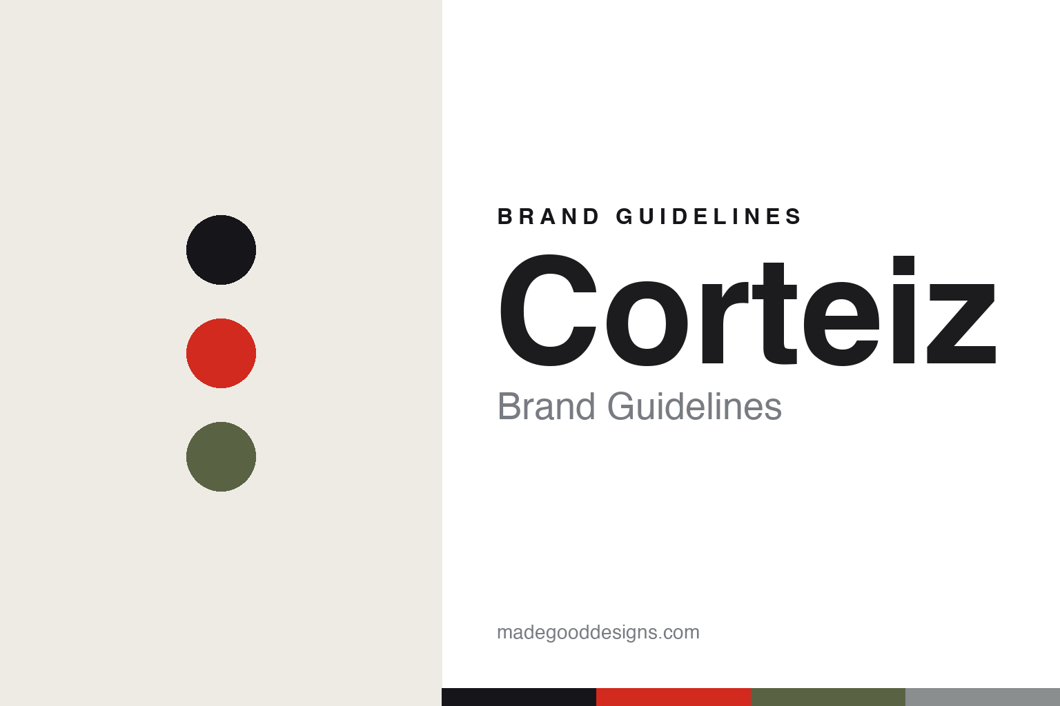
Corteiz Brand Guidelines
Rules the world.
Aa
Two constants: a bold, anti-establishment palette and a bold grotesque register. Abstract homage — not the Corteiz wordmark or its Alcatraz logo.
Rules the world
Corteiz turned scarcity into a movement.
Corteiz is a lesson in scarcity as a movement. Founded around 2017 by Clint (known as Clint419) in London, the independent brand — full name Corteiz Rules The World (CRTZRTW) — built a cult following on anti-establishment attitude and a signature Alcatraz-island logo, a symbol of rebellion.
Its brand identity is bold, exclusive and guerrilla. Corteiz is famous for its marketing: a password-protected website with invite-only drops, and stunts like “Da Great Bolo Exchange” (customers swapped old jackets for a new “Bolo” puffer, with the old ones donated to the homeless) and a 99p cargos drop that drew huge crowds. The community and the scarcity are the brand.
(Honest notes: it’s independent and founder-owned; Clint keeps his identity famously private. In a great full-circle, Nike challenged the “Cortez” name in 2021 — then collaborated with Corteiz on the Air Max 95 in 2023. There’s no official brand colour — the identity is the logo and the scarcity, not a palette (the “Gutta Green” people associate with it is a Nike-collab colorway) — so the tones here are an unofficial interpretation.)
Colour
Corteiz lives in a bold, anti-establishment palette. Click a swatch to copy the hex.
Corteiz’s identity is bold, utilitarian and anti-establishment — an ink, a signal red, an army green, a concrete grey, and a paper. The palette leans on stark ink, a signal red and a utilitarian green — the register of army-surplus, protest and street. It signals rebellion, exclusivity and grit rather than polish. The honest caveat: with no published brand hex, these tones are an original, unofficial interpretation, not first-party values.
The lesson is a bold, utilitarian palette signals anti-establishment attitude. Corteiz’s world is a guerrilla drop. For designers, it is a reminder that a stark, army-surplus palette — ink, a signal red, a utilitarian green — reads as rebellious and street-authentic, matching a brand built on scarcity and community. The takeaways: use a bold, utilitarian palette for anti-establishment energy; let the logo and story lead; and treat any single hex as unofficial — using ink for small text so the red stays a signal.
Typography
The register is a bold grotesque — stark and confident.
Corteiz’s identity carries a bold, confident, anti-establishment spirit — a logo and a scarcity model that do the talking. A bold grotesque captures the mood: it is stark and assertive, the register of army stencils and street posters. Set in a bold palette, the grotesque feels stark and confident — exactly the personality Corteiz carries. It is assertive rather than polished, mirroring a guerrilla drop. (Corteiz’s real wordmark and its Alcatraz logo are trademarks we describe but do not reproduce, and the exact brand typeface is not ours to use.) Because the mark is not ours to use, the honest description is “a bold grotesque spirit,” shown here in a stand-in. The type behaves like the brand: bold, confident and anti-establishment.
Aa
A bold grotesque spirit — stark and confident. (Specimen set in Archivo, a bold grotesque STAND-IN; NOT the Corteiz wordmark or Alcatraz logo, which are trademarks.)
Scarcity as identity
Corteiz stands for exclusivity and community.
Corteiz is a lesson in making scarcity and community the identity. A bold anti-establishment palette, a rebellious logo and a guerrilla drop model turn exclusivity into the whole brand — the harder it is to get, the more it means. The scarcity is the differentiator. The differentiator is a bold, exclusive, community-driven identity.
For designers and brand-builders, Corteiz offers a clear takeaway: scarcity and story can be a positioning. The lessons: build community and exclusivity; let a strong logo and attitude lead; and use a bold, utilitarian palette. It is also a reminder to stay accurate: the 99p drop was cargos (not tees), the associated green is a Nike-collab colorway, and the palette here is an unofficial interpretation. Corteiz made scarcity the brand — proof that exclusivity can be the difference.
Explore & save
Keep Corteiz’s identity on hand — save it to a board in the Made Good inspiration library.
Corteiz identity set
Pin the anti-establishment palette and the bold-grotesque register to your own board.


