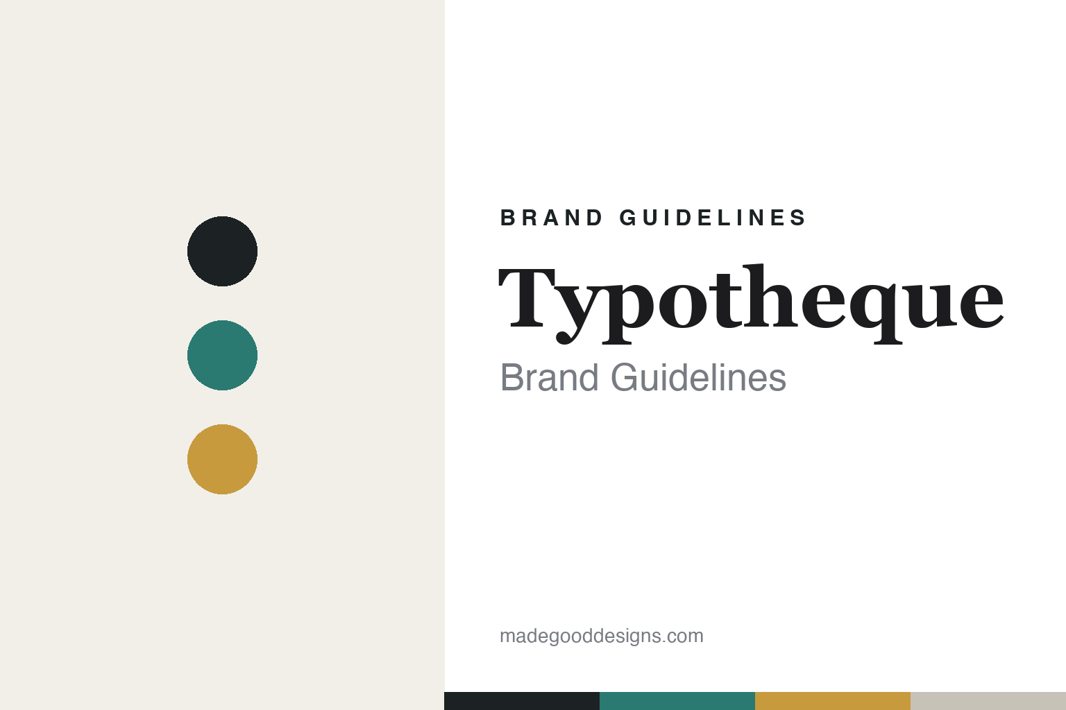
Typotheque Brand Guidelines
Type for the world.
Aa
Two constants: a considered, global palette and an editorial serif register. Abstract homage — not the Typotheque wordmark or its typefaces.
Type for the world
Typotheque designs type for every language.
Typotheque is a lesson in type as a global, intellectual project. Founded in 1999 by Peter Biľak in The Hague, the independent foundry is behind the flagship Fedra (Sans and Serif), plus Greta, Lava and History — and, above all, pioneering multi-script work spanning some 37 writing systems.
Its brand identity is intellectual, editorial and research-driven — minimal and typographic, backed by genuine research into readability, accessibility and endangered-language support. Typotheque was the first foundry to license type for the web (2009), contributes to Unicode, and champions “responsible type” for underrepresented languages.
(Honest notes: Fedra is the flagship, not Lava (a later text face); it’s a Dutch foundry, though Biľak is Slovak-born; and it is independent — not owned by Monotype. Biľak also co-founded the Fontstand rental app and TPTQ Arabic, and helped start Indian Type Foundry in 2009 (a separate company). There’s no official brand hex, so the tones here are an unofficial interpretation.)
Colour
Typotheque lives in a considered, global palette. Click a swatch to copy the hex.
Typotheque’s identity is considered, intellectual and editorial — an ink, a teal, an ochre, a stone, and a paper. The palette pairs a serious ink base with a considered teal and a warm ochre — the register of a thoughtful, globally-minded research foundry. It signals seriousness, breadth and care rather than decoration. The honest caveat: with no published brand hex, these tones are an original, unofficial interpretation, not first-party values.
The lesson is a considered palette signals intellectual breadth. Typotheque’s world is a global, research-led studio. For designers, it is a reminder that a restrained, thoughtful palette — an ink anchor, a considered accent or two — reads as serious and globally-minded, right for a foundry designing type for the whole world. The takeaways: anchor with a serious ink; add one or two considered accents; and treat any single hex as unofficial — using deep ink for small text so the palette stays considered.
Typography
The register is an editorial serif — intellectual and considered.
Typotheque’s identity carries an intellectual, editorial, considered spirit — a minimal, research-led page. A refined editorial serif captures the mood: it is literary and thoughtful, the register of a foundry that writes and researches as much as it draws. Set in a considered palette, the editorial serif feels intellectual and considered — exactly the personality Typotheque carries. It is thoughtful rather than loud, mirroring a research page. (Typotheque’s real wordmark and its retail typefaces — Fedra, Greta and the rest — are commercial products and trademarks we name but do not reproduce or set text in; the exact brand typeface is not ours to use.) Because those faces are not ours to set, the honest description is “an editorial serif spirit,” shown here in a stand-in. The type behaves like the brand: intellectual, editorial and considered.
Aa
An editorial serif spirit — intellectual and considered. (Specimen set in Lora, an editorial serif STAND-IN; NOT Typotheque’s wordmark or any Typotheque retail typeface, which are trademarks.)
Responsibility as identity
Typotheque stands for global, responsible type.
Typotheque is a lesson in making global responsibility the identity. A considered palette, an editorial voice and genuine research into multi-script and endangered-language type make responsible, worldwide type the brand — serious, thoughtful, global. The intellectual breadth is the differentiator. The differentiator is a multi-script, research-led, responsible identity.
For designers and brand-builders, Typotheque offers a clear takeaway: research and responsibility can be a positioning. The lessons: let genuine research lead; design for breadth (many scripts, many readers); and keep the identity considered and editorial. It is also a reminder to stay accurate: Fedra is the flagship, it’s a Dutch (not Slovak) foundry, it’s independent of Monotype, and the palette here is an unofficial interpretation. Typotheque made responsibility the brand — proof that breadth can be the difference.
Explore & save
Keep Typotheque’s identity on hand — save it to a board in the Made Good inspiration library.
Typotheque identity set
Pin the considered palette and the editorial-serif register to your own board.


