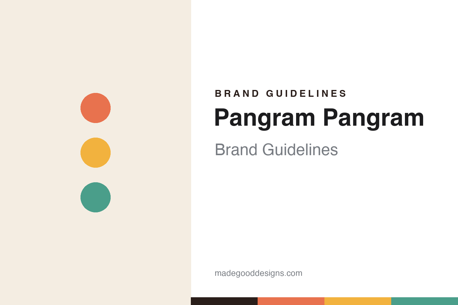
Pangram Pangram Brand Guidelines
Type for everyone.
Aa
Two constants: a warm, friendly palette and a friendly geometric sans register. Abstract homage — not the Pangram wordmark or its PP typefaces.
Type for everyone
Pangram Pangram made a foundry feel welcoming.
Pangram Pangram is a lesson in accessibility as a brand. Founded in 2018 by Mat (Mathieu) Desjardins and a small team in Montreal, the independent foundry is behind some of the most-shared type of the era — its flagship PP Neue Montreal, the wildly popular display serif PP Editorial New, plus PP Mori, PP Fraktion, PP Telegraf, PP Right Grotesk and PP Migra.
Its brand personality is friendly, warm and accessible — designer-first, with big interactive specimens and a generous, approachable tone. That warmth is backed by a genuinely open model: fonts are “free to try” (usable for exploration and personal use), with paid commercial licenses (from around $40) for commercial projects.
(Honest notes: the name is doubled — “Pangram Pangram,” not just “Pangram,” and unrelated to the linguistics term. The “PP” prefix is the installed family-name convention (the site often drops it, showing “Neue Montreal”). We describe the accessible, free-for-personal-use ethos it still runs today, without claiming a formal “pay-what-you-want then pivoted” history that isn’t documented. And there is no single official brand hex, so the colours here are an unofficial interpretation.)
Colour
Pangram Pangram lives in warm, friendly colour. Click a swatch to copy the hex.
Pangram Pangram’s identity is warm, friendly and accessible — a coral, a warm yellow, a teal, a sand, and an ink. Rather than one fixed brand colour, it uses warm, inviting, varied colour across its specimens. It signals an approachable, designer-first foundry rather than an exclusive or austere one. The honest caveat: with no published brand hex, these tones are an original, unofficial interpretation, not first-party values.
The lesson is warm colour makes a brand feel welcoming. Pangram Pangram’s world is an open, friendly studio. For designers, it is a reminder that warmth and generosity — inviting colour, an open “try it” model, an approachable tone — can build an enormous, loyal audience, especially in a field that can feel gatekept. The takeaways: use warm, inviting colour to feel accessible; back it with a genuinely generous model; and treat any single hex as unofficial — using a deep coral for small text so the warm tones stay friendly.
Typography
The register is a friendly geometric sans — warm and approachable.
Pangram Pangram’s identity carries a friendly, warm, approachable spirit — inviting colour and an open “try it” ethos. A friendly geometric sans captures the mood: it is warm and welcoming, the register of a foundry that wants everyone to play with its type. Set against warm colour, the friendly sans feels approachable — exactly the accessible personality Pangram Pangram carries. It is welcoming rather than exclusive, mirroring a generous specimen page. (Pangram Pangram’s real wordmark and its PP retail typefaces are commercial products and trademarks we name but do not reproduce or set text in; the exact brand typeface is not ours to use.) Because those faces are not ours to set, the honest description is “a friendly geometric sans spirit,” shown here in a stand-in. The type behaves like the brand: warm, friendly and approachable.
Aa
A friendly geometric sans spirit — warm and approachable. (Specimen set in Poppins, a geometric sans STAND-IN; NOT Pangram Pangram’s wordmark or any PP retail typeface, which are trademarks.)
Accessible by design
Pangram Pangram stands for warm, open type.
Pangram Pangram is a lesson in winning by being welcoming. Warm colour, a friendly tone and a genuinely open “free to try” model turned a young foundry into one of the most-shared type sources anywhere — accessibility as growth. The warmth and openness are the differentiator. The differentiator is a friendly, accessible, designer-first identity.
For designers and brand-builders, Pangram Pangram offers a clear takeaway: generosity and warmth build audiences. The lessons: use warm, inviting colour; make trying easy with an open model; and keep the tone approachable. It is also a reminder to stay accurate: the name is doubled, “PP” is the installed-name convention, the free-for-personal-use ethos is current (not a documented past-tense pivot), and the palette here is an unofficial interpretation. Pangram Pangram made access the brand — proof that warmth can be the difference.
Explore & save
Keep Pangram Pangram’s identity on hand — save it to a board in the Made Good inspiration library.
Pangram Pangram identity set
Pin the warm-friendly palette and the friendly-sans register to your own board.


