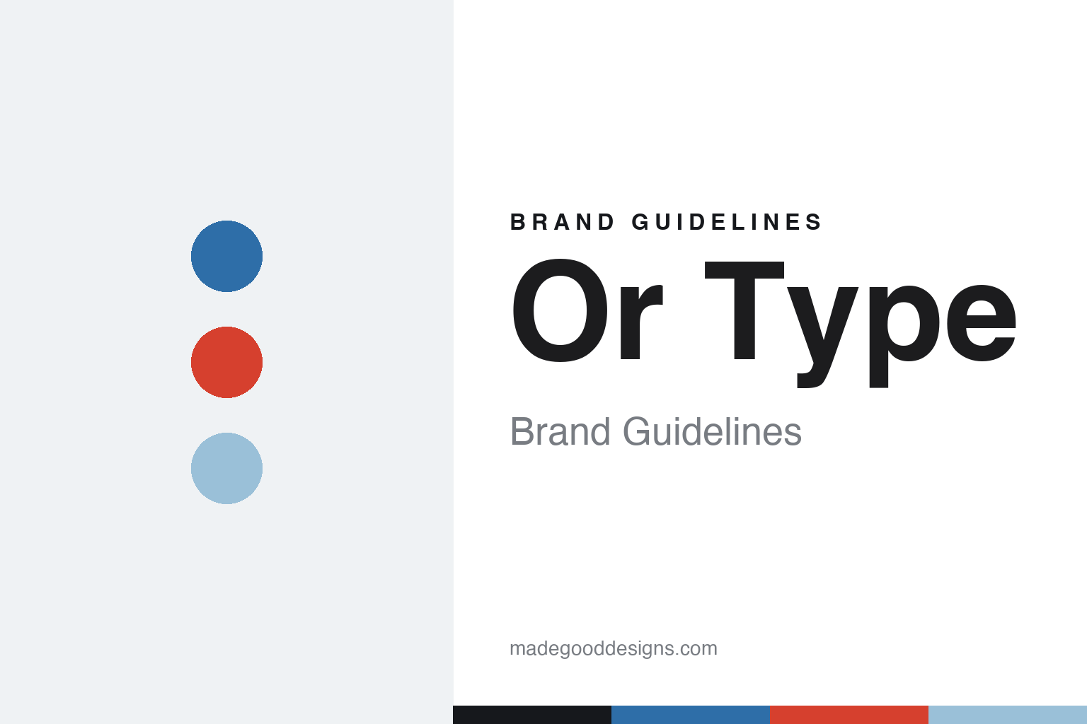
Or Type Brand Guidelines
Icelandic idiosyncrasy.
Aa
Two constants: an Icelandic, idiosyncratic palette and a quirky register. Abstract homage — not the Or Type wordmark or its typefaces.
Icelandic idiosyncrasy
Or Type is a foundry with a personality.
Or Type is a lesson in idiosyncrasy as a brand. Run under the joint alias GUNMAD — Guðmundur Úlfarsson and Mads Freund Brunse — the independent Reykjavík foundry (founded around 2011) sells a tight catalogue of characterful families: the flagship Or Lemmen, the quirky Boogie School Sans and Serif (with school-grade weight names), the display face Landnáma (named for Iceland’s medieval Book of Settlements), plus Separat, La Pontaise and Similar.
Its brand personality is idiosyncratic, playful and distinctly Icelandic-indie. Its signature website gimmick broadcasts visitors’ keystrokes live on an “ON AIR” wire; there’s a narrow fixed layout and no conventional “About” page. The identity is witty and experimental, mostly monochrome, letting the fonts and the quirks carry it.
(Honest notes: GUNMAD is the two-founder alias — not a single person. The founding year is best given softly as “around 2011.” And Untitled Sans and Untitled Serif are Klim’s, not Or Type’s — a common mix-up. There’s no official brand hex, so the colours here are an unofficial interpretation.)
Colour
Or Type lives in an idiosyncratic Icelandic palette. Click a swatch to copy the hex.
Or Type’s identity is idiosyncratic, cool and playful — a glacier blue, a lava red, an ice, a paper, and a volcanic ink. Rather than one fixed brand colour, Or Type feels cool and Icelandic with unexpected warm pops. It signals a witty, experimental, personality-forward foundry rather than a corporate one. The honest caveat: with no published brand hex, these tones are an original, unofficial interpretation, not first-party values.
The lesson is idiosyncrasy can be the whole identity. Or Type’s world is a quirky Icelandic studio. For designers, it is a reminder that personality and play — an unexpected palette, a live-typing gimmick, oddball typeface names — can make a small foundry unforgettable. The takeaways: lean into idiosyncrasy; let unexpected details carry the character; and treat any single hex as unofficial — using volcanic ink for small text so the cool tones stay crisp.
Typography
The register is a quirky sans — idiosyncratic and playful.
Or Type’s identity carries an idiosyncratic, playful, experimental spirit — oddball names and a live-typing site. A quirky, characterful sans captures the mood: it is distinctive and unexpected, the register of a personality-forward indie foundry. Set in an Icelandic palette, the quirky sans feels idiosyncratic and playful — exactly the character Or Type carries. It is distinctive rather than neutral, mirroring an experimental identity. (Or Type’s real wordmark and its retail typefaces — Or Lemmen, Boogie School and the rest — are commercial products and trademarks we name but do not reproduce or set text in; the exact brand typeface is not ours to use.) Because those faces are not ours to set, the honest description is “a quirky sans spirit,” shown here in a stand-in. The type behaves like the brand: idiosyncratic, playful and experimental.
Aa
A quirky sans spirit — idiosyncratic and playful. (Specimen set in Syne, an experimental sans STAND-IN; NOT Or Type’s wordmark or any Or Type retail typeface, which are trademarks.)
Idiosyncrasy as identity
Or Type stands for playful Icelandic character.
Or Type is a lesson in making personality the whole brand. An idiosyncratic palette, oddball typeface names and a live-typing website turn character into the identity — witty, experimental, unmistakably itself. The idiosyncrasy is the differentiator. The differentiator is a playful, personality-first, Icelandic-indie identity.
For designers and brand-builders, Or Type offers a clear takeaway: a small foundry can win on personality. The lessons: lean into your quirks; let unexpected details (a live wire, grade-school weight names) carry the brand; and keep it genuinely yours. It is also a reminder to stay accurate: GUNMAD is a two-founder alias, the founding year is soft (~2011), Untitled Sans/Serif are Klim’s not theirs, and the palette here is an unofficial interpretation. Or Type made idiosyncrasy the brand — proof that personality can be the difference.
Explore & save
Keep Or Type’s identity on hand — save it to a board in the Made Good inspiration library.
Or Type identity set
Pin the idiosyncratic Icelandic palette and the quirky-sans register to your own board.


