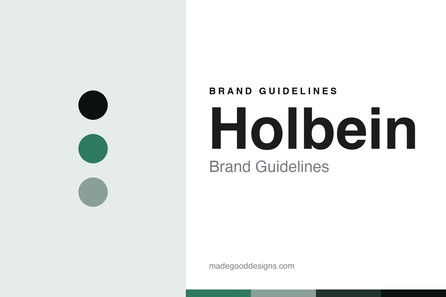
Holbein Brand Guidelines
The Osaka colour house.
Aa
Two constants: a viridian palette and an illustrator-sans register. Abstract homage — not a Holbein colour, label or wordmark.
The Osaka colour house
Holbein is the Japanese colour house from Osaka, with roots to 1900, known for its gouache and Acryla Gouache.
Holbein is a lesson in how a colour is made for the illustrator’s hand. From Osaka, this Japanese colour house makes professional watercolours, gouache and its signature Acryla Gouache — colours prized for a huge, flat, opaque range beloved by illustrators, and by manga and anime artists. Its answer to how a colour is made is precise and vast: grind a professional colour, then offer it in a range wide enough for any hand. A colour made for the person who fills a page.
Its identity is the Japanese illustrator’s colour. Holbein’s gouache, its Acryla Gouache and its Osaka making are the work it is known for. A range, made a signature. A house that colours the illustrator’s world.
(Honest notes, so the story stays precise. Holbein is a Japanese colour house based in Osaka, and its paint is genuinely made in Japan by its own colour works; the modern business splits a trading company from the manufacturing arm, sometimes called “Holbein Works.” Its roots go back to 1900 — it began as the Yoshimura Minekichi shop, not as is sometimes said under another name — and it was incorporated in its modern form in 1951; the “Holbein” name, after the Renaissance painter Hans Holbein the Younger, was adopted in the 1930s. It is an independent Japanese company; its North American distributor is a separate agent, not its owner. It is known for professional-grade colours — no student lines — and especially its gouache and Acryla Gouache, popular with illustrators; it also makes traditional Japanese nihonga pigments, which we treat respectfully as a cultural craft, not a brand invention. Its labels and marks are its IP, described but never reproduced, and there is no official brand hex — these tones are an unofficial interpretation. This is design commentary and does not promote any product.)
Colour
Holbein lives in a viridian palette. Click a swatch to copy the hex.
Holbein’s identity is Japanese, precise and vivid — a viridian, an ink, a sage, a pine, and a paper. The palette leans viridian and sage: the register of a clean, opaque colour and an illustrator’s desk. It signals range and precision over heritage theatre. The honest caveat: with no published brand hex, these values are an original, unofficial interpretation, not first-party colours.
The lesson is a viridian palette signals an illustrator’s, made-in-Osaka identity. Holbein’s world is an opaque, wide-range, Japanese-made object. For designers, it is a reminder that a clean viridian and a soft sage can carry a brand built on range — the green of a flat gouache and the sage of a mixing tray. Because these tones can fail as small text, keep type dark and let the colour live in the accents, palette and band. The takeaways: make it professional; offer a wide range; serve the illustrator; and treat any single hex as unofficial.
Typography
The register is an illustrator sans — clean, precise, modern.
Holbein’s identity carries a clean, precise, modern spirit — an illustrator’s colour house, not an old-masters one. An illustrator sans captures the mood: neat, exact and current, the register of a professional gouache maker. Set in a viridian palette, the illustrator sans feels clean and precise — exactly the personality Holbein carries. It is modern rather than antique, mirroring a flat, opaque colour. (Holbein’s real labels and marks are things we describe but do not reproduce, and the exact typeface is not ours to use.) Because it is not ours to use, the honest description is “an illustrator-sans spirit,” shown here in a stand-in. The type behaves like the house: clean, precise and modern.
Aa
An illustrator-sans spirit — clean and precise. (Specimen set in Zen Kaku Gothic New, an illustrator-sans STAND-IN; NOT the Holbein wordmark or any label.)
How a colour is made
Holbein stands for the illustrator’s colour.
Holbein is a lesson in how a colour is made for the illustrator’s page. A viridian palette, an illustrator sans and a flat, opaque gouache make one thing — a professional colour in a vast, dependable range — the whole house: Japanese, precise and vivid. The gouache and Acryla Gouache are the signature, and the range is the meaning. The point is a colour made for people who cover a surface evenly and predictably — illustrators, manga and anime artists — with a professional palette wide enough for any subject.
Put to work, the identity is range-for-a-purpose as design. A colour house in this spirit would make a professional colour, then offer it in a range built for its actual users, and keep the making at home. It would be honest about its history rather than romanticise it. A brand learning from it would see that serving a specific user superbly — the illustrator — is a durable identity, that a huge, dependable opaque range is a real competitive edge, and that being precise, roots to 1900 as the Yoshimura shop, the Holbein name adopted in the 1930s, an independent Japanese maker, keeps the story honest. A brand learning from it would also treat a cultural line, its nihonga pigments, with respect rather than as a novelty. It would let the sheer breadth of the range be the proof of seriousness, since a professional who needs an exact hue, mixed flat and repeatable, is served by depth of choice far more than by a good story. The lesson Holbein teaches is that a professional range for a real user can hold an identity: the colour gives it substance, and the range gives it purpose. The craft is the personality, and the gouache is the proof.
For designers and brand-builders, Holbein holds the illustrator pole in this round about how a colour is made: serve a real user, and offer the range they need. The lessons: make it professional; build the range; make it at home; and never reproduce a protected label. It is also a reminder to stay precise: Holbein is a Japanese colour house from Osaka with roots to 1900, its gouache and Acryla Gouache made in Japan — with the palette here an unofficial interpretation. Holbein made the illustrator’s colour the identity — proof that range for a purpose can be the difference.
Explore & save
Keep Holbein’s identity on hand — save it to a board in the Made Good inspiration library.
Holbein identity set
Pin the viridian palette and the illustrator-sans register to your own board.