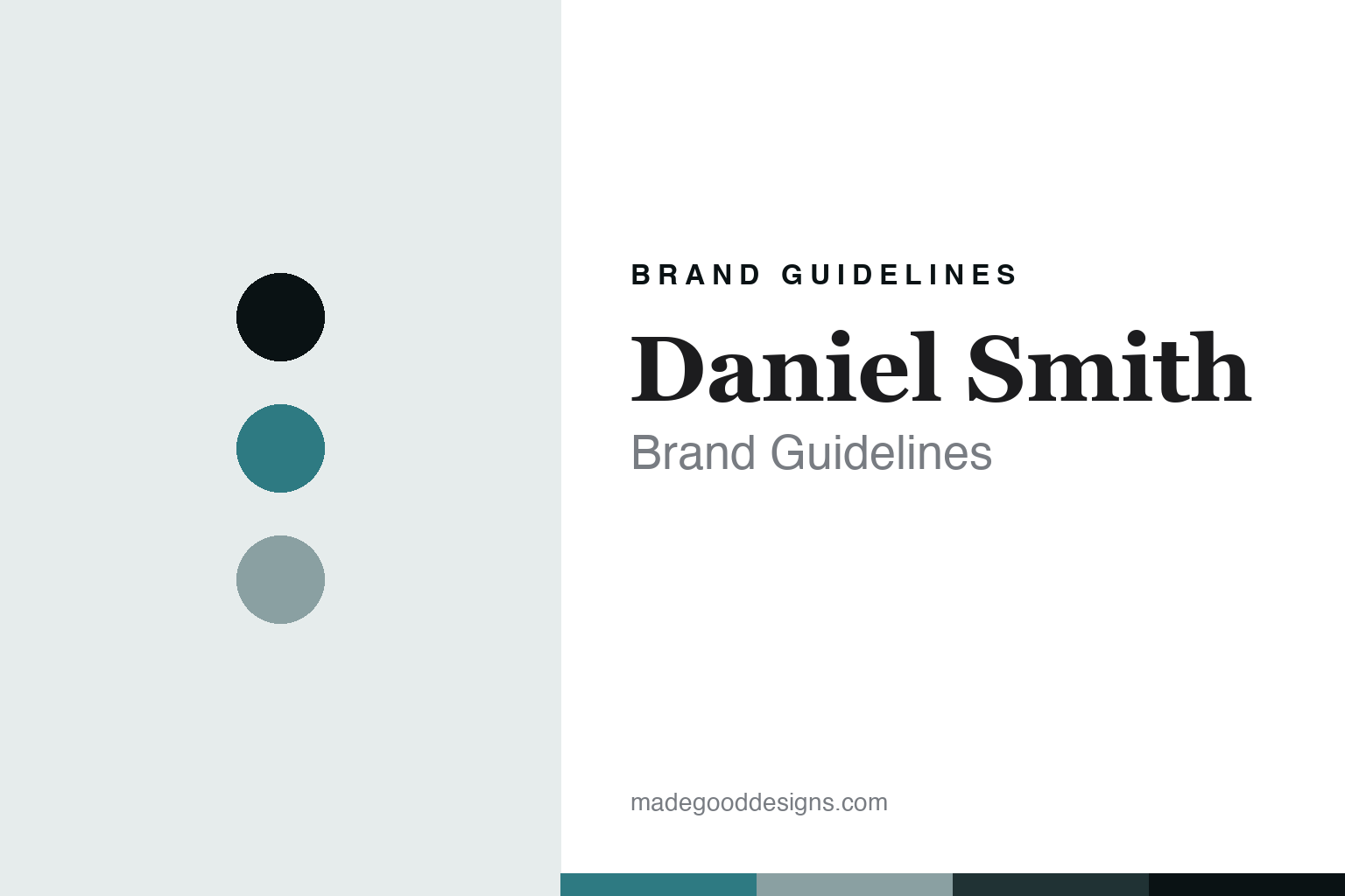
Daniel Smith Brand Guidelines
The colour from Seattle.
Aa
Two constants: a mineral-turquoise palette and a mineral-serif register. Abstract homage — not a Daniel Smith colour, label or wordmark.
The colour from Seattle
Daniel Smith is the Seattle watercolour maker, milling pigment in the USA, known for its Quinacridones and PrimaTek genuine-mineral colours.
Daniel Smith is a lesson in how a colour is made from the ground up — sometimes literally from a rock. From Seattle, Washington, it mills pigment and makes paint in its own facility, and it made its name with an innovator’s approach: turning high-performance Quinacridone pigments into artists’ paints, and grinding genuine semi-precious minerals — turquoise, lapis lazuli, amethyst — into its PrimaTek watercolours. Its answer to how a colour is made is inventive and material: chase unusual pigments, mill them well in America, and offer a range far larger than most. A colour made by people who love pigment for its own sake.
Its identity is the innovative American watercolour. Daniel Smith’s huge Extra Fine range, its Quinacridones and its PrimaTek genuine-mineral colours are the work it is known for. A pigment, chased and milled. A house that will make a watercolour out of a gemstone.
(Honest notes, so the story stays precise. Daniel Smith genuinely mills pigment and makes paint in Seattle, Washington — real US manufacture, not designed-in-America and made elsewhere. Two clarifications matter. First, its origin: it was founded in 1976 by Dan Smith, a printmaker, as a maker of printmaking inks; the watercolours and oils it is now famous for came later — so it did not begin as a watercolour company. Second, ownership: it is not owned by its founder today. John Cogley, who joined in the IT department and rose to lead the company, bought it in 2008; it is an independent, privately held manufacturer, not part of a conglomerate. Note too that the old multi-brand Daniel Smith retail and catalog business was separated off around 2013; we do not name an acquirer we cannot confirm. PrimaTek is a registered brand line, not a generic term. Its logo, labels and colour names are its IP, described but never reproduced, and there is no official brand hex — these tones are an unofficial interpretation. This is design commentary and does not promote any product.)
Colour
Daniel Smith lives in a mineral-turquoise palette. Click a swatch to copy the hex.
Daniel Smith’s identity is inventive, mineral and American — a mineral turquoise, an ink, a sage, a teal, and a paper. The palette leans mineral turquoise and sage: the register of a colour ground from real stone and the calm of a Pacific-Northwest maker. It signals discovery and material over convention. The honest caveat: with no published brand hex, these values are an original, unofficial interpretation, not first-party colours — an abstract nod to a mineral colour, not a sampled paint.
The lesson is a mineral-turquoise palette signals an inventive, made-in-Seattle identity. Daniel Smith’s world is an inventive, pigment-driven, US-made object. For designers, it is a reminder that a mineral turquoise and a soft sage can carry a brand built on unusual pigment — the colour of ground turquoise and the grey-green of the Northwest. Because these tones can fail as small text, keep type dark and let the colour live in the accents, palette and band. The takeaways: chase the pigment; mill it at home; offer real range; and treat any single hex as unofficial.
Typography
The register is a mineral serif — refined, curious, considered.
Daniel Smith’s identity carries a refined, curious, considered spirit — an innovator’s house, not a mass brand. A mineral serif captures the mood: elegant, exact and inquisitive, the register of a maker fascinated by pigment. Set in a mineral-turquoise palette, the mineral serif feels refined and curious — exactly the personality Daniel Smith carries. It is considered rather than loud, mirroring a carefully milled watercolour. (Daniel Smith’s real labels and marks are things we describe but do not reproduce, and the exact typeface is not ours to use.) Because it is not ours to use, the honest description is “a mineral-serif spirit,” shown here in a stand-in. The type behaves like the house: refined, curious and considered.
Aa
A mineral-serif spirit — refined and curious. (Specimen set in Cormorant Garamond, a mineral-serif STAND-IN; NOT the Daniel Smith wordmark or any label.)
The colour around the world
Daniel Smith stands for the inventive colour, milled at home.
Daniel Smith is a lesson in how a colour is made by chasing pigment and milling it in America. A mineral-turquoise palette, a mineral serif and a genuine-mineral watercolour make one thing — an inventive colour ground from unusual pigment in Seattle — the whole house: inventive, mineral and American. The pigment chase is the differentiator, and the Seattle milling is the meaning. The point is a colour house that will grind a semi-precious stone into a watercolour, and that helped bring high-performance Quinacridones to artists — a maker defined by curiosity about pigment.
Put to work, the identity is invention as design. A colour house in this spirit would chase interesting pigments, mill them well at home, and offer a range wide enough to reward exploration — while being honest about its own history. It would own its unglamorous origin, printmaking inks, rather than pretend it was always a watercolour house. A brand learning from it would see that genuine innovation and real domestic manufacture are a durable identity — that “a watercolour made from actual turquoise, milled in Seattle” is a story a rebadged importer cannot tell — and that being precise, founded 1976 as an ink maker, owned since 2008 by John Cogley, the retail arm long since separated from the paint maker, keeps the story trustworthy. A brand learning from it would also protect a coined line name like PrimaTek as an asset rather than let it slide into a generic term, because a name that stands for a genuine innovation is worth keeping distinct. The lesson Daniel Smith teaches is that pigment-driven invention can hold an identity: the unusual colours give it substance, and the American milling gives it credibility. The curiosity is the personality, and the mineral colour is the proof.
For designers and brand-builders, Daniel Smith closes this round about the colour around the world from the United States: chase the pigment, mill it at home, and own your history. The lessons: pursue unusual colours; make them domestically; offer real range; protect a coined name; be candid about origin and ownership; and never reproduce a protected label. It is also a reminder to stay precise: Daniel Smith is a Seattle watercolour maker founded in 1976 as a printmaking-ink company, milling pigment in the USA, owned since 2008 by John Cogley, and known for its Quinacridones and PrimaTek genuine-mineral colours — with the palette here an unofficial interpretation. Daniel Smith made pigment-driven invention the identity — proof that curiosity, milled at home, can be the difference.
Explore & save
Keep Daniel Smith’s identity on hand — save it to a board in the Made Good inspiration library.
Daniel Smith identity set
Pin the mineral-turquoise palette and the mineral-serif register to your own board.


