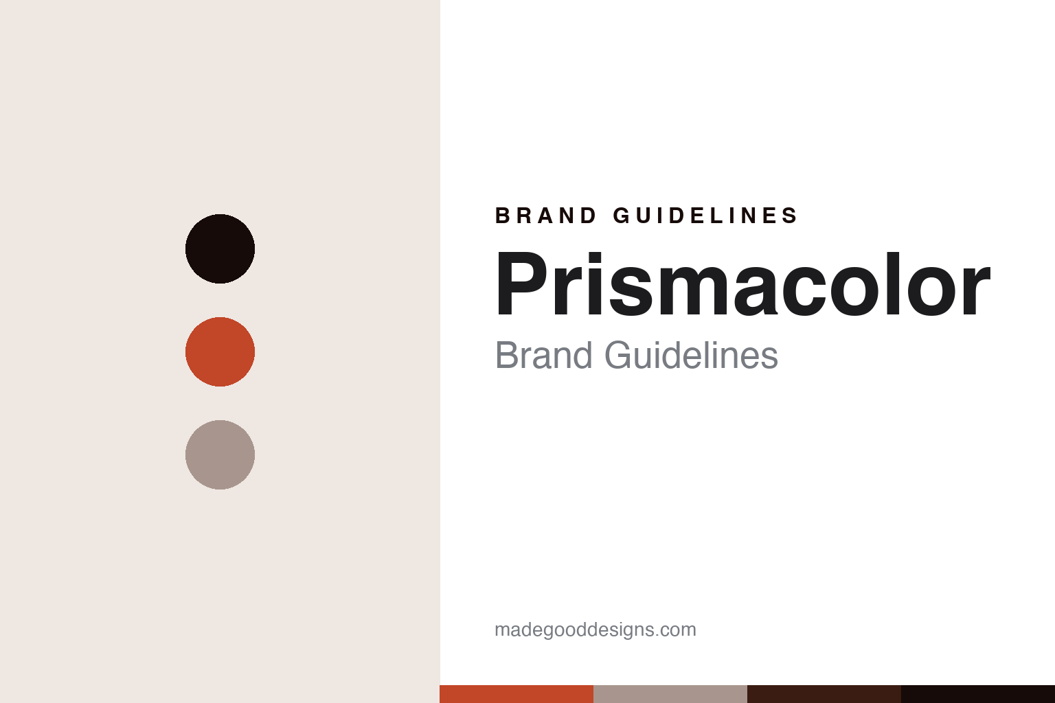
Prismacolor Brand Guidelines
The American soft core.
Aa
Two constants: a wax-red palette and a studio-sans register. Abstract homage — not a Prismacolor colour, label or barrel.
The American soft core
Prismacolor is the American soft wax-core coloured pencil, a Newell Brands name descended from the Eagle Pencil Company, now made offshore.
Prismacolor is a lesson in how a colour core wins on softness. In American studios it is the wax-based coloured pencil known for a rich, buttery laydown and heavy blendability — the Premier Soft Core. Its answer to how a colour is made a pencil is generosity: pack a soft, highly pigmented wax core that lays down thick colour and blends and burnishes easily. A colour core made for saturation and smoothness.
Its identity is the American soft-core coloured pencil. Prismacolor’s Premier Soft Core, and its Col-Erase, Verithin and Scholar lines, are the work it is known for. A soft wax core, made a signature. A studio staple for illustrators and colourists.
(Honest notes, so the story stays precise, because both the making and the ownership have changed. The Prismacolor product name dates to 1938, but the company behind it traces to the Eagle Pencil Company, founded in 1856 in Yonkers, New York; through the Berol name it became part of Newell in 1995, and today Prismacolor is a brand of Newell Brands — so it is not an independent American company. On manufacture: Prismacolor pencils are no longer made in the USA; production moved offshore, and packaging is widely reported to state “Made in Mexico,” which we report as the packaging’s wording rather than assert a specific plant. Its flagship Premier Soft Core is wax-based, not oil-based. We also note, honestly, that some artists have reported core breakage and quality-inconsistency over the years, often linked to the manufacturing move; we present that as reported user experience, not a proven defect. Its name, logo and line names are its IP, described but never reproduced, and there is no official brand hex — these tones are an unofficial interpretation. This is design commentary and does not promote any product.)
Colour
Prismacolor lives in a wax-red palette. Click a swatch to copy the hex.
Prismacolor’s identity is bold, soft and American — a wax red, an ink, a linen, a sienna, and a paper. The palette leans wax red and linen: the register of a soft, saturated wax core and a working studio. It signals richness and blend over restraint. The honest caveat: with no published brand hex, these values are an original, unofficial interpretation, not first-party colours.
The lesson is a wax-red palette signals a soft-core, studio identity. Prismacolor’s world is a soft, saturated, blendable object. For designers, it is a reminder that a warm wax red and a soft linen can carry a brand built on softness — the red of a heavily pigmented core and the neutral of a colourist’s desk. Because these tones can fail as small text, keep type dark and let the colour live in the accents, palette and band. The takeaways: make the core soft; pigment it heavily; be honest about where it is made now; and treat any single hex as unofficial.
Typography
The register is a studio sans — bold, plain, contemporary.
Prismacolor’s identity carries a bold, plain, contemporary spirit — a studio staple, not a heritage marque. A studio sans captures the mood: strong, even and modern, the register of a colourist’s everyday pencil. Set in a wax-red palette, the studio sans feels bold and plain — exactly the personality Prismacolor carries. It is contemporary rather than ornate, mirroring a soft, saturated core. (Prismacolor’s real labels and marks are things we describe but do not reproduce, and the exact typeface is not ours to use.) Because it is not ours to use, the honest description is “a studio-sans spirit,” shown here in a stand-in. The type behaves like the house: bold, plain and contemporary.
Aa
A studio-sans spirit — bold and plain. (Specimen set in Space Grotesk, a studio-sans STAND-IN; NOT the Prismacolor wordmark or any label.)
The coloured-pencil houses
Prismacolor stands for the soft core, honestly located.
Prismacolor is a lesson in how a colour core builds a following on feel. A wax-red palette, a studio sans and a soft wax core make one thing — a pencil that lays down rich, blendable colour — the whole house: bold, soft and American in heritage. The soft core is the differentiator, and the studio loyalty is the meaning. The point is a coloured pencil defined by how it feels under the hand, which is why colourists reach for it — even as its making and ownership have moved on from its American-heritage roots.
Put to work, the identity is feel as design. A colour house in this spirit would optimise for the experience of use — softness, saturation, blend — and be honest about its history: an American name now owned by a global group and made offshore. It would neither hide the manufacturing move nor overclaim a “Made in USA” heritage it no longer has. A brand learning from it would see that owning a specific feel is a durable identity — that “the soft core that blends like butter” is a promise a colourist can feel immediately — and that being precise, a 1938 name on an 1856 company, now Newell-owned and made offshore, keeps the story honest. A brand learning from it would also handle criticism plainly, treating reported breakage as user experience to acknowledge rather than a claim to deny or ignore. The lesson Prismacolor teaches is that feel can hold an identity: the soft core gives it a signature, and the honesty about origin keeps it trustworthy. The softness is the personality, and the blendable colour is the proof.
For designers and brand-builders, Prismacolor holds the soft-core pole in this vein of the coloured-pencil houses, from the United States: own a feel, and be honest about origin. The lessons: optimise the experience; pigment it richly; disclose the ownership and the manufacturing move; acknowledge real feedback; and never reproduce a protected label. It is also a reminder to stay precise: Prismacolor is an American soft wax-core coloured pencil, a Newell Brands name descended from the Eagle Pencil Company and now made offshore — with the palette here an unofficial interpretation. Prismacolor made the soft core the identity — proof that feel, honestly located, can be the difference.
Explore & save
Keep Prismacolor’s identity on hand — save it to a board in the Made Good inspiration library.
Prismacolor identity set
Pin the wax-red palette and the studio-sans register to your own board.


