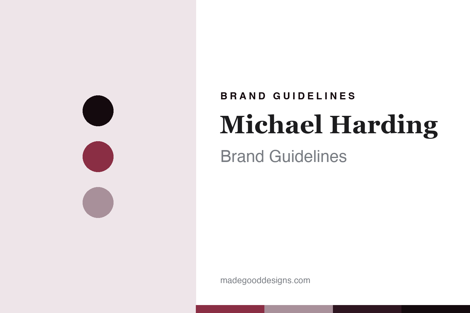
Michael Harding Brand Guidelines
The painter’s own paint.
Aa
Two constants: a crimson-rose palette and a painter’s-serif register. Abstract homage — not a Michael Harding colour, label or wordmark.
The painter’s own paint
Michael Harding is the independent, artist-founded maker of hand-milled high-pigment oil colours in South Wales since 1982.
Michael Harding is a lesson in how a colour is made when a painter makes it for himself. Dissatisfied with commercial paint, a working painter began milling his own oil colours in 1982, and built a company on a simple rule: pure pigment and binder, with no fillers, extenders or artificial dryers. Its answer to how a colour is made is uncompromising and personal: mill it by hand, load the pigment, and leave out everything a painter does not want. A colour made by someone who paints with it.
Its identity is the painter’s own paint. Michael Harding’s hand-milled high-pigment oils and its single-pigment watercolours are the work it is known for. A colour, made without shortcuts. A house that carries the founder’s own name because he stands behind every tube.
(Honest notes, so the story stays precise. Michael Harding’s colours are milled by hand in a workshop in South Wales — the company relocated there from Whitechapel in East London around 2009 — so this is genuine UK manufacture, hand-made. It was founded in 1982 by Michael Harding, a living painter; we keep to public business facts and treat it as independent and artist-founded rather than asserting a family-ownership structure the company does not publish. Its positioning is premium, high-pigment professional oils made by traditional methods, with no fillers, extenders or artificial dryers, plus watercolours, mediums and oil primers; its named medium is Miracle Medium. Two points of care: it is a modern house, founded 1982, not a centuries-old lineage; and we describe it as favoured by professional painters without claiming a specific conservator endorsement we cannot source. Its name, labels and Miracle Medium are its IP, described but never reproduced, and there is no official brand hex — these tones are an unofficial interpretation. This is design commentary and does not promote any product.)
Colour
Michael Harding lives in a crimson-rose palette. Click a swatch to copy the hex.
Michael Harding’s identity is rich, classical and uncompromising — a crimson rose, an ink, a mauve, a maroon, and a paper. The palette leans crimson rose and mauve: the register of a deep, high-pigment oil and a painter’s own bench. It signals purity and depth over convenience. The honest caveat: with no published brand hex, these values are an original, unofficial interpretation, not first-party colours.
The lesson is a crimson-rose palette signals a high-pigment, made-in-Wales identity. Michael Harding’s world is a pure, richly loaded, hand-milled object. For designers, it is a reminder that a deep crimson rose and a soft mauve can carry a brand built on leaving things out — the depth of a saturated oil and the grey of a working studio. Because these tones can fail as small text, keep type dark and let the colour live in the accents, palette and band. The takeaways: load the pigment; leave out the fillers; mill it by hand; and treat any single hex as unofficial.
Typography
The register is a painter’s serif — refined, classical, sure.
Michael Harding’s identity carries a refined, classical, sure spirit — a painter’s house, not a factory brand. A painter’s serif captures the mood: elegant, traditional and confident, the register of a maker who signs his name to the paint. Set in a crimson-rose palette, the painter’s serif feels refined and classical — exactly the personality the house carries. It is sure rather than showy, mirroring a pure, high-pigment oil. (Michael Harding’s real labels and marks are things we describe but do not reproduce, and the exact typeface is not ours to use.) Because it is not ours to use, the honest description is “a painter’s-serif spirit,” shown here in a stand-in. The type behaves like the house: refined, classical and sure.
Aa
A painter’s-serif spirit — refined and classical. (Specimen set in Playfair Display, a painter’s-serif STAND-IN; NOT the Michael Harding wordmark or any label.)
The house behind the colour
Michael Harding stands for the paint a painter makes for himself.
Michael Harding is a lesson in how a colour is made when the maker is the user. A crimson-rose palette, a painter’s serif and a high-pigment oil make one thing — a paint milled by hand to a painter’s own standard — the whole house: rich, classical and uncompromising. The refusal of fillers is the differentiator, and the founder’s own name is the meaning. The point is a colour made without shortcuts by someone who paints with it, and who put his name on the tube as a guarantee.
Put to work, the identity is conviction as design. A colour house in this spirit would set a purity rule and hold it, mill by hand, and be honest about being young and independent rather than dressing itself in false antiquity. It would let the founder’s craft, not a marketing story, carry the brand. A brand learning from it would see that an uncompromising standard is a durable identity — that “pure pigment and binder, nothing else” is a promise a painter can feel on the palette — and that being precise, founded 1982, made in South Wales, independent and artist-founded, keeps the conviction credible. A brand learning from it would also recognise the quiet power of an eponymous name: when the founder is a living painter who signs the work, the name is a standard, not just a label, and that raises the cost of ever cutting a corner. The lesson Michael Harding teaches is that conviction can hold an identity: the pigment gives it depth, and the maker’s name gives it accountability. The purity is the personality, and the hand-milled colour is the proof.
For designers and brand-builders, Michael Harding holds the purist pole in this round about the house behind the colour, from Britain: set a rule, hold it, and stand behind it by name. The lessons: load the pigment; leave out the rest; mill by hand; date the house honestly; and never reproduce a protected label. It is also a reminder to stay precise: Michael Harding is an independent, artist-founded maker of hand-milled high-pigment oils in South Wales since 1982 — with the palette here an unofficial interpretation. Michael Harding made conviction the identity — proof that an uncompromising standard can be the difference.
Explore & save
Keep Michael Harding’s identity on hand — save it to a board in the Made Good inspiration library.
Michael Harding identity set
Pin the crimson-rose palette and the painter’s-serif register to your own board.