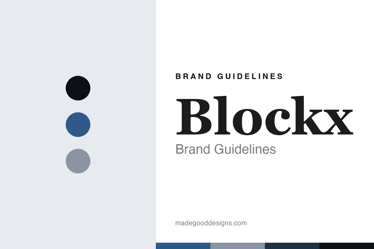
Blockx Brand Guidelines
The colour from Belgium.
Aa
Two constants: a cobalt-blue palette and a heritage-serif register. Abstract homage — not a Blockx colour, label or wordmark.
The colour from Belgium
Blockx is the Belgian colour-house founded in 1865, known for extra-fine oils and honey-binder watercolours, now part of the Exacompta Clairefontaine group.
Blockx is a lesson in how a colour is made to a chemist’s idea of the “good colours of yesteryear”. Founded in Belgium in 1865, it set out to recreate the depth of older artists’ colours for painters frustrated by an industrialising trade, and it built its name on extra-fine oil colours and on watercolours bound with honey. Its answer to how a colour is made is old-fashioned in the best sense: choose fine pigments, bind them richly, and refuse to thin the recipe. A colour made for saturation, in a European tradition.
Its identity is the heritage Belgian colour-house. Blockx’s extra-fine oils and its honey-binder watercolours are the work it is known for. A recipe, kept. A house built by a chemist for his painter friends.
(Honest notes, so the story stays precise, because the heritage needs care. Blockx was founded in 1865 by Jacques Blockx I, a Belgian chemist, and its documented history places its factory at Terwagne, in Clavier, in the Walloon province of Liège — not, as sometimes stated, in the Antwerp region; the present-day manufacturing address is not something we assert here. One important correction on ownership: Blockx is not a family firm today. It is a brand within the French Exacompta Clairefontaine group (Clairefontaine-Rhodia), which publishes its site — so although it still markets a “family since 1865” story, we describe the founding as family and the current ownership as the French group, honestly and without implying continuity. Its extra-fine oils are the historic core; its honey-bound watercolours were launched in 1976, not 1865. The artists it names — Magritte, Pissarro, Signac, Ensor — are the company’s own associations, so we say “associated with,” not “advised.” Its logo, labels and colour names are its IP, described but never reproduced, and there is no official brand hex — these tones are an unofficial interpretation. This is design commentary and does not promote any product.)
Colour
Blockx lives in a cobalt-blue palette. Click a swatch to copy the hex.
Blockx’s identity is European, classical and rich — a cobalt blue, an ink, a slate, a Prussian, and a paper. The palette leans cobalt blue and slate: the register of a deep, well-bound colour and a nineteenth-century colour-house. It signals depth and tradition over brightness. The honest caveat: with no published brand hex, these values are an original, unofficial interpretation, not first-party colours — an abstract nod to a fine blue, not a sampled paint.
The lesson is a cobalt-blue palette signals a heritage, extra-fine identity. Blockx’s world is a saturated, richly bound, European-made object. For designers, it is a reminder that a deep cobalt and a cool slate can carry a brand built on a nineteenth-century recipe — the blue of a fine oil and the grey of a chemist’s bench. Because these tones can fail as small text, keep type dark and let the colour live in the accents, palette and band. The takeaways: choose fine pigment; bind it richly; date the heritage honestly; and treat any single hex as unofficial.
Typography
The register is a heritage serif — classical, refined, grounded.
Blockx’s identity carries a classical, refined, grounded spirit — a nineteenth-century colour-house, not a modern brand. A heritage serif captures the mood: traditional, elegant and rooted, the register of a house founded by a chemist in 1865. Set in a cobalt-blue palette, the heritage serif feels classical and refined — exactly the personality Blockx carries. It is grounded rather than showy, mirroring a deep, well-bound oil. (Blockx’s real labels and marks are things we describe but do not reproduce, and the exact typeface is not ours to use.) Because it is not ours to use, the honest description is “a heritage-serif spirit,” shown here in a stand-in. The type behaves like the house: classical, refined and grounded.
Aa
A heritage-serif spirit — classical and refined. (Specimen set in Playfair Display, a heritage-serif STAND-IN; NOT the Blockx wordmark or any label.)
The colour around the world
Blockx stands for a nineteenth-century recipe, honestly owned.
Blockx is a lesson in how a colour is made to an old recipe, and a heritage owned honestly. A cobalt-blue palette, a heritage serif and an extra-fine oil make one thing — a richly bound colour in a European tradition — the whole house: classical, rich and grounded. The 1865 founding by a chemist is the story, and the refusal to thin the recipe is the meaning. The point is a colour made without compromise on pigment, born when a Belgian chemist tried to recreate the good colours the trade had lost.
Put to work, the identity is heritage carried honestly as design. A colour house in this spirit would keep its extra-fine recipe, lean on its founding story, and be candid about what it is today — a heritage brand now inside a larger group, not an unbroken family firm. It would date its lines truthfully, letting the oils carry the 1865 story and the watercolours own their later 1976 start. A brand learning from it would see that a genuine nineteenth-century founding is a durable identity — that “a chemist’s colours for his painter friends” is a story worth telling — but only if the modern facts are told alongside it: the Walloon factory of record, the ownership by a French group, the artist names presented as association rather than endorsement. A brand learning from it would also resist over-claiming its famous names, because a roster spanning well beyond one art movement is more credible described plainly than dressed as a claim that the house “advised the Impressionists.” The lesson Blockx teaches is that an old recipe plus an honest present can hold an identity: the pigment gives it depth, and the candour gives it trust. The heritage is the personality, and the extra-fine colour is the proof.
For designers and brand-builders, Blockx holds the heritage pole in this round about the colour around the world, from Belgium: keep the recipe, and own the present honestly. The lessons: choose fine pigment; bind it richly; separate what founded in 1865 from what launched in 1976; disclose the group ownership; and never reproduce a protected label. It is also a reminder to stay precise: Blockx is a Belgian colour-house founded in 1865 by the chemist Jacques Blockx I, known for extra-fine oils and honey-binder watercolours, and now a brand of France’s Exacompta Clairefontaine group — with the palette here an unofficial interpretation. Blockx made an old recipe the identity — proof that a founding story, told honestly, can be the difference.
Explore & save
Keep Blockx’s identity on hand — save it to a board in the Made Good inspiration library.
Blockx identity set
Pin the cobalt-blue palette and the heritage-serif register to your own board.