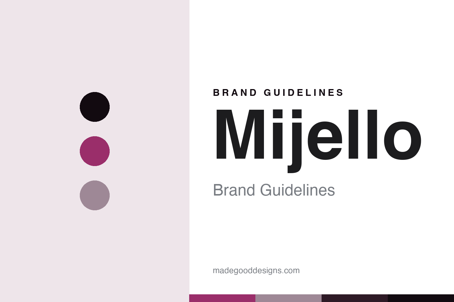
Mijello Brand Guidelines
The colour from Korea.
Aa
Two constants: a vivid-magenta palette and a modern-sans register. Abstract homage — not a Mijello colour, label or wordmark.
The colour from Korea
Mijello is the Korean brand founded in 2002 as a palette maker that became known for its Mission Gold professional watercolours.
Mijello is a lesson in how a colour house can begin with the container, not the colour. This Korean company started in 2002 by solving a mundane problem — traditional palettes that leaked and washed off — with airtight, sealable plastic palettes, and only later became a professional watercolour brand with its Mission Gold line. Its answer to how a colour is made is unusual: master the tools first, then the paint. A colour house that earned its place by fixing the palette, then filling it.
Its identity is the modern Korean maker. Mijello’s airtight palettes and its Mission Gold watercolours are the work it is known for. A tool, then a colour. A house that grew from a better palette into a paint brand.
(Honest notes, so the story stays precise. Mijello is a Korean company, and its official site is mijello.com; we point only there, because a former English-language domain has been hijacked and now serves spam. It was founded in February 2002, and — this is the key correction — it began as a palette maker: its early years are entirely airtight palettes and water containers, and its Mission Gold professional watercolour came roughly a decade later, around 2011. So it is a palette maker that became a paint brand, not the reverse, and it is a modern company, not a heritage house. Its manufacture is in South Korea, consistent with its own positioning as “Korea’s professional watercolour brand.” Its palette designs are protected by patent and design registration, so the distinctive sealable form is not a free-to-copy generic shape. It should not be confused with ShinHan, a separate, older Korean art-materials maker. Its logo, labels and product names are its IP, described but never reproduced, and there is no official brand hex — these tones are an unofficial interpretation. This is design commentary and does not promote any product.)
Colour
Mijello lives in a vivid-magenta palette. Click a swatch to copy the hex.
Mijello’s identity is modern, bright and practical — a vivid magenta, an ink, a mauve, a plum, and a paper. The palette leans vivid magenta and mauve: the register of a vivid contemporary watercolour and a clean, engineered tool. It signals brightness and utility over heritage. The honest caveat: with no published brand hex, these values are an original, unofficial interpretation, not first-party colours.
The lesson is a vivid-magenta palette signals a modern, tool-first identity. Mijello’s world is a bright, practical, Korean-made object. For designers, it is a reminder that a vivid magenta and a soft mauve can carry a brand that started with the palette, not the paint — the intensity of a modern watercolour and the calm of an engineered surface. Because these tones can fail as small text, keep type dark and let the colour live in the accents, palette and band. The takeaways: solve the tool; then make the colour; protect your form; and treat any single hex as unofficial.
Typography
The register is a modern sans — clean, engineered, contemporary.
Mijello’s identity carries a clean, engineered, contemporary spirit — a modern product company, not a heritage colourman. A modern sans captures the mood: even, precise and current, the register of a maker that thinks in product design. Set in a vivid-magenta palette, the modern sans feels clean and engineered — exactly the personality Mijello carries. It is contemporary rather than antique, mirroring a bright modern watercolour and a sealable palette. (Mijello’s real labels and marks are things we describe but do not reproduce, and the exact typeface is not ours to use.) Because it is not ours to use, the honest description is “a modern-sans spirit,” shown here in a stand-in. The type behaves like the house: clean, engineered and contemporary.
Aa
A modern-sans spirit — clean and engineered. (Specimen set in Manrope, a modern-sans STAND-IN; NOT the Mijello wordmark or any label.)
The colour around the world
Mijello stands for the tool that became a colour.
Mijello is a lesson in how a colour house can be built from the container up. A vivid-magenta palette, a modern sans and a professional watercolour make one thing — a modern Korean maker that mastered the tool before the colour — the whole house: bright, engineered and practical. The airtight palette is the origin, and Mission Gold is the arrival. The point is a company that earned credibility with painters by fixing something every painter used daily, then had the standing to launch a serious watercolour.
Put to work, the identity is product-thinking as design. A colour house in this spirit would treat the whole system — the paint, the palette, the way the two meet — as one design problem, and be honest that its expertise began with the container. It would protect its engineered forms and point users to its real, current site rather than a hijacked one. A brand learning from it would see that entering a heritage-heavy category from an unexpected angle is a viable identity — that “the company that fixed the palette” is a distinctive story in a field of centuries-old colourmen — and that being precise, founded in 2002, palettes first and paint later, keeps the modern claim honest. A brand learning from it would also guard its digital identity as carefully as its physical one, because a name is only as trustworthy as the domain a customer actually lands on, and a hijacked look-alike can quietly undo a real brand’s reputation. The lesson Mijello teaches is that solving the tool can hold an identity: the palette gives it a reason to exist, and the paint gives it a place to stand. The engineering is the personality, and the modern colour is the proof.
For designers and brand-builders, Mijello holds the modern-maker pole in this round about the colour around the world, from Korea: solve the tool first, then earn the colour. The lessons: design the whole system; protect the form; point to the real site; and never reproduce a protected label. It is also a reminder to stay precise: Mijello is a Korean brand founded in 2002 as a palette maker, made in South Korea, that became known for its Mission Gold watercolours around 2011 — with the palette here an unofficial interpretation. Mijello made the tool the identity — proof that starting with the container, honestly told, can be the difference.
Explore & save
Keep Mijello’s identity on hand — save it to a board in the Made Good inspiration library.
Mijello identity set
Pin the vivid-magenta palette and the modern-sans register to your own board.