Camlin Brand Guidelines
The colour from India.
Aa
Two constants: a poster-red palette and an everyday-sans register. Abstract homage — not a Camel/Camlin colour, label, wordmark or camel motif.
The colour from India
Camlin is India’s everyday art-and-stationery house, whose Camel art brand is a fixture of Indian classrooms, now majority-owned by Japan’s Kokuyo.
Camlin is a lesson in how a colour becomes a country’s first colour. For generations of Indian schoolchildren and hobbyist painters, the first paint was a Camel poster colour or watercolour, in a box bought for an art class. Under the company known today as Kokuyo Camlin, the Camel art brand made colour affordable, available and ubiquitous across India. Its answer to how a colour is made is scale and access: make it good enough, cheap enough and everywhere, so that a whole country learns to paint on it. A colour made for the classroom and the kitchen table.
Its identity is the everyday Indian colour. Camel’s poster colours, watercolours and student sets — and Camlin’s pencils and geometry boxes — are the work it is known for. A colour, made ordinary and everywhere. A house woven into how India learns to draw.
(Honest notes, so the story stays precise. The company is Indian, headquartered in Mumbai and manufacturing in India. Two clarifications matter. First, the names: the corporate entity today is Kokuyo Camlin Ltd, and under it sit two brands — Camel, the artists’-colours brand (paints, brushes), and Camlin, the stationery brand and the legacy company name. We treat Camel as the art-materials mark and Camlin as the company and stationery name, and do not use them interchangeably. Second, ownership: in May 2011, Japan’s Kokuyo acquired a majority stake (about 50.74%) and the firm was renamed Kokuyo Camlin, though the founding Dandekar family retains a leadership presence — so it is neither a purely family-owned Indian firm nor a Japanese-made one; it is Indian-manufactured under a Japanese majority owner. It was founded in 1931 as Dandekar & Co. by the brothers D. P. and G. P. Dandekar. The Camel name and its camel motif are registered marks, described but never reproduced, and there is no official brand hex — these tones are an unofficial interpretation. This is design commentary and does not promote any product.)
Colour
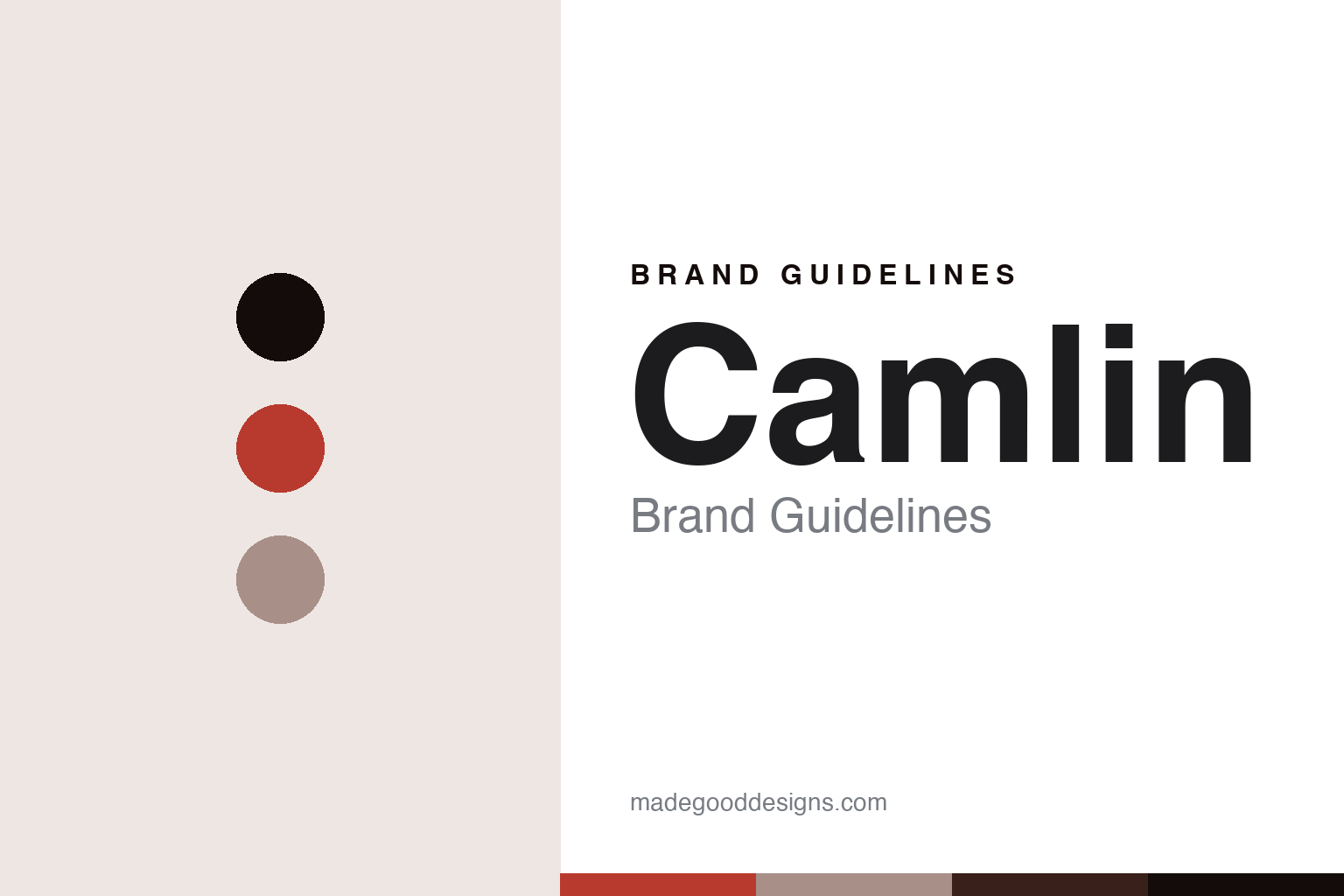
Camlin lives in a poster-red palette. Click a swatch to copy the hex.
Camlin’s identity is everyday, bright and accessible — a poster red, an ink, a linen, a sienna, and a paper. The palette leans poster red and linen: the register of a classroom poster colour and an affordable student set. It signals reach and warmth over prestige. The honest caveat: with no published brand hex, these values are an original, unofficial interpretation, not first-party colours.
The lesson is a poster-red palette signals an everyday, made-in-India identity. Camlin’s world is an accessible, ubiquitous, Indian-made object. For designers, it is a reminder that a warm poster red and a soft linen can carry a brand built on access — the red of a school poster colour and the linen of cheap paper. Because these tones can fail as small text, keep type dark and let the colour live in the accents, palette and band. The takeaways: make it affordable; make it available; keep the brands distinct; and treat any single hex as unofficial.
Typography
The register is an everyday sans — friendly, plain, legible.
Camlin’s identity carries a friendly, plain, legible spirit — an everyday brand, not a luxury house. An everyday sans captures the mood: approachable, clear and unpretentious, the register of a colour that belongs in every schoolbag. Set in a poster-red palette, the everyday sans feels friendly and plain — exactly the personality Camlin carries. It is accessible rather than exclusive, mirroring an affordable student colour. (Camel and Camlin’s real labels and marks are things we describe but do not reproduce, and the exact typeface is not ours to use.) Because it is not ours to use, the honest description is “an everyday-sans spirit,” shown here in a stand-in. The type behaves like the house: friendly, plain and legible.
Aa
An everyday-sans spirit — friendly and plain. (Specimen set in Mulish, an everyday-sans STAND-IN; NOT the Camel or Camlin wordmark or any label.)
The colour around the world
Camlin stands for the everyday colour, made accessible.
Camlin is a lesson in how a colour is made into a nation’s default. A poster-red palette, an everyday sans and an affordable poster colour make one thing — the colour a country learns to paint on — the whole house: everyday, bright and accessible. The reach is the differentiator, and the affordability is the meaning. The point is a colour made ordinary on purpose: good enough for serious learning, cheap enough for every classroom, and available in every stationery shop in India.
Put to work, the identity is access as design. A colour house in this spirit would compete on availability and value rather than prestige, and be honest about its structure — an Indian maker with a Japanese majority owner, and two distinct brands under one roof. It would treat ubiquity as an achievement, not an embarrassment, because being the first paint a child ever uses is a kind of cultural authorship. A brand learning from it would see that everyday accessibility is a powerful identity — that “the colour a whole country grew up with” is a bond a premium house can never buy — and that being precise, Camel is the art brand and Camlin the company and stationery name, majority-owned by Kokuyo since 2011 but still made in India, keeps the story honest. A brand learning from it would also respect the difference between the two names it owns, because collapsing an art brand and a stationery brand into one blurs exactly the distinction customers rely on. The lesson Camlin teaches is that access can hold an identity: the affordability gives it reach, and the ubiquity gives it meaning. The everydayness is the personality, and the classroom colour is the proof.
For designers and brand-builders, Camlin holds the everyday pole in this round about the colour around the world, from India: make it accessible, and keep your brands honestly distinct. The lessons: compete on value and reach; treat ubiquity as authorship; disclose the ownership; keep Camel and Camlin apart; and never reproduce a protected mark or motif. It is also a reminder to stay precise: Camlin is an Indian house founded in 1931 as Dandekar & Co., made in India, whose Camel art brand is a classroom fixture, now majority-owned by Japan’s Kokuyo as Kokuyo Camlin — with the palette here an unofficial interpretation. Camlin made access the identity — proof that being everywhere, honestly told, can be the difference.
Explore & save
Keep Camlin’s identity on hand — save it to a board in the Made Good inspiration library.
Camlin identity set
Pin the poster-red palette and the everyday-sans register to your own board.