Best Fonts for Medical and Healthcare
The best fonts for medical and healthcare brands do two things at once: read effortlessly and feel reassuring. That points to open, humanist sans-serifs with tall x-heights and clear letterforms — type that stays legible on a prescription label, a hospital wayfinding sign, or a patient portal. This guide ranks the typefaces clinics, hospitals, and health startups rely on, notes free versus paid and where to get each, and pairs them into a calm, credible system. For the bigger picture, see our healthcare branding guide and the medical logo design walkthrough.
Below: what makes a font right for healthcare, the typefaces, what to avoid, and how to build a trustworthy system.
What makes a good font for medical and healthcare?
Healthcare branding lives or dies on clarity and trust. A confusing label or an anxious-looking sign has real consequences. Prioritize:
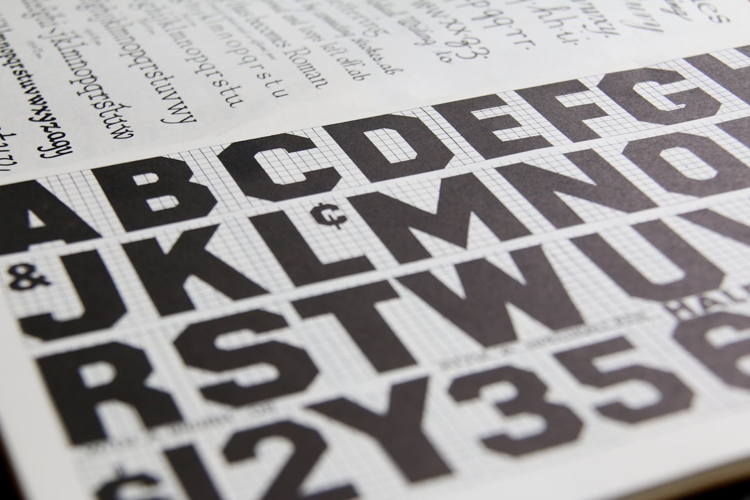
- High legibility. Open apertures, a tall x-height, and clearly differentiated characters (capital I, lowercase l, number 1) prevent misreads on dosages, forms, and signage.
- A humanist sans-serif. Humanist letterforms feel approachable and human rather than cold or clinical — the right emotional register for patient-facing brands.
- A calm, neutral tone. Nothing flashy or trendy. Healthcare type should lower anxiety, not raise it.
- A large family. Multiple weights and a true italic keep forms, charts, and UI consistent across print and screen.
- Wide language and symbol coverage. Patient populations are diverse; broad character sets and accents matter.
Most healthcare identities pair one clean sans for headlines and UI with the same family (or a readable serif) for body text. Keep the palette restrained and the contrast high.
Best medical and healthcare fonts
Open Sans (free)
Open Sans is the default trust face of healthcare — a humanist sans with open forms, a neutral tone, and superb legibility at every size. Free on Google Fonts. It is the safest, most versatile choice for body text, forms, and patient portals, and it never looks dated.
Source Sans 3 (free)
Source Sans 3 is Adobe’s clean, friendly workhorse sans (formerly Source Sans Pro), with excellent screen rendering and a wide weight range. Free on Google Fonts and open-source. It reads as professional and calm, ideal for hospital websites and long patient-education pages.
Lato (free)
Lato is a humanist sans with subtly rounded details that feel warm and approachable without losing seriousness. Free on Google Fonts. It softens a clinical brand a touch, which suits family practices, pediatrics, and wellness clinics.
Inter (free)
Inter is a UI-optimized sans with a tall x-height and tight, even spacing built for screens. Free on Google Fonts. It is the strongest choice for telehealth apps, patient dashboards, and any interface-heavy product where small-size clarity is critical.
PT Sans (free)
PT Sans is a humanist sans with a slightly sturdy, institutional feel and broad Cyrillic and Latin coverage. Free on Google Fonts. It works well for signage and printed documents where a dependable, no-nonsense face is needed.
IBM Plex Sans (free)
IBM Plex Sans is a modern, engineered humanist sans with a quietly technical character that reads as competent and current. Free on Google Fonts and open-source. A good fit for health-tech and medical-device brands that want to feel precise without feeling cold.
Atkinson Hyperlegible (free)
Atkinson Hyperlegible was designed by the Braille Institute specifically to maximize character recognition for low-vision readers, with deliberately distinct letterforms. Free on Google Fonts. It is the accessibility-first choice for senior care, ophthalmology, and any patient-facing material where readability cannot fail.
Merriweather (free)
Merriweather is a sturdy, screen-optimized serif with a tall x-height and excellent on-screen readability. Free on Google Fonts. When a healthcare brand wants a touch of warmth or tradition in body text or pull quotes, it pairs cleanly with Open Sans or Source Sans 3.
Best healthcare font pairings
| Font | Style | Free/Paid | Why it works |
|---|---|---|---|
| Open Sans | Humanist sans | Free | Neutral, trustworthy, legible everywhere |
| Source Sans 3 | Humanist sans | Free | Clean workhorse for web and documents |
| Lato | Humanist sans | Free | Warm, approachable, softens clinical tone |
| Inter | UI sans | Free | Tall x-height, ideal for apps and dashboards |
| PT Sans | Humanist sans | Free | Sturdy, dependable for signage and print |
| IBM Plex Sans | Humanist sans | Free | Precise, modern fit for health-tech |
| Atkinson Hyperlegible | Accessible sans | Free | Maximum legibility for low-vision readers |
| Merriweather | Screen serif | Free | Warm, readable body and quotes |
Fonts to avoid for medical and healthcare
Avoid anything that undercuts clarity or trust. Skip script, handwritten, and novelty faces — Comic Sans and Papyrus read as unprofessional and out of place on health materials. Be wary of high-contrast Didone serifs (the thin strokes vanish at small sizes and on poor printers, a real legibility risk on labels). Condensed and ultra-thin weights hurt readability for older and low-vision patients; keep weights at regular or medium for body text. Finally, avoid trendy geometric display sans as your primary body face — geometric forms with near-identical letters can blur character recognition exactly where it matters most.
Matching your font to your healthcare brand
The sans you choose sets the emotional tone before a patient reads a word, so match it to the setting. A hospital or specialist clinic reads as competent and reassuring in Open Sans or Source Sans 3. A pediatric or wellness brand can warm up with Lato, whose rounded details feel friendly without losing credibility. A telehealth app or medical-device product belongs in Inter or IBM Plex Sans, which are built for screens and small UI. When accessibility is paramount — senior care, vision services, public-health signage — Atkinson Hyperlegible is the deliberate, defensible choice.
Consistency builds trust in healthcare. Lock one logo face, one headline weight, and one body face, then apply them everywhere — signage, forms, the website, the patient portal, and printed instructions. A single humanist sans across the system feels clean and unified; adding a readable serif like Merriweather for long-form content reads as warm but still credible. Define the system once and hold it across every touchpoint.
Tips for medical and healthcare typography
- Legibility first. Choose a humanist sans with open apertures and distinct characters; misreads on health materials are not acceptable.
- Mind accessibility. Default to Atkinson Hyperlegible or a tall-x-height sans, keep body text at 16px or larger online, and maintain strong color contrast.
- Limit to one or two families. A single sans (or a sans plus one readable serif) keeps the brand calm and coherent.
- Keep weights moderate. Regular and medium for body, a single bold for emphasis; avoid thin and condensed weights.
- Test on real materials. Print a sample label and view the portal on a phone before committing — clarity in context beats clarity in a specimen.
For more on trust-first identity work, see our best fonts for law firms and best fonts for real estate guides, which share the same credibility-first thinking. To go deeper on sans-serifs, read our roundup of the best sans-serif fonts; to choose a headline-and-body pair use the font pairing guide; and before embedding any font, check the font licensing guide.
Frequently Asked Questions
What is the best font for a medical or healthcare brand?
Open Sans is the most reliable healthcare font: a humanist sans-serif that reads as neutral, trustworthy, and highly legible across signage, forms, and patient portals. Source Sans 3 and Lato are equally strong, and Atkinson Hyperlegible is the best choice when accessibility for low-vision readers is the priority. All are free on Google Fonts.
Should medical fonts be serif or sans-serif?
Sans-serif is the standard for healthcare because clean, open letterforms maximize legibility on labels, signage, and screens, and humanist sans-serifs feel approachable rather than cold. A readable serif like Merriweather can support long-form body text or quotes, but logos, UI, and patient-facing materials are usually set in a humanist sans.
What font is most legible for patients?
Atkinson Hyperlegible is the most legible, designed by the Braille Institute to maximize character recognition for low-vision readers through deliberately distinct letterforms. For general use, Open Sans, Source Sans 3, and Inter also rank high because of their open apertures and tall x-heights. Pair any of them with large sizes and strong contrast.
Which medical and healthcare fonts are free?
Open Sans, Source Sans 3, Lato, Inter, PT Sans, IBM Plex Sans, Atkinson Hyperlegible, and Merriweather are all free and open-source on Google Fonts. They render consistently across devices and can be embedded on a clinic or hospital website at no licensing cost, which keeps a healthcare identity affordable and accessible.
What font do hospitals use on signage?
Most hospital wayfinding uses clean humanist sans-serifs chosen for legibility at distance and angle — Open Sans, Source Sans 3, Frutiger, and similar faces are common. For accessibility-driven environments, Atkinson Hyperlegible is increasingly adopted. The shared priorities are open letterforms, a tall x-height, strong contrast, and characters that cannot be confused.