Cafe Branding: Identity for Coffee Shops
Cafe branding has one job most other hospitality brands do not: it has to earn a daily habit. People do not visit a fine-dining room every morning, but they will pick the same coffee shop five days a week — and they pick it on feel as much as on the espresso. A warm, crafted, consistent identity is what makes a cafe the one a neighborhood adopts, and that identity lives in the logo, the palette, the type, and the cup in your hand.
This guide covers the visual system and the specific touchpoints that matter most for coffee shops. If you are building a hospitality brand from scratch, start with our broader restaurant branding guide, then come back here for the cafe-specific dials.
The Cafe Brand Feeling: Warm and Crafted
Coffee culture trades on craft, ritual, and warmth, and a cafe’s visual identity should signal all three before anyone tastes the coffee. “Warm and crafted” is the dominant register for a reason — it tells a guest this is a place to slow down, made by people who care. That does not mean every cafe looks the same; a third-wave specialty roaster leans clean and exacting, while a neighborhood corner shop leans cozy and hand-drawn. Decide which end of that spectrum you sit on before you choose a single color.
Logo: Simple Enough to Live on a Cup
A cafe logo gets stamped, printed, and embossed on small, often curved, often single-color surfaces — cups, sleeves, stamps, embroidery. That makes scalability and a strong one-color version non-negotiable. Design a primary lockup plus a compact mark or monogram that reads at the size of a stamp. Avoid fine detail and thin lines that vanish when foil-stamped on a kraft cup. For appetite-and-craft-specific logo decisions, see our food logo design guide, and for the build workflow our logo design process.
- Primary lockup: icon plus wordmark for signage and the website.
- Monogram / stamp mark: a one-or-two-letter device that survives a 25mm rubber stamp.
- One-color version: for cups, embroidery, and laser etching on wood.
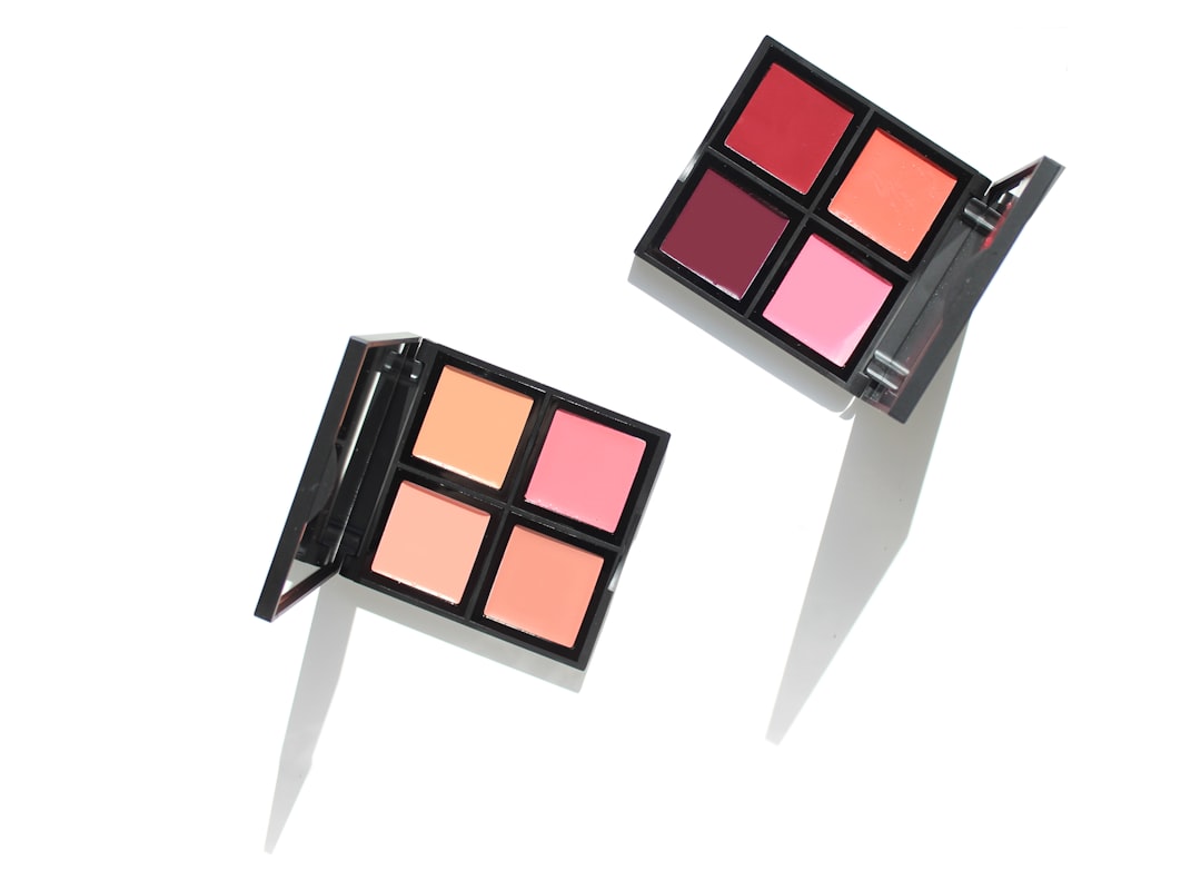
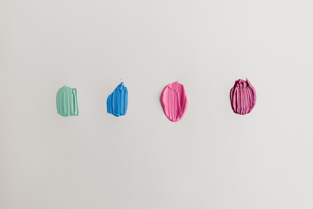
Color Palette: Earthy and Warm
Cafe palettes skew warm and natural — creams, browns, terracotta, olive, muted ochre — because they read as roasted, handmade, and unhurried. A common and effective formula is a warm neutral base (cream or oat), one earthy brand color (a clay, forest, or burnt-orange), and a single brighter accent for energy. Cool, clinical blues and grays can work for a deliberately minimalist specialty brand, but for most neighborhood cafes warmth wins. Always specify a Pantone reference for your main color so your cups, sign, and bags all match across different printers.
Typography: Friendly but Legible
Pair a characterful display face for the logo and headlines with a calm, legible workhorse for the menu and signage. Humanist sans-serifs and warm slab or transitional serifs both suit the crafted feel; a hand-lettered or script accent can add personality on a chalkboard or specials card without taking over the system. Keep the menu type plain and large — guests read it standing up, in line, often in dim morning light. Our font pairing guide covers how to combine a personality face with a workhorse without clashing.
The Cup Is Your Billboard
The to-go cup is the single most-seen object a cafe produces. It walks down the street, sits on desks, and shows up in photos — free, mobile advertising if you design it well. You rarely need a four-color cup; a strong one-color print or a logo sleeve on a quality blank does the job and costs far less. Test the artwork on the actual cup curve and color before ordering a pallet, because a logo that looks crisp flat can pinch and distort wrapped around a 12oz paper cup.
| Touchpoint | What carries the brand | Budget tip |
|---|---|---|
| To-go cups | One-color logo or sleeve | Print sleeves, not cups, to start |
| Bags / retail beans | Sticker or stamp on kraft bag | A custom stamp beats custom-printed bags early on |
| Menu board | Brand type + chalk lettering | Reusable board, changeable content |
| Loyalty card | Mark + stamp art | Doubles as a branded keepsake |
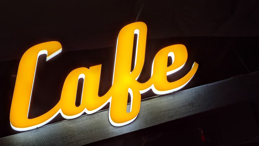
Signage and the Storefront
A cafe sign has to pull people off the sidewalk, so contrast and legibility beat cleverness. Use a simplified logo variant at the largest practical size, add an A-frame board for daily specials, and keep window vinyl sparse so passersby can see the warm room inside — the interior is part of the pitch. Coordinate the awning, sign, and menu board so the frontage reads as one identity. For the full storefront and wayfinding checklist, the restaurant branding guide has the signage section.
Menu and Specials
Cafe menus change often — seasonal drinks, a rotating single-origin, a new pastry — so design for easy updates. Set a clean template in your brand type with clear sections (espresso, brewed, not-coffee, food) and leave room for a daily specials card. Keep prices legible but not aggressively aligned into a price column. If you also serve full plates, our menu design guide covers layout and pricing in depth.
Interior and Atmosphere
For a cafe, the room is the brand. Lighting, materials, music, plant choices, the texture of the tables, and the type on the restroom door all reinforce — or undercut — the warm, crafted promise. You do not need a big budget; you need consistency. Natural wood, soft light, ceramic over disposable for dine-in, and a tidy counter all say “crafted” louder than any logo can. Make sure staff aprons or tees sit in your palette so the people are part of the identity too.
Digital and Social
Coffee shops live on social, so build a recognizable photography style — consistent light, a repeated angle, your palette in the frame — and use the same logo and name across your website, Google Business Profile, and Instagram. Pin hours and location where a phone user finds them in one tap. A cafe is also a sibling to mobile coffee concepts; if a cart or trailer is in your future, our food truck design guide covers branding a vehicle for legibility on the move.
Frequently Asked Questions
What makes good cafe branding?
Consistency and warmth. A scalable logo that works on a cup, an earthy palette specified for print, a legible type system, and a coherent room all repeating the same crafted, unhurried feeling. Because a cafe earns daily habits, recognition across every touchpoint matters more than any single clever element.
What colors work best for a coffee shop?
Warm, earthy tones — creams, browns, terracotta, olive, ochre — read as roasted and handmade and suit most cafes. A clean, cooler palette can fit a deliberately minimalist specialty brand. Pick one warm base, one brand color, and a single accent, and lock a Pantone for cross-vendor consistency.
How should I design my cafe’s to-go cups?
Keep it to a strong one-color logo or a branded sleeve on a quality blank — full-color printed cups are expensive and rarely worth it early on. Test the artwork on the actual curved cup before ordering, since flat designs can distort when wrapped, and a sleeve lets you reprint without re-cupping.
Do I need a different logo for the sign and the cup?
You need variants of one logo, not different logos. A full lockup suits the storefront sign; a compact mark or monogram suits cups, stamps, and social avatars; and a one-color version covers embroidery and etching. They should clearly belong to the same family at every size.