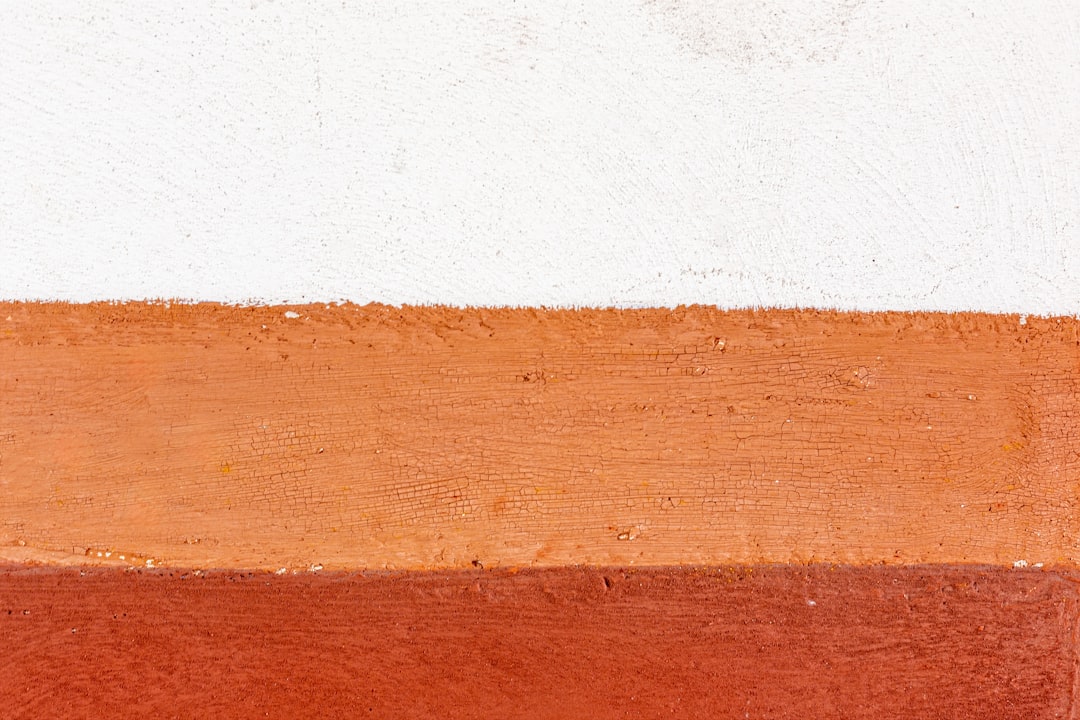
Colors That Go With Burnt Orange
Burnt orange is a deep, earthy orange with a scorched, slightly brown warmth — confident, retro, and grounded. The best colors that go with burnt orange are cool contrasts like navy and teal, soft neutrals such as cream, and earthy partners like olive and brown, with charcoal to sharpen the scheme. Below are exact hex codes, ready palettes, and notes on using burnt orange in branding, web design, and interiors.
What colors go with burnt orange?
Burnt orange (around #CC5500) is a warm, muted orange. Because it’s saturated and earthy, it pairs best with cool colors that contrast it and neutrals that let it breathe. The strongest matches are:
- Navy (#1F2A44) — a deep cool blue that gives burnt orange crisp, near-complementary contrast and instant sophistication.
- Teal (#008080) — a blue-green opposite that makes burnt orange pop with a vivid, mid-century energy.
- Cream (#F5EFE6) — a warm neutral that softens burnt orange and adds breathing room without going stark white.
- Charcoal (#36454F) — a near-black neutral that grounds burnt orange and keeps a palette modern and bold.
- Olive (#808000) — a muted yellow-green in the earthy family that gives a natural, organic, autumnal pairing.
- Brown (#5C4033) — a deep, woody neutral that deepens burnt orange into a cozy, layered autumn scheme.
Best color combinations for burnt orange
Burnt orange sits in the warm orange zone, which makes blues like navy and teal its natural complementary colors and the source of its sharpest contrast. Olive and brown are earthy analogous neighbors, while cream and charcoal act as anchors. If you’re deciding exactly which orange you have, our rust vs orange comparison and shades of orange guide help you place the tone before building a palette.
Burnt orange + navy + cream (classic and confident)
The most reliable pairing. Navy supplies cool contrast, cream softens the scheme, and burnt orange brings warmth — a versatile go-to for editorial, hospitality, and heritage branding.
Burnt orange + teal + cream (retro and vibrant)
Teal and burnt orange make a punchy mid-century duo. Cream keeps it from getting loud — a lively scheme for packaging, posters, and statement design.
Burnt orange + olive + brown (earthy and warm)
An autumnal trio of warm earth tones. Olive and brown ground burnt orange into a cozy, organic palette — ideal for craft, food, and outdoor brands.
Burnt orange palettes with hex codes
| Pairing color | Hex | Why it works / mood |
|---|---|---|
| Navy | #1F2A44 | Cool near-complement; sophisticated |
| Teal | #008080 | Complementary contrast; retro |
| Cream | #F5EFE6 | Warm neutral; soft lightener |
| Charcoal | #36454F | Dark neutral; modern and bold |
| Olive | #808000 | Earthy analogous; organic |
| Brown | #5C4033 | Woody neutral; cozy and warm |
| White | #FFFFFF | Clean space; crisp and modern |
Three ready palettes to copy:
- Classic confident: Burnt orange #CC5500 · Navy #1F2A44 · Cream #F5EFE6 · Charcoal #36454F
- Retro vibrant: Burnt orange #CC5500 · Teal #008080 · Cream #F5EFE6 · White #FFFFFF
- Earthy warm: Burnt orange #CC5500 · Olive #808000 · Brown #5C4033 · Cream #F5EFE6
How to build a balanced burnt orange palette
Burnt orange is warm and saturated, so it works best as an accent or mid-tone that cooler colors and neutrals surround. A reliable structure is roughly 20–30% burnt orange, 50–60% neutral (cream, white, or charcoal), and 10–20% a cool contrast like navy or teal. That cool note is what keeps a burnt-orange scheme from reading overly hot.
Burnt orange’s undertone changes its best partners. A redder, rustier burnt orange leans toward brown, olive, and cream for an earthy feel, while a brighter, more pumpkin burnt orange handles teal and navy for crisper contrast. Hold your tone against both a navy and an olive swatch to see which direction flatters it. Knowing whether your scheme leans warm or cool also helps — see warm vs cool colors.
A reliable way to test a burnt orange palette is the 60-30-10 rule: 60% dominant, 30% secondary, 10% accent. Burnt orange usually works best as the 30% secondary or the 10% accent against a 60% neutral like cream or charcoal, with navy or teal supplying contrast. Push burnt orange to the dominant 60% only when you want a genuinely bold, retro statement — and keep the surrounding tones light so it doesn’t overwhelm.
Because burnt orange is mid-dark, it carries light text well but can vibrate against pure red or bright pink. For digital and brand use, set cream or white text on burnt orange backgrounds, reserve teal for small accents, and check that navy or charcoal text keeps enough contrast to stay legible.
Colors to avoid with burnt orange
Burnt orange is warm and earthy, so a few combinations fight it:
- Bright primary red — too close in warmth and equally intense, so it competes with burnt orange instead of complementing it.
- Hot magenta or fuchsia — clashes with burnt orange’s earthy warmth and makes both look garish.
- Cool baby blue alone — too pale and chilly to balance burnt orange’s depth; navy or teal give far stronger structure.
Burnt orange in branding vs interiors
In branding, burnt orange signals warmth, confidence, energy, and craft, which suits hospitality, food, outdoor, and heritage brands. Pair it with navy and cream for a classic identity or with teal for a retro one, and use burnt orange as a primary or accent. For the full process, see how to choose brand colors.
In interiors, burnt orange makes a warm feature — a velvet sofa, accent wall, or rug — against cream, charcoal, and natural wood. Brass and wood tones bring out its richness, while teal and olive accents add freshness. As a saturated color it works best balanced by light neutrals; for grounding partners, see our neutral color palette guide. For sibling pairings, see colors that go with bronze.
Frequently Asked Questions
What is the best color to pair with burnt orange?
Navy (#1F2A44) is the best partner for burnt orange because the deep cool blue gives near-complementary contrast and a sophisticated, balanced look. For a more retro feel, teal works beautifully, while cream and charcoal are the easiest neutrals to anchor the scheme.
Does burnt orange go with gray?
Yes. Charcoal and mid-gray are excellent neutrals for burnt orange because they ground its warmth and read modern. Cool grays keep the scheme crisp and contemporary; very warm taupe-grays can blur into the orange, so a more neutral or cool gray gives the cleaner result.
What colors go with burnt orange for a wedding?
For a wedding, burnt orange pairs beautifully with cream, navy, olive, and brown. Cream and olive feel organic and autumnal, navy adds elegance, and brass or gold accents bring warmth. A burnt-orange-and-cream palette suits most fall wedding schemes.
What is the difference between burnt orange and rust?
Burnt orange is a brighter, more orange tone, while rust is a deeper, redder-brown that reads closer to a neutral. They share many partners, but rust behaves more like a base color, whereas burnt orange reads as a vivid mid-tone accent. The same navy, teal, and cream pairings flatter both, just at different intensities.
Is burnt orange a warm or cool color?
Burnt orange is a firmly warm color, since it sits between red and yellow with an earthy, scorched depth. That warmth is why navy, teal, and cream balance it so well, supplying the cool contrast and light neutrals that keep a burnt-orange scheme from feeling overheated.