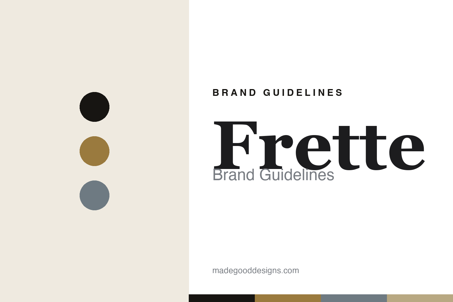
Frette Brand Guidelines
The jacquard linen.
Aa
Two constants: a gold-and-slate palette and a jacquard serif register. Abstract homage — not the Frette textiles, weave or packaging.
The jacquard linen
Frette weaves luxury into the bed.
Frette is a lesson in a weave as luxury. Founded in 1860 in Grenoble, France, it moved to Italy in 1865 and became, over a century and a half, the name most associated with fine hotel linens.
Its identity is jacquard weaving. On antique and modern jacquard looms, Frette works brocade, matelassé and damask in extra-long-staple cotton with a lustrous finish — sateen, percale, poplin, linen, silk and cashmere — and it has dressed the beds of the world’s luxury hotels for over a century. Recent collaborations with the interior designer Tara Bernerd and, in 2024, with Thom Browne, extend the house into new rooms. Woven luxury, for the bed.
(Honest notes: Frette was founded in Grenoble, France, in 1860 — by three co-founders (Edmond Frette with Alexandre Payre and Charles Chaboud), not by Edmond alone — and moved to Italy (Concorezzo in 1865, later Monza), so the founding place and today’s HQ differ. It is not independent: ownership passed through private-equity hands to Raza Heritage Holdings in 2023. It is produced in Italy through a large network of Italian suppliers rather than a single categorical “made in Italy” guarantee, and its historic-client stories are best treated as reported heritage marketing. There’s no official brand hex, and we reproduce no actual Frette weave — these tones are an unofficial interpretation. This is design commentary and does not promote any product.)
Colour
Frette lives in a gold-and-slate palette. Click a swatch to copy the hex.
Frette’s identity is refined, lustrous and Italian — a gold, an ink, a slate, a champagne, and an ivory. The palette pairs a gold with a slate — the register of a luxury jacquard house. It signals sheen and craft rather than novelty. The honest caveat: with no published brand hex, these tones are an original, unofficial interpretation, not first-party values.
The lesson is a gold with a slate signals a luxury-linen house. Frette’s world is a lustrous, woven bed. For designers, it is a reminder that a single technique — jacquard — mastered over 150 years can be the whole identity. Because a mid gold can fail as small text, keep type dark and let the colour live in the accents, palette and band. The takeaways: own a technique; hold a signature association (hotels); keep the finish lustrous; and treat any single hex as unofficial.
Typography
The register is a jacquard serif — refined, lustrous, Italian.
Frette’s identity carries a refined, lustrous, Italian spirit — a woven, luxurious bed. A high-contrast old-style serif captures the mood: it is elegant and classical, the register of Italian luxury. Set in a gold-and-slate palette, the jacquard serif feels refined and lustrous — exactly the personality Frette carries. It is classical rather than trendy, mirroring damask and matelassé. (Frette’s real textiles, weaves and wordmark are works we describe but do not reproduce, and the exact typeface is not ours to use.) Because it is not ours to use, the honest description is “a jacquard serif spirit,” shown here in a stand-in. The type behaves like the brand: refined, lustrous and Italian.
Aa
A jacquard serif spirit — refined and lustrous. (Specimen set in Cormorant Garamond, a high-contrast serif STAND-IN; NOT the Frette packaging.)
A weave as luxury
Frette stands for jacquard hotel linens.
Frette is a lesson in making a weave the identity. A gold-and-slate palette, a jacquard serif and a lustrous bed make jacquard the whole brand — refined, lustrous, Italian. The weave is the differentiator. The differentiator is 150 years of jacquard mastery, on the world’s best beds.
For designers and brand-builders, Frette offers a clear takeaway: own a technique and the association it earns. The lessons: master a weave; hold a signature link (luxury hotels); keep the finish lustrous; and be honest about the story. It is also a reminder to stay accurate: it was founded in 1860 in France by three co-founders, moved to Italy, is now Raza-Heritage-owned, and the palette here is an unofficial interpretation. Frette made jacquard the brand — proof that a weave can be the difference.
Explore & save
Keep Frette’s identity on hand — save it to a board in the Made Good inspiration library.
Frette identity set
Pin the gold-and-slate palette and the jacquard-serif register to your own board.


