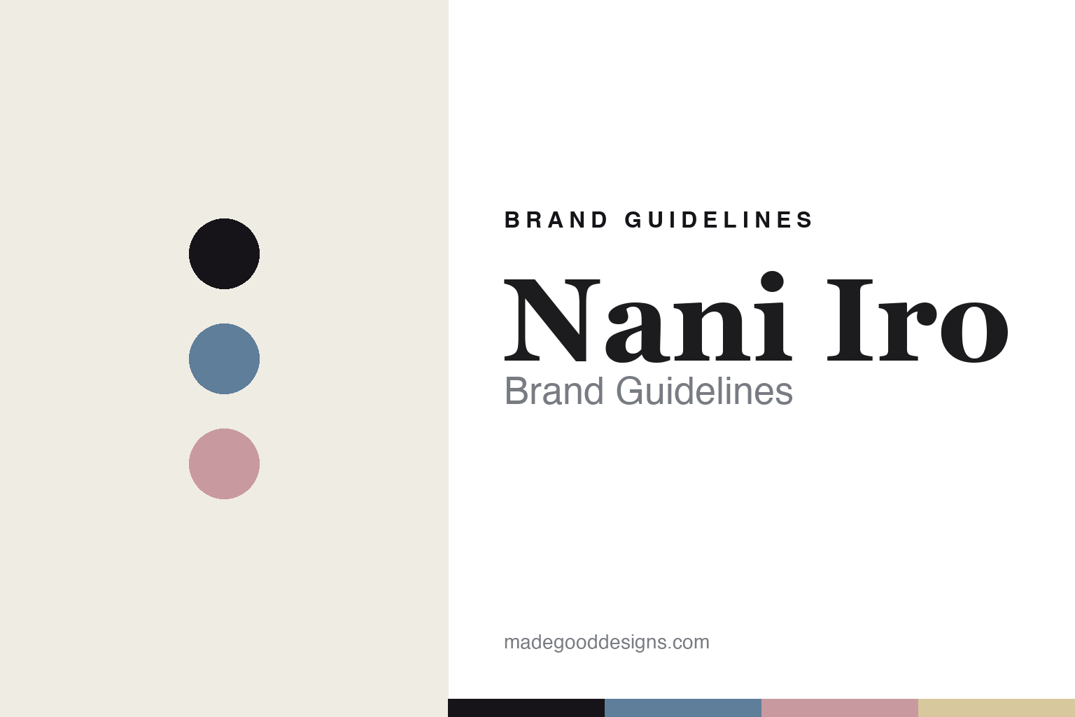
Nani Iro Brand Guidelines
The painted cloth.
Aa
Two constants: a wash-blue-and-blush palette and a painterly serif register. Abstract homage — not the Nani Iro prints (© Kokka & Naomi Ito) or packaging.
The painted cloth
Nani Iro paints art onto Japanese cloth.
Nani Iro is a lesson in a painting as a textile. It is the textile art line of the Japanese watercolour artist Naomi Ito, produced by the fabric company Kokka, launched in 2002 and based in Osaka.
Its identity is double-gauze art prints. Nani Iro pioneered the double-gauze print textile and built its world on painterly, watercolour-derived, nature-inspired prints on premium Japanese cotton, sold as yardage for sewing alongside a homeware line (Sumau). Each design begins as one of Naomi Ito’s paintings. A painter’s work, made into cloth.
(Honest notes: Nani Iro is best framed as Naomi Ito’s textile art line produced by the fabric company Kokka — the copyright is jointly Kokka and Naomi Ito — rather than “her company.” The 2002 launch and the double-gauze pioneering are the brand’s own statements. The name is commonly glossed as “what color” (何色), but that isn’t officially confirmed, so we say “commonly glossed as.” Note that nani-iro.com is an unrelated site; the brand is at naniiro.jp. Its Sumau homeware is stated as made in Japan; we hedge the full yardage range. There’s no official brand hex, and the prints are copyrighted artworks — we reproduce none; these tones are an unofficial interpretation. This is design commentary and does not promote any product.)
Colour
Nani Iro lives in a wash-blue-and-blush palette. Click a swatch to copy the hex.
Nani Iro’s identity is painterly, soft and Japanese — a wash blue, an ink, a blush, a straw, and a paper. The palette pairs a wash blue with a blush — the register of watercolour on cloth. It signals art and softness rather than novelty. The honest caveat: with no published brand hex, these tones are an original, unofficial interpretation, not first-party values.
The lesson is a wash blue with a blush signals a painted-cloth house. Nani Iro’s world is a painting you can sew. For designers, it is a reminder that an artist’s own hand — watercolour, on a distinctive substrate — can be a whole identity. Because a mid wash blue can fail as small text, keep type dark and let the colour live in the accents, palette and band. The takeaways: let the artist lead; own a substrate (double gauze); keep it painterly; and treat any single hex as unofficial.
Typography
The register is a painterly serif — soft, artful, Japanese.
Nani Iro’s identity carries a soft, artful, Japanese spirit — a watercolour cloth. A gentle, brushy-contrast serif captures the mood: it is warm and expressive, the register of a painter’s line. Set in a wash-blue-and-blush palette, the painterly serif feels soft and artful — exactly the personality Nani Iro carries. It is expressive rather than mechanical, mirroring watercolour prints. (Nani Iro’s real prints (© Kokka & Naomi Ito) and wordmark are works we describe but do not reproduce, and the exact typeface is not ours to use.) Because it is not ours to use, the honest description is “a painterly serif spirit,” shown here in a stand-in. The type behaves like the brand: soft, artful and Japanese.
Aa
A painterly serif spirit — soft and artful. (Specimen set in Lora, a brushy-contrast serif STAND-IN; NOT the Nani Iro prints or packaging.)
A painting as a textile
Nani Iro stands for double-gauze art prints.
Nani Iro is a lesson in making a painting the identity. A wash-blue-and-blush palette, a painterly serif and a watercolour cloth make painted textiles the whole brand — soft, artful, Japanese. The painting is the differentiator. The differentiator is an artist’s own watercolours, printed on double gauze.
For designers and brand-builders, Nani Iro offers a clear takeaway: let an artist’s hand lead the product. The lessons: let the artist lead; own a substrate; keep it painterly; and be honest about the story. It is also a reminder to stay accurate: it’s Naomi Ito’s art line under Kokka, launched in 2002, Osaka-based, and the prints are copyrighted works we reproduce none of — the palette here is an unofficial interpretation. Nani Iro made a painting the brand — proof that an artist’s hand can be the difference.
Explore & save
Keep Nani Iro’s identity on hand — save it to a board in the Made Good inspiration library.
Nani Iro identity set
Pin the wash-blue-and-blush palette and the painterly-serif register to your own board.


