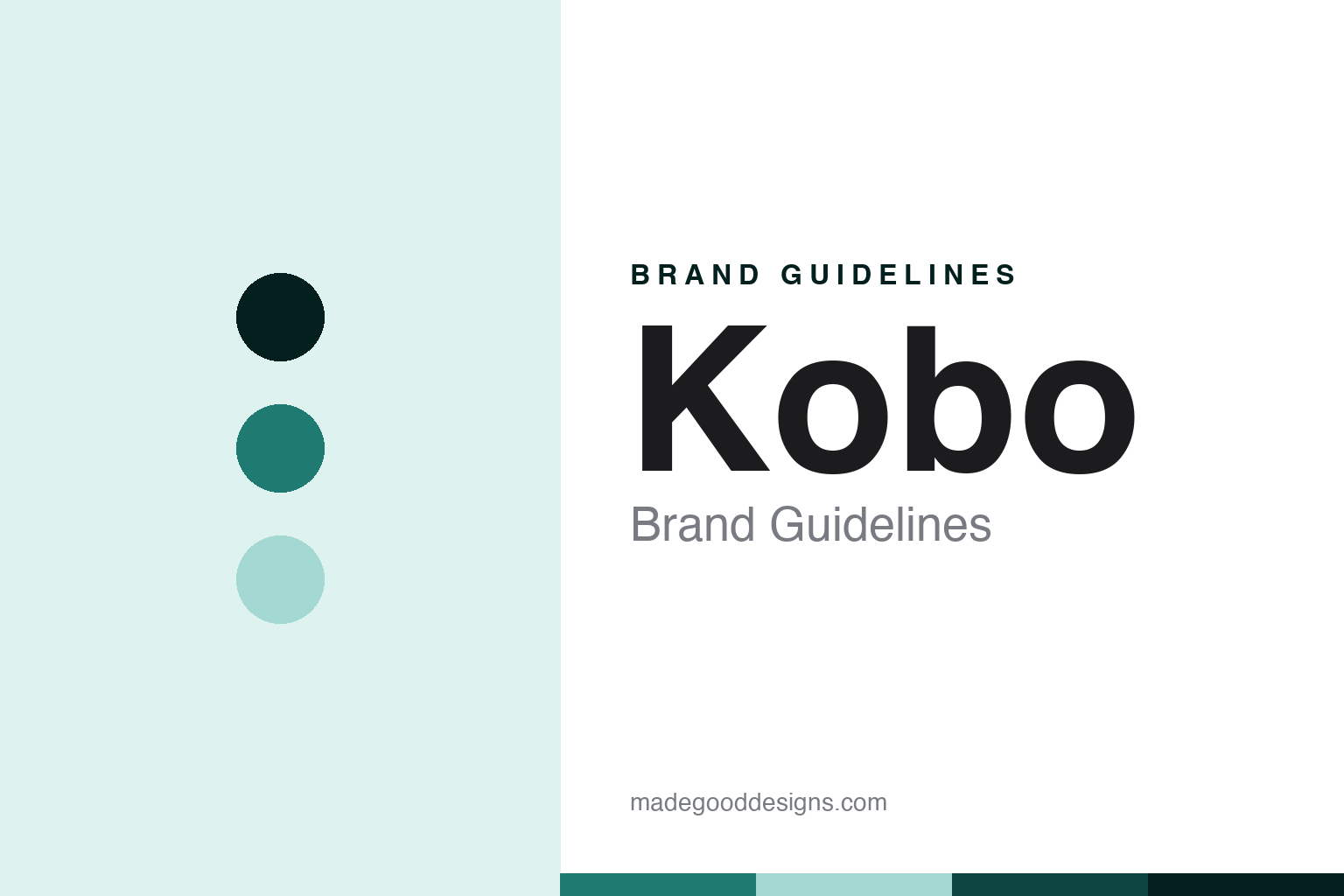
Kobo Brand Guidelines
The open-format challenger.
Aa
Two constants: an open-teal palette and an open-sans register. Abstract homage — not a Kobo product or mark; no device, screen or logo is reproduced.
The open-format challenger
Kobo is the Toronto-born, Rakuten-owned e-reader that answers Kindle with open EPUB and library borrowing.
Kobo brings the paper-like-screen round its open-challenger node — the main global alternative to Kindle, built on openness where Kindle is closed. It was founded in 2009 in Toronto and is owned today by the Japanese group Rakuten. Kobo makes and sells the e-readers, and its answer to a round about who owns these devices and how open they are is the mirror image of Kindle: Canadian-founded, Japanese-owned, and deliberately open.
Its identity is the open-format challenger. The native EPUB support, the library borrowing and the Rakuten ownership are the story here. A reader, open. The open-format challenger.
(Honest notes, so the founding, the ownership and the openness are framed accurately. Kobo sells the e-readers as its heroes — the Clara, the Libra and the stylus-equipped Elipsa, now including colour models — and we report its language as the brand’s own. On founding: it was spun off from the Canadian bookseller Indigo in 2009, out of an earlier service, and its name is an anagram of “book.” On ownership: the Japanese e-commerce group Rakuten acquired it in 2012, so it is Canadian-founded and Japanese-owned, both true in sequence, and still headquartered in Toronto. On the differentiator, which is the whole point: Kobo supports the open EPUB format natively, so you can load an EPUB directly, and it has built-in library borrowing through OverDrive and Libby, unlike Kindle’s closed store. On the lineup: its most recent wave was in 2024, with the Sage now discontinued and no new hardware in 2025. On where it is made: in Asia, built by Taiwanese contract manufacturers with production in Taiwan and China. Its designs, the Kobo name and its livery are IP we describe but do not reproduce; there is no official brand hex; these tones are an unofficial interpretation.)
Colour
Kobo lives in an open teal. Click a swatch to copy the hex.
Kobo’s identity is open, reader-friendly and challenging — an open teal, an ink, a pale aqua, a deep teal, and a paper. The palette leans open teal and pale aqua: a fresh, welcoming register that nods to openness and libraries rather than a loud logo colour. It signals the open-format challenger — open, flexible and reader-first. The honest caveat: with no published brand hex, these values are an original, unofficial interpretation, not first-party colours.
The lesson is an open teal signals an open, reader-friendly identity. Kobo’s world is your own EPUB and a library loan on the same reader. For designers, it is a reminder that a fresh open teal and a soft pale aqua can carry a device brand — a welcoming tone held as colour, not a product shot. Because these tones can fail as small text, keep type dark and let the colour live in the accents, palette and band. The takeaways: date it to 2009; name Rakuten as the Japanese owner; lead with native EPUB and library borrowing; place manufacturing in Asia; and treat the livery as trade dress.
Typography
The register is an open sans — open, flexible, reader-first.
Kobo’s identity carries an open, flexible, reader-first spirit — a challenger built on openness, not lock-in. An open sans captures the mood: clean, welcoming and confident, the register of a reader that takes your files and your library card. Set in an open-teal palette, the open sans feels open and reader-first — exactly the personality Kobo carries. It behaves like a made, functional thing rather than a loud logo, mirroring an e-ink dot matrix and a page-margin rule. (Kobo’s real readers and the name are things we describe but do not reproduce, and the exact typeface is not ours to use.) Because it is not ours to use, the honest description is “an open-sans brand,” shown here in a stand-in. The type behaves like the brand: open, flexible and reader-first.
Aa
An open-sans brand — open and reader-first. (Specimen set in Archivo, an open-sans STAND-IN; NOT the Kobo logo or any product.)
The paper-like screen
Kobo stands for the open-format challenger.
Kobo brings the round its open-challenger node. An open-teal palette, an open sans and a 2009 founding make one thing — the open-format challenger — the whole identity: open, reader-friendly and challenging. The native EPUB support is the pitch, and the library borrowing is the proof. The point is the main alternative to Kindle, built on openness, in a round about who owns these devices and how open they are.
Put to work, the identity is the brand told straight, ownership named and openness led with. A maker in this spirit would date it to 2009, name Rakuten as the Japanese owner, and lead with native EPUB and library borrowing. A reader in this spirit would keep the facts right: Kobo sells the Clara, Libra and Elipsa as its heroes; it was founded in 2009 in Toronto, spun off from Indigo, with a name that anagrams “book”; it has been owned by Japan’s Rakuten since 2012; it supports EPUB natively and library borrowing via Libby; and it is made in Asia. Kobo sits second in the round, after the Kindle. The honest editorial moves are to date it to 2009, to name Rakuten, to lead with the open ecosystem, to place manufacturing in Asia, and to frame it as Canadian-founded and Japanese-owned.
For designers and brand-builders, Kobo continues the paper-like screen: make openness the identity — and name the owner behind the challenger. The lessons: define yourself against a dominant rival by being open where it is closed; support the standard format and the library rather than a single store; name a foreign parent plainly; keep a founding and an ownership both true in sequence; and never reproduce a logo. It is also a reminder to stay precise: Kobo is the Toronto-born, Rakuten-owned e-reader that answers Kindle with open EPUB and library borrowing — with the palette here an unofficial interpretation. The hook is that mirror: where the Kindle locks you to Amazon’s store, Kobo lets you drag your own EPUB onto the device and borrow from the public library through Libby — the open answer to the closed giant, run out of Toronto but owned in Tokyo. Read that way, Kobo is less a rival reader than an open alternative: open, flexible, reader-first. The lesson for a brand is that openness and honest ownership reinforce each other, and naming Rakuten keeps the story earned. Kobo made the-open-format-challenger the identity — proof that openness carries a round.
Explore & save
Keep Kobo’s identity on hand — save it to a board in the Made Good inspiration library.
Kobo identity set
Pin the open-teal palette and the open-sans register to your own board.