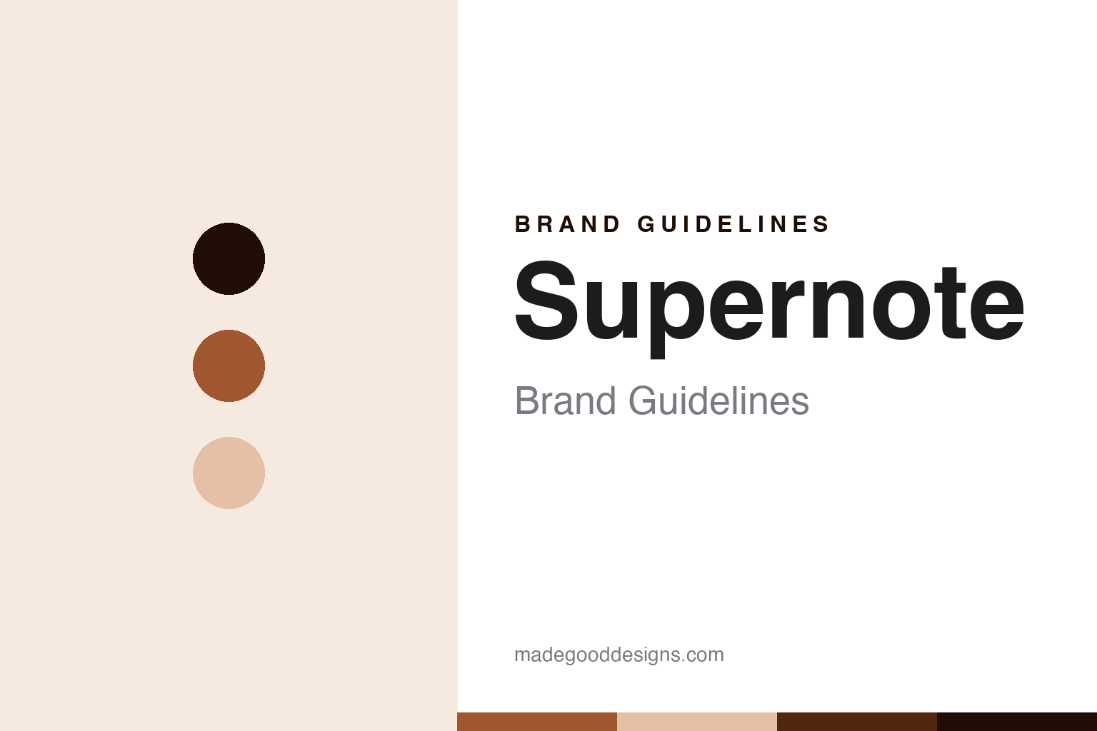
Supernote Brand Guidelines
The writing-first e-paper notebook.
Aa
Two constants: a writing-sienna palette and a writing-sans register. Abstract homage — not a Supernote product or mark; no device, screen or logo is reproduced.
The writing-first e-paper notebook
Supernote is Ratta’s writing-first, repairable e-paper notebook with a cult following.
Supernote brings the paper-like-screen round its writing-first node — a device built, above all, to feel like writing on paper, and to last. It is a line made by the company Ratta, and it makes and sells the e-paper notebooks. Its answer to a round about who owns these devices and how open they are is careful on nationality: a privately held company with offices in China, Japan and the United States, hard to pin to a single flag.
Its identity is the writing-first e-paper notebook. The pen-on-paper writing feel, the repairability ethos and the cult following are the story here. A notebook, writing-first. The writing-first e-paper notebook.
(Honest notes, so the nationality, the founding and the ethos are framed carefully, because the first two are genuinely murky. Supernote sells the devices as its heroes — the larger Manta and the compact Nomad, following its earlier A5 X and A6 X — and we report its language as the brand’s own. On nationality, deliberately hedged: Ratta operates offices in Shanghai, Tokyo and the United States, and it has been described as both Chinese and Japanese, so rather than assign one nationality we describe it as a privately held company with offices across those three. On founding: the Supernote line launched around 2019, while Ratta the company is older, having started in payment terminals before moving into e-paper, so we date the line, not a single company year. On the differentiator, which is the whole identity: Supernote is writing-first and deliberately distraction-minimal, aiming to feel as close to a real notepad and pen as possible, with no backlight by choice, low writing latency, and a genuine repairability and longevity ethos — user-replaceable batteries and motherboards — favouring software upgrades over hardware churn. On where it is made: assembly is not clearly stated, and is assumed to be China from common reporting, which we flag rather than assert. On community: it has a cult, community-engaged following and competes directly with reMarkable. Its designs, the Supernote and Ratta names and its feature names are IP we describe but do not reproduce; there is no official brand hex; these tones are an unofficial interpretation.)
Colour
Supernote lives in a writing sienna. Click a swatch to copy the hex.
Supernote’s identity is writing-first, durable and considered — a writing sienna, an ink, a pale clay, a deep umber, and a paper. The palette leans writing sienna and pale clay: a warm, inky register that nods to pen on paper and long ownership rather than a loud logo colour. It signals the writing-first e-paper notebook — tactile, durable and considered. The honest caveat: with no published brand hex, these values are an original, unofficial interpretation, not first-party colours.
The lesson is a writing sienna signals a writing-first, durable identity. Supernote’s world is a device that feels like a notebook and is built to be repaired, not replaced. For designers, it is a reminder that a warm writing sienna and a soft pale clay can carry a device brand — an inky tone held as colour, not a product shot. Because these tones can fail as small text, keep type dark and let the colour live in the accents, palette and band. The takeaways: hedge the nationality across three offices; date the line to around 2019; lead with the writing feel and repairability; flag the assembly location as reported; and keep Supernote and Ratta distinct.
Typography
The register is a writing sans — tactile, durable, considered.
Supernote’s identity carries a tactile, durable, considered spirit — a writing tool built to last, not a disposable gadget. A writing sans captures the mood: clean, plain and honest, the register of a device judged by how it writes and how long it lasts. Set in a writing-sienna palette, the writing sans feels tactile and durable — exactly the personality Supernote carries. It behaves like a made, functional thing rather than a loud logo, mirroring a stylus stroke and a paper grain. (Supernote’s real devices and the names are things we describe but do not reproduce, and the exact typeface is not ours to use.) Because it is not ours to use, the honest description is “a writing-sans brand,” shown here in a stand-in. The type behaves like the brand: tactile, durable and considered.
Aa
A writing-sans brand — tactile and durable. (Specimen set in Work Sans, a writing-sans STAND-IN; NOT the Supernote logo or any product.)
The paper-like screen
Supernote stands for the writing-first e-paper notebook.
Supernote brings the round its writing-first node. A writing-sienna palette, a writing sans and a line launched around 2019 make one thing — the writing-first e-paper notebook — the whole identity: writing-first, durable and considered. The pen-on-paper writing feel is the pitch, and the repairability ethos is the proof. The point is a device built to feel like a notebook and to be kept for years, in a round about who owns these devices and how open they are.
Put to work, the identity is the brand told straight, the nationality hedged and the ethos led with. A maker in this spirit would hedge the nationality across three offices, date the line to around 2019, and lead with the writing feel and repairability. A reader in this spirit would keep the facts right: Supernote sells the Manta and Nomad as its heroes; it is made by Ratta, a private company with offices in Shanghai, Tokyo and the US; the line launched around 2019; it is writing-first and repairable by design; and its assembly location is reported rather than confirmed. Supernote sits sixth in the round, after PocketBook. The honest editorial moves are to hedge the nationality, to date the line to around 2019, to lead with writing and repairability, to flag the assembly as reported, and to keep Supernote and Ratta distinct.
For designers and brand-builders, Supernote continues the paper-like screen: make the writing feel and repairability the identity — and hedge a genuinely murky nationality. The lessons: compete on one experience, here writing, done better than anyone; make longevity and repairability a real differentiator; hedge a nationality that sources genuinely dispute; flag an assembly location as reported when it is not confirmed; and never reproduce a logo. It is also a reminder to stay precise: Supernote is Ratta’s writing-first, repairable e-paper notebook with a cult following — with the palette here an unofficial interpretation. The hook is that stance: against a market of ever-thinner, ever-newer gadgets, Supernote built a device to feel like pen on paper and to be repaired rather than replaced — user-swappable batteries and boards, software updates over new hardware — earning a cult following even as its own nationality stays hard to pin down across Shanghai, Tokyo and the US. Read that way, Supernote is less a gadget than a writing tool: tactile, durable, considered. The lesson for a brand is that a focused experience and honest hedging reinforce each other, and flagging what is uncertain keeps the story earned. Supernote made the-writing-first-e-paper-notebook the identity — proof that a writing feel carries a round.
Explore & save
Keep Supernote’s identity on hand — save it to a board in the Made Good inspiration library.
Supernote identity set
Pin the writing-sienna palette and the writing-sans register to your own board.


