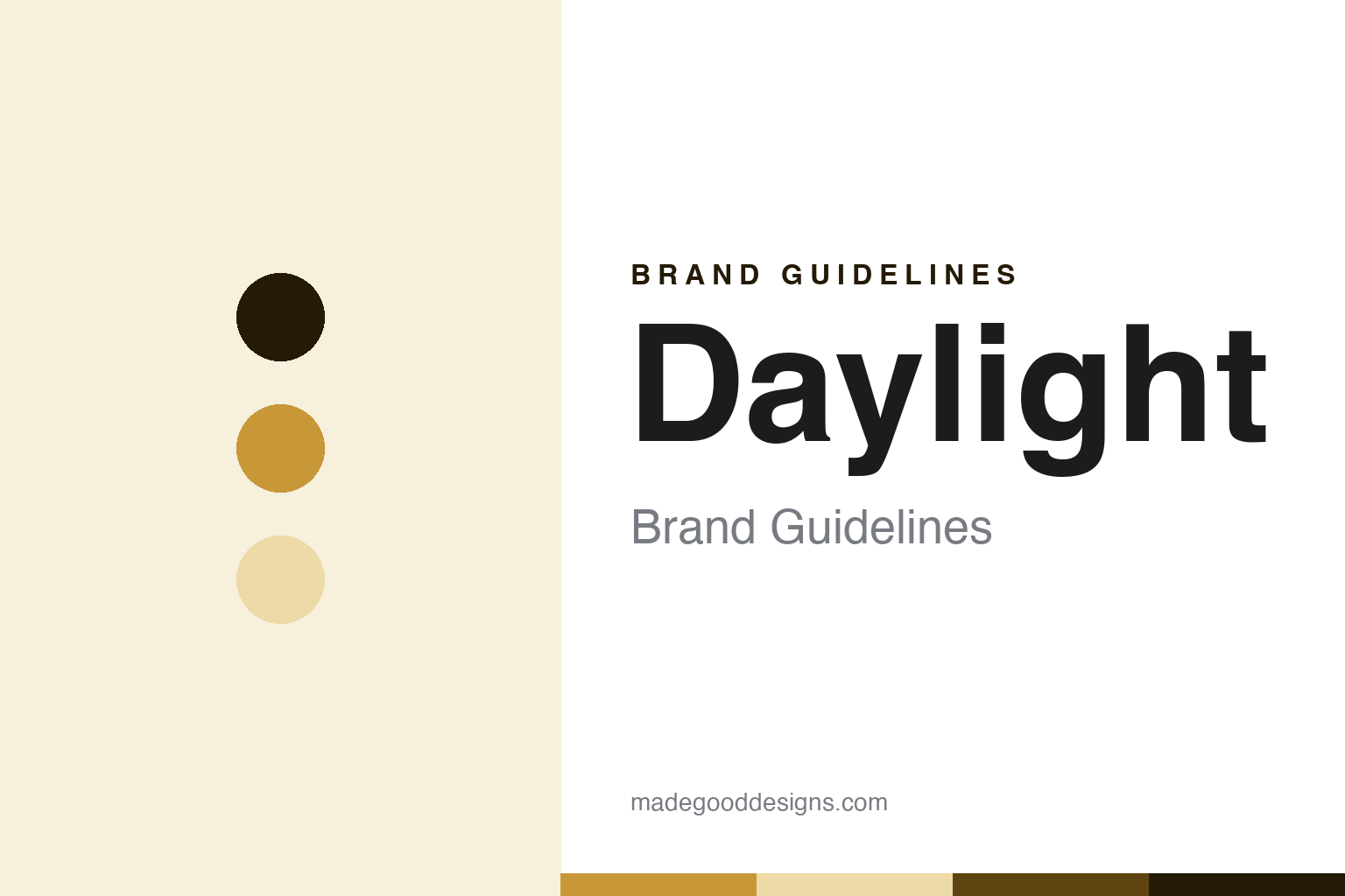
Daylight Brand Guidelines
The calm, blue-light-free computer.
Aa
Two constants: a sunrise-amber palette and a wellbeing-sans register. Abstract homage — not a Daylight product or mark; no device, screen or logo is reproduced. Amber here is an interpretation, not Daylight’s own livery.
The calm, blue-light-free computer
Daylight is the US benefit corporation whose DC-1 uses a paper-like LivePaper LCD and an amber, blue-light-free screen.
Daylight closes the paper-like-screen round as its outlier node — the one device here that is not e-ink at all, yet belongs, because its whole point is a paper-like screen that is easy on the eyes. It is made by Daylight Computer Co., an American startup registered as a public benefit corporation, based in San Francisco. Daylight makes and sells the device, and its answer to a round about who owns these devices and how open they are is distinctive: a mission-registered US company built around wellbeing.
Its identity is the calm, blue-light-free computer. The paper-like LivePaper LCD, the amber blue-light-free screen and the digital-wellbeing mission are the story here. A computer, calm. The calm, blue-light-free computer.
(Honest notes, so the technology, the funding and the founding are framed accurately, because each is easy to get wrong. Daylight sells the device as its hero — the DC-1 — and we report its language as the brand’s own. On the technology, the most important correction: the DC-1 is not e-ink or e-paper; it is a reflective, paper-like LCD the company calls “LivePaper,” running at sixty frames a second without e-ink’s lag, in monochrome, sunlight-readable because it reflects ambient light, with an amber, blue-light-free backlight for dim and night use, on a modified Android system called SolOS, so we never call it an e-reader or an e-ink device. On founding: the company dates to 2018, while the DC-1 was revealed in 2024 and its first run sold out, so we do not conflate company and product. On funding, an important trap: it raised around twelve million dollars from current and former executives of Oculus, Pinterest and Dropbox, and it is not backed by the venture firm a16z, which funds an unrelated company also called Daylight, so we keep the two apart. On where it is made: its LivePaper display is reported as Japanese-made and final assembly as China, which we flag as likely but not officially confirmed. On positioning: it is a calm, healthier computer for deep focus and digital wellbeing, sitting in the gap between an e-reader and a tablet. Its designs, the Daylight, DC-1, LivePaper and SolOS names and the amber livery are IP we describe but do not reproduce; there is no official brand hex; these tones are an unofficial interpretation.)
Colour
Daylight lives in a sunrise amber. Click a swatch to copy the hex.
Daylight’s identity is calm, warm and wellbeing-led — a sunrise amber, an ink, a pale wheat, a deep bronze, and a paper. The palette leans sunrise amber and pale wheat: a warm, gentle register that nods to the brand’s blue-light-free, amber-lit philosophy rather than a loud logo colour — offered as an interpretation, since amber is central to Daylight’s own story and we do not reproduce its exact livery. It signals the calm, blue-light-free computer — warm, gentle and focused. The honest caveat: with no published brand hex, and with amber treated as thematic to the brand, these values are an original, unofficial interpretation, not first-party colours.
The lesson is a sunrise amber signals a calm, wellbeing-led identity. Daylight’s world is a warm-lit screen you can read at night or in the sun without eye strain. For designers, it is a reminder that a warm sunrise amber and a soft pale wheat can carry a device brand — a gentle tone held as colour, not a product shot. Because these tones can fail as small text, keep type dark and let the colour live in the accents, palette and band. The takeaways: never call it e-ink; date the company to 2018 and the DC-1 to 2024; keep the funding separate from a16z’s Daylight; flag display-Japan and assembly-China as reported; and treat amber as thematic.
Typography
The register is a wellbeing sans — warm, gentle, focused.
Daylight’s identity carries a warm, gentle, focused spirit — a wellbeing device, not a spec race. A wellbeing sans captures the mood: clean, calm and confident, the register of a computer built to be kind to your eyes and attention. Set in a sunrise-amber palette, the wellbeing sans feels warm and focused — exactly the personality Daylight carries. It behaves like a designed object rather than a loud logo, mirroring a warm-light glow and a paper grain. (Daylight’s real device, the amber livery and the names are things we describe but do not reproduce, and the exact typeface is not ours to use.) Because it is not ours to use, the honest description is “a wellbeing-sans brand,” shown here in a stand-in. The type behaves like the brand: warm, gentle and focused.
Aa
A wellbeing-sans brand — warm and focused. (Specimen set in Space Grotesk, a wellbeing-sans STAND-IN; NOT the Daylight logo or its amber livery.)
The paper-like screen
Daylight stands for the calm, blue-light-free computer.
Daylight closes the paper-like-screen round as its outlier node. A sunrise-amber palette, a wellbeing sans and a 2018 founding make one thing — the calm, blue-light-free computer — the whole identity: calm, warm and wellbeing-led. The paper-like LivePaper LCD is the pitch, and the amber blue-light-free screen is the proof. The point is the one non-e-ink device in the round, built around eye comfort and focus, in a round about who owns these devices and how open they are.
Put to work, the identity is the brand told straight, the technology corrected and the funding kept separate. A maker in this spirit would never call it e-ink, date the company to 2018 and the DC-1 to 2024, and keep the funding separate from the unrelated Daylight. A reader in this spirit would keep the facts right: Daylight sells the DC-1 as its hero; it is a US public benefit corporation founded in 2018, with the DC-1 revealed in 2024; its screen is a reflective LivePaper LCD, not e-ink, with an amber blue-light-free backlight; it raised from Oculus, Pinterest and Dropbox executives, not a16z; and its display is reported Japanese-made with assembly in China. Daylight closes the round, after Supernote. The honest editorial moves are to correct the e-ink assumption, to separate company and product dates, to keep the funding distinct from the other Daylight, to flag the manufacturing as reported, and to treat amber as thematic.
For designers and brand-builders, Daylight closes the paper-like screen: build around wellbeing — and be precise that it is a LivePaper LCD, not e-ink. The lessons: pursue a paper-like screen by a different route than e-ink; make eye comfort and focus the mission, backed by a benefit-corporation structure; correct a technology assumption rather than let retail mis-tags stand; keep a same-named company’s funding out of your story; and never reproduce a logo or a signature colour. It is also a reminder to stay precise: Daylight is the US benefit corporation whose DC-1 uses a paper-like LivePaper LCD and an amber, blue-light-free screen — with the palette here an unofficial interpretation. The hook is that outlier logic: everything else in this round is e-ink, but Daylight reaches the same paper-like, easy-on-the-eyes goal with a reflective LCD it invented called LivePaper — fast like a tablet, warm and blue-light-free like a lamp at dusk — a calm computer built by a benefit corporation for focus and wellbeing. Read that way, Daylight is less an e-reader than a calm computer: warm, gentle, focused. The lesson for a brand is that a wellbeing mission and technical precision reinforce each other, and correcting the e-ink assumption keeps the story earned. Daylight made the-calm-blue-light-free-computer the identity — proof that a different route to the same goal can close a round.
Explore & save
Keep Daylight’s identity on hand — save it to a board in the Made Good inspiration library.
Daylight identity set
Pin the sunrise-amber palette and the wellbeing-sans register to your own board.