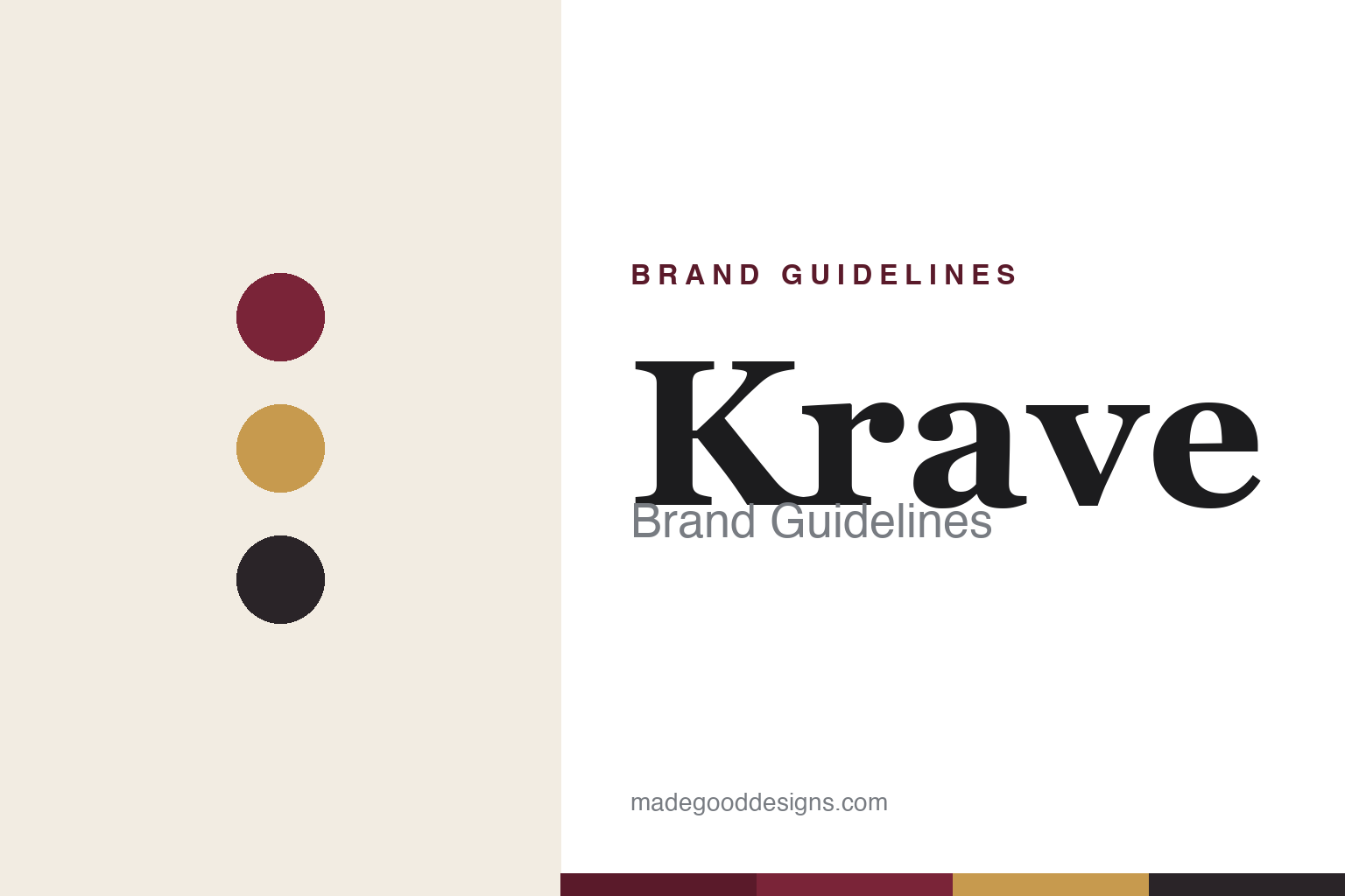
Krave Brand Guidelines
Snack food doesn’t have to be junk food.
Aa
Two constants: a gourmet burgundy-and-gold palette and a refined serif wordmark. Abstract homage — not the Krave wordmark or packaging.
The gourmet jerky that came home
Krave was sold to Hershey — then bought back by its founder.
Krave is a lesson in a brand’s round trip. Founded in 2009 by Jon Sebastiani — of the Sonoma Sebastiani wine family — it led the “jerky renaissance,” turning a gas-station snack into a premium, gourmet product with a wine-country sensibility and sophisticated flavours (Chili Lime, Black Cherry Barbecue).
Its ownership story is the twist. Hershey acquired Krave in 2015 (reported at roughly $220–240 million), then, when it underperformed inside the confectionery giant, sold it back to founder Jon Sebastiani in 2020 via his incubator Sonoma Brands. Today Krave is independent again, part of a premium meat-snacks platform (Triple Peak Brands), still selling its upscale jerky.
(Honest notes: Krave is no longer a Hershey brand — Hershey divested it in 2020, selling it back to its founder; the acquisition price is reported, not officially disclosed, so we use a range; and its taglines have shifted across eras. No official brand hex is published.)
Colour
Krave lives in gourmet burgundy and gold. Click a swatch to copy the hex.
Krave’s identity is premium, gourmet and warm — a Krave burgundy, a gold, a charcoal, a cream, and an ink. The palette leans upscale: wine-country burgundy, warm gold and charcoal, signalling a culinary, elevated snack rather than a mass jerky. It says “snack food doesn’t have to be junk food.” The honest caveat: with no published brand hex, these tones are an original, unofficial interpretation, not first-party values.
The lesson is burgundy and gold read as gourmet. Krave’s world is wine country and the kitchen, not the gas station. For designers, it is a reminder that a warm, refined palette can reposition a humble category as premium — the colours do the elevating. The takeaways: choose a palette that signals the price tier you want; keep it warm and restrained; and treat any single hex as unofficial — using a deep burgundy for small text so the gold stays an accent.
Typography
The wordmark spirit is a refined serif — culinary and premium.
Krave’s identity carries a refined, culinary, premium spirit — a “KRAVE” wordmark with a small flame-like mark, styled for the gourmet shelf. A refined serif captures the mood: it is elegant and appetising, the register of a jerky born from a wine family and sold on flavour and craft. Set against burgundy and gold, the serif feels upscale and considered — exactly the gourmet personality Krave carries. It is culinary rather than rugged, mirroring a snack that wants to sit beside good food. (Krave’s real wordmark and packaging are trademarks and trade dress we describe but do not reproduce, and the exact typeface is not published, so we don’t assert it.) Because the specific mark is not ours to use, the honest description is “a refined serif spirit,” not the Krave logo. The type behaves like the brand: elegant, culinary and premium.
Aa
A refined serif spirit — culinary and premium. (Specimen set in EB Garamond, a refined serif; NOT the Krave logo, which is a trademark.)
When a founder buys the brand back
Krave stands for gourmet — and independence regained.
Krave is a lesson in the value of a founder’s vision. It elevated jerky into a gourmet category, sold to a giant, and then — rare in consumer goods — was bought back by its founder when the fit didn’t work. That round trip is itself the brand’s story: a premium identity that made more sense in founder hands than inside a confectionery conglomerate. The differentiator is a clear premium positioning tied to a founder’s taste.
For designers and brand-builders, Krave offers a clear takeaway: positioning and ownership have to fit. The lessons: a premium look (burgundy, gold, refined serif) can reposition a humble category; but a brand’s identity thrives when its stewardship matches its vision; and honesty about a brand’s corporate journey is part of its story. It is also a reminder to stay accurate: Krave is independent again under Sonoma Brands (not Hershey), and the acquisition price is reported, not disclosed — with the palette here an unofficial interpretation. Krave came home — proof that fit can be the difference.
Explore & save
Keep Krave’s identity on hand — save it to a board in the Made Good inspiration library.
Krave identity set
Pin the gourmet burgundy-and-gold palette and the refined-serif spirit to your own board.

