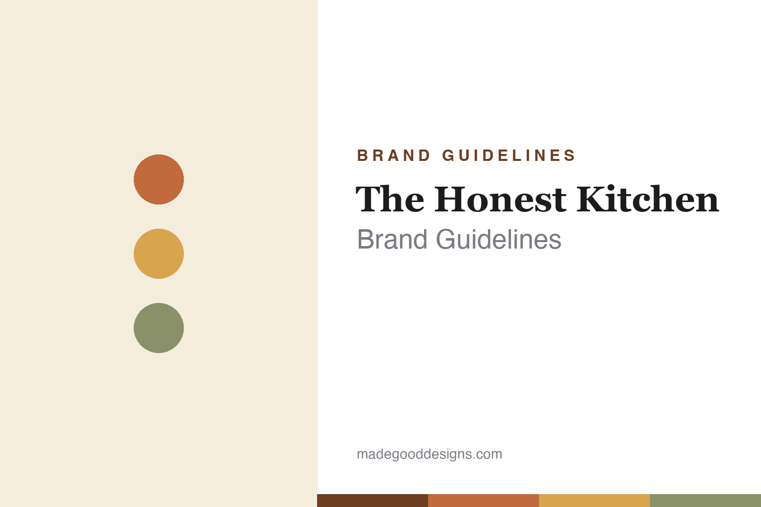
The Honest Kitchen Brand Guidelines
Feed them the best.
Aa
Two constants: a wholesome warm palette and a homey slab wordmark. Abstract homage — not The Honest Kitchen wordmark or packaging.
The human-grade pioneer
The Honest Kitchen invented human-grade pet food.
The Honest Kitchen is a lesson in creating a standard, then defending it. Founded in 2002 in San Diego by Lucy Postins (who first made the food for her own dog), it pioneered human-grade, dehydrated pet food — minimally processed, whole-food recipes you rehydrate with warm water, made in a human-food facility. It is, by its own and widely-credited account, the first human-grade pet food brand.
That claim was hard-won. When challenged, The Honest Kitchen won a 2007 legal case (against the Ohio Department of Agriculture), prompting the FDA’s first “Letter of No Objection” that allowed the “human grade” label claim on pet food. Its design is wholesome and homey — warm tones, real whole-food photography (“food, not feed”) — under the line “Feed them the best.”
(Honest notes: The Honest Kitchen is founder-led and privately held, having taken a 2022 minority investment (Monarch Alternative Capital) — not an acquisition or sale; Lucy Postins now serves as Chief Integrity Officer (a professional CEO runs operations); and “human grade” is a regulated term, not a Honest Kitchen trademark. No official brand hex is published.)
Colour
The Honest Kitchen lives in wholesome warm tones. Click a swatch to copy the hex.
The Honest Kitchen’s identity is wholesome, warm and homey — a terracotta, a warm gold, a sage, a cream, and an ink. The palette is kitchen and pantry: warm terracottas and golds softened by sage and cream, with real whole-food photography. It signals honest, minimally-processed, human-grade food — “food, not feed.” The honest caveat: with no published brand hex, these tones are an original, unofficial interpretation, not first-party values.
The lesson is warm, homey colour signals real food. The Honest Kitchen’s world is a home kitchen. For designers, it is a reminder that warm, pantry-like tones plus recognisable whole-food imagery can communicate “food you could eat yourself,” matching a human-grade promise. The takeaways: use warm, kitchen-derived tones; show recognisable whole ingredients; and treat any single hex as unofficial — using a deep terracotta-brown for small text so the warm tones stay wholesome.
Typography
The wordmark spirit is a homey slab — wholesome and honest.
The Honest Kitchen’s identity carries a wholesome, honest, homey spirit — a “The Honest Kitchen” wordmark over warm, whole-food imagery. A sturdy, homey slab serif captures the mood: it is warm and trustworthy, the register of a founder-led pioneer that made pet food you could technically eat. Set against terracotta and cream, the slab type feels honest and kitchen-warm — exactly the human-grade, whole-food personality it carries. It is homey rather than clinical, mirroring food made in a real kitchen. (The Honest Kitchen’s real wordmark and packaging are trademarks and trade dress we describe but do not reproduce, and the exact typeface is not published, so we don’t assert it.) Because the specific mark is not ours to use, the honest description is “a homey slab spirit,” not the logo. The type behaves like the brand: wholesome, honest and warm.
Aa
A homey slab spirit — wholesome and honest. (Specimen set in Zilla Slab, a slab serif; NOT The Honest Kitchen logo, which is a trademark.)
Pioneering a standard
The Honest Kitchen stands for human-grade.
The Honest Kitchen is a lesson in owning a category you created. It didn’t just make premium food; it pioneered “human-grade” pet food and then fought — and won — the legal battle to say so on the label, prompting the FDA’s first Letter of No Objection. Being first, and defending the standard, is the brand’s deepest equity, dressed in wholesome, honest design. The differentiator is genuine pioneer status.
For designers and brand-builders, The Honest Kitchen offers a clear takeaway: pioneering a standard is a durable story. The lessons: if you created a category, tell that origin clearly; back a claim (human-grade) with real proof (a facility, a legal win); and dress it in design that embodies the promise (kitchen-warm, whole-food). It is also a reminder to stay accurate: it is founder-led with a 2022 minority investment (not sold), and “human grade” is a regulated term it pioneered the use of — with the palette here an unofficial interpretation. The Honest Kitchen was first — proof that pioneering can be the difference.
Explore & save
Keep The Honest Kitchen’s identity on hand — save it to a board in the Made Good inspiration library.
The Honest Kitchen identity set
Pin the wholesome-warm palette and the homey-slab spirit to your own board.