GoMacro Brand Guidelines
Trust what you eat, love how you feel.
Aa
Two constants: a bright mosaic palette and a rounded wordmark. Abstract homage — not the GoMacro wordmark or mosaic art.
A macrobiotic bar, family-made
GoMacro grew from a kitchen and stayed independent.
GoMacro is a lesson in values-led independence. Founded in 2004 by mother-and-daughter Amelia Kirchoff and Jola Sonkin on a family farm in Viola, Wisconsin, it grew from Amelia’s macrobiotic diet during her breast-cancer recovery into the vegan “MacroBar.” Rare among its peers, it remains family- and women-owned and independent — no private equity, no buyer.
Its bars are organic, plant-based, gluten-free and non-GMO, wrapped in a wellness-and-giving-back ethos (“The GoMacro Way”). And its design is distinctive: a 2020 refresh brought bold per-flavour colour, and its packaging is built around a signature mosaic motif — bright, tiled, and cohesive across the range — under the line “Trust what you eat, love how you feel.”
(Honest notes: the name comes from macrobiotic, not fitness “macros”; GoMacro is genuinely independent and family/women-owned (no outside investment); and it was founded in 2004. No official brand hex is published.)
Colour
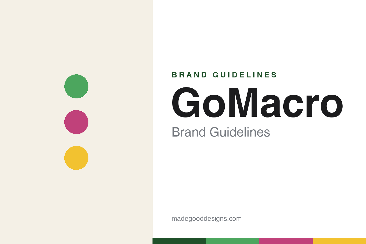
GoMacro lives in a bright mosaic palette. Click a swatch to copy the hex.
GoMacro’s identity is bright, colourful and wholesome — a GoMacro green, a berry, a sunny yellow, a cream, and an ink. The palette is vivid and per-flavour, expressed through a signature mosaic tile motif that makes the range feel joyful and cohesive. It signals plant-based, wholesome, feel-good food. The honest caveat: with no published brand hex, these tones are an original, unofficial interpretation, not first-party values.
The lesson is a signature motif unifies a colourful range. GoMacro’s world is a bright mosaic. For designers, it is a reminder that a distinctive graphic device (the mosaic) plus per-flavour colour can make a wide range feel both varied and unmistakably one brand. The takeaways: pick a signature motif; use bright per-flavour colour within it; and treat any single hex as unofficial — using a deep green for small text so the mosaic colours stay bright.
Typography
The wordmark spirit is a rounded sans — friendly and wholesome.
GoMacro’s identity carries a friendly, wholesome, values-led spirit — a “GoMacro” wordmark over bright, mosaic-patterned packaging. A soft rounded sans captures the mood: it is warm and approachable, the register of a family-run, plant-based brand with a giving-back ethos. Set against a bright mosaic palette, the rounded type feels cheerful and wholesome — exactly the feel-good personality GoMacro carries. It is friendly rather than clinical, mirroring a bar made with a mission. (GoMacro’s real wordmark and mosaic packaging are trademarks and trade dress we describe but do not reproduce, and the exact typeface is not published, so we don’t assert it.) Because the specific mark is not ours to use, the honest description is “a rounded sans spirit,” not the GoMacro logo. The type behaves like the brand: friendly, wholesome and warm.
Aa
A rounded sans spirit — friendly and wholesome. (Specimen set in Quicksand, a rounded sans; NOT the GoMacro logo, which is a trademark.)
Independence as identity
GoMacro stands for staying itself.
GoMacro is a lesson in keeping control of the story. In an aisle where nearly every peer has taken capital or been acquired, GoMacro stayed family- and women-owned and independent — and let its values (plant-based, giving back, a macrobiotic origin) shape a joyful, mosaic-patterned identity. Independence isn’t just ownership; it shows up in the freedom to be distinctive. The differentiator is authentic, independent, values-led design.
For designers and brand-builders, GoMacro offers a clear takeaway: values and independence can power a distinctive look. The lessons: let a genuine origin (macrobiotic, family farm) inform the brand; build a signature motif (the mosaic) that stays consistent; and use bright colour to express optimism. It is also a reminder to stay accurate: GoMacro is independent and family/women-owned, founded 2004, and its name is macrobiotic — with the palette here an unofficial interpretation. GoMacro stayed itself — proof that independence can be the difference.
Explore & save
Keep GoMacro’s identity on hand — save it to a board in the Made Good inspiration library.
GoMacro identity set
Pin the bright mosaic palette and the rounded-sans spirit to your own board.