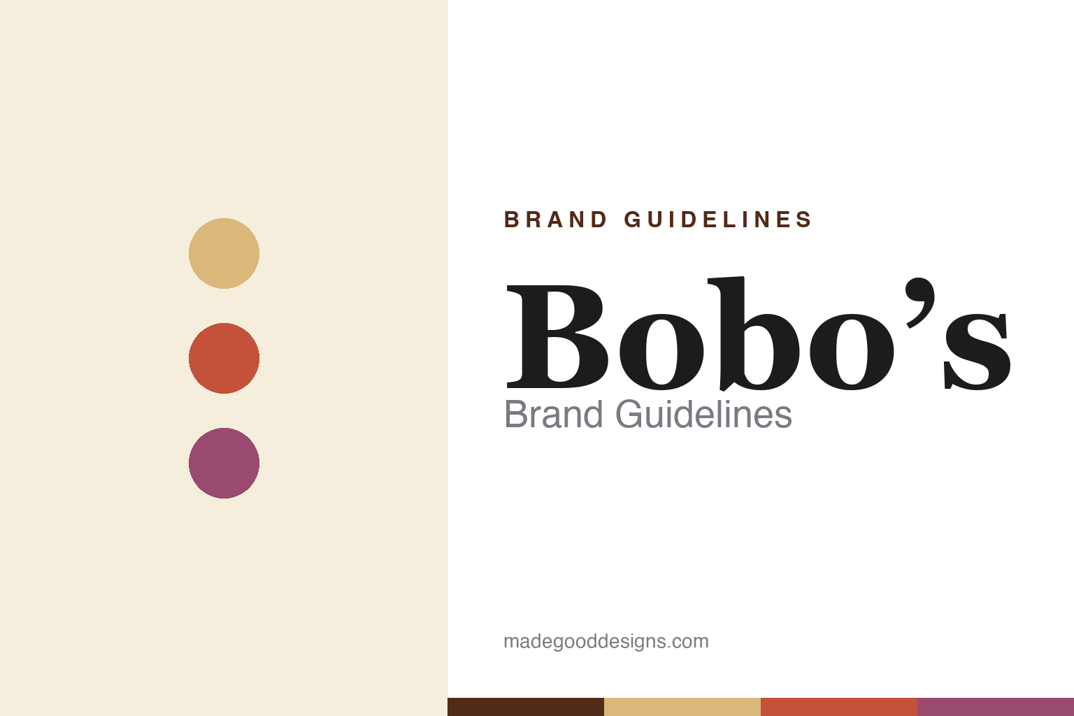
Bobo’s Brand Guidelines
Baked from the heart.
Aa
Two constants: a homey warm palette and a homey slab wordmark. Abstract homage — not the Bobo’s wordmark, heart mark or packaging.
Baked from the heart
Bobo’s turned a home recipe into a wholesome brand.
Bobo’s is a lesson in homemade warmth as a brand. Founded in 2003 in Boulder, Colorado by Beryl Stafford and her daughter — nicknamed “Bobo” — from a home-kitchen recipe, it built a wholesome, handmade-style whole-grain oat-bar brand (plus oat bites, stuffed bars and fig bars). Its whole feel is homemade: soft, hearty, simple.
The design leans fully into that warmth — a homey, handmade aesthetic with a signature heart motif and the line “Baked from the heart.” A recent refresh modernised the look while keeping it warm and approachable, the opposite of a sleek, clinical protein bar.
(Honest notes: the daughter nicknamed “Bobo” is Alex Stafford (a later CEO, T.J. McIntyre, is unrelated to the name); Bobo’s is founder-led but venture-backed (it has raised outside capital and reportedly explored a sale in 2023, with no completed deal), so it isn’t purely independent; and it was founded in 2003. No official brand hex is published.)
Colour
Bobo’s lives in homey, warm tones. Click a swatch to copy the hex.
Bobo’s identity is homey, warm and handmade — an oat tan, a warm red, a berry, a cream, and an ink. The palette is a kitchen: oaty tans, warm reds and berry tones, with a heart motif. It signals homemade, wholesome, made-with-love baking rather than engineered nutrition. The honest caveat: with no published brand hex, these tones are an original, unofficial interpretation, not first-party values.
The lesson is warm, homey colour signals handmade. Bobo’s world is a home kitchen. For designers, it is a reminder that warm, oaty tones plus a heart motif can communicate “baked with love,” a deliberate contrast to sleek or clinical snack design. The takeaways: use warm, kitchen-derived tones; add a genuine emotional motif (the heart); and treat any single hex as unofficial — using a warm brown for small text so the tones stay homey.
Typography
The wordmark spirit is a homey slab — warm and handmade.
Bobo’s identity carries a warm, homey, handmade spirit — a friendly “Bobo’s” wordmark with a heart motif on wholesome packaging. A homey slab serif captures the mood: it is warm and approachable, the register of a brand born in a home kitchen and “baked from the heart.” Set against oaty tans and warm reds, the slab type feels handmade and comforting — exactly the wholesome personality Bobo’s carries. It is homey rather than sleek, mirroring a bar that tastes homemade. (Bobo’s real wordmark, the heart motif and packaging are trademarks and trade dress we describe but do not reproduce, and the exact typeface is not published, so we don’t assert it.) Because the specific mark is not ours to use, the honest description is “a homey slab spirit,” not the Bobo’s logo. The type behaves like the brand: warm, homey and handmade.
Aa
A homey slab spirit — warm and handmade. (Specimen set in Bitter, a slab serif; NOT the Bobo’s logo, which is a trademark.)
Homemade warmth against sleek nutrition
Bobo’s stands for made with love.
Bobo’s is a lesson in emotional warmth as differentiation. As the bar aisle filled with sleek, clinical, high-protein design, Bobo’s went the other way — homemade, warm, heart-on-the-wrapper — leaning on a real home-kitchen origin and a “baked from the heart” promise. That warmth is its whole positioning: comfort, not optimisation. The differentiator is genuine, homemade emotional appeal.
For designers and brand-builders, Bobo’s offers a clear takeaway: warmth can be a counter-position. The lessons: when the category goes clinical, go homey; use a real origin (a home kitchen, a daughter’s nickname) and an emotional motif (the heart); and keep the palette warm. It is also a reminder to stay accurate: Bobo’s is founder-led but venture-backed (and explored a sale in 2023), founded 2003, with “Bobo” being Alex Stafford — with the palette here an unofficial interpretation. Bobo’s baked from the heart — proof that warmth can be the difference.
Explore & save
Keep Bobo’s’s identity on hand — save it to a board in the Made Good inspiration library.
Bobo’s identity set
Pin the homey-warm palette and the homey-slab spirit to your own board.