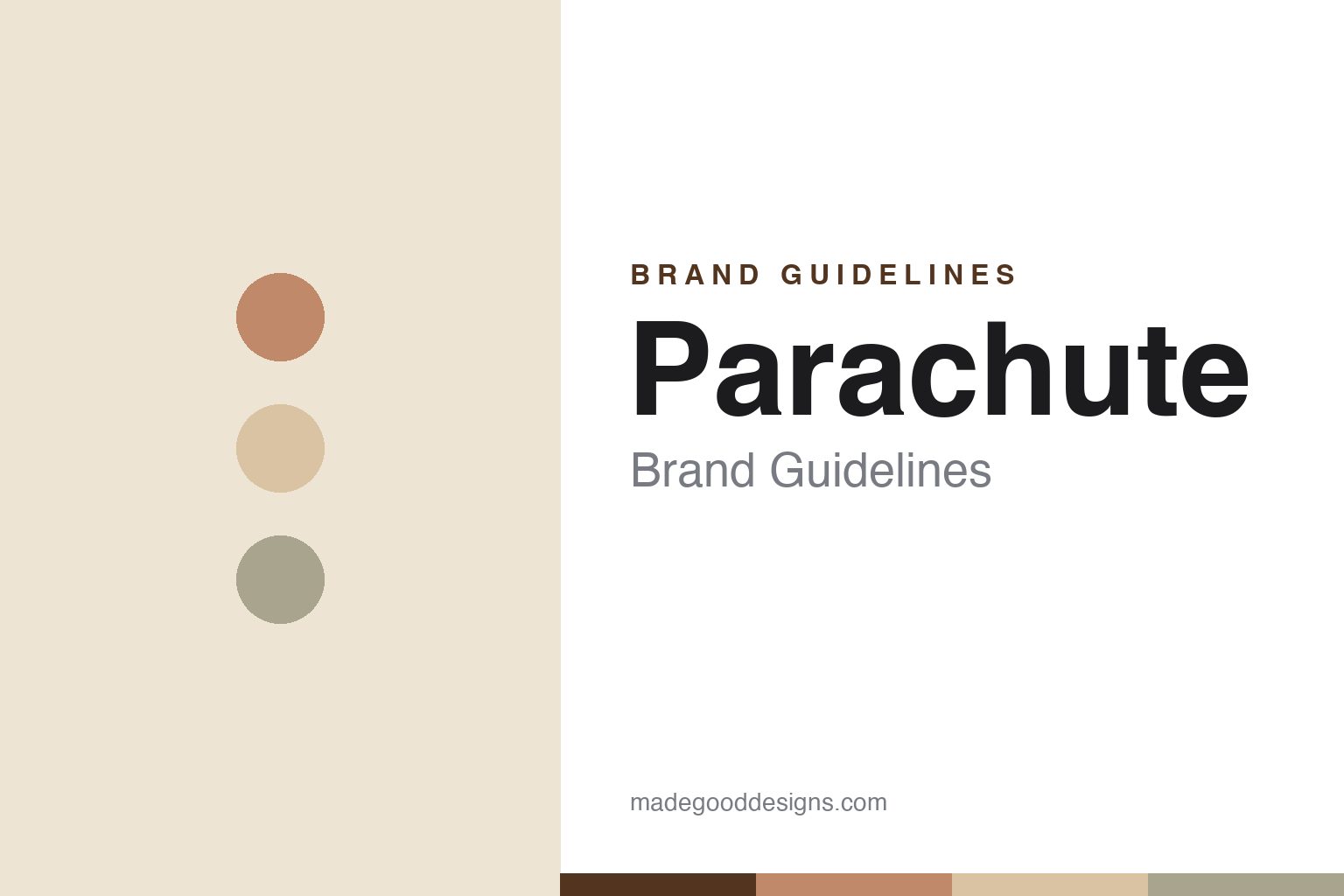
Parachute Brand Guidelines
Perfectly undone.
Aa
Two constants: a warm neutral palette and a clean, understated wordmark. Abstract homage — not the Parachute wordmark.
Better than luxury bedding
Parachute made premium home essentials feel effortless.
Parachute is a lesson in a warm, effortless take on premium. Founded in 2014 by Ariel Kaye in Los Angeles — after great sheets on the Amalfi Coast — it built a direct-to-consumer premium home brand on European-milled textiles, deliberately rejecting confusing thread-count marketing. Its signature Venice sheets come in percale, sateen and linen, and the line has grown into bath, décor, baby and more.
The identity is warm, minimalist and Californian — a neutral palette, airy sun-washed photography, and the guiding idea that a bed should look “perfectly undone,” lived-in rather than fussy. Parachute was also an early DTC-to-retail mover, opening physical stores from 2016.
(Honest notes: Parachute is private and independent (not acquired), venture-backed, and reached profitability in 2024; it is a mid-sized brand (peak revenue around $150 million in 2021), not a giant, and its 2022 push into furniture was largely rolled back. Founder Ariel Kaye still leads it. Its bedding is made in a family-owned mill in Portugal. No official brand hex is published.)
Colour
Parachute lives in warm neutrals. Click a swatch to copy the hex.
Parachute’s identity is warm, natural and undone — a clay, a warm sand, a greige, a bone, and an ink. The palette is a soft foundation of whites, creams and bone with clay and terracotta earth accents and the occasional deep “Ink.” It signals relaxed, sun-washed, Californian comfort rather than crisp hotel formality. The honest caveat: with no published brand hex, these tones are an original, unofficial interpretation, not first-party values.
The lesson is warm neutrals feel lived-in. Parachute’s world is a sunlit, rumpled bed. For designers, it is a reminder that soft, warm neutrals and airy photography can make “premium” feel effortless and human — “perfectly undone” rather than staged. The takeaways: build on a warm-neutral foundation; let a little clay or terracotta warm it; and treat any single hex as unofficial — using a deep clay-brown for small text so the neutrals stay warm.
Typography
The wordmark spirit is a clean geometric sans — understated and warm.
Parachute’s identity carries an understated, warm, effortless spirit — a clean, quiet wordmark over sun-washed home photography. A clean geometric sans captures the mood: it is calm and modern without shouting, the register of a brand that wants the room, not the logo, to be the hero. Set against warm neutrals, the clean type feels relaxed and premium — exactly the “perfectly undone” personality Parachute carries. It is quiet rather than decorative, mirroring bedding meant to be lived in. (Parachute’s real wordmark is a trademark and trade dress we describe but do not reproduce, and the exact typeface is not published, so we don’t assert it.) Because the specific mark is not ours to use, the honest description is “a clean geometric spirit,” not the Parachute logo. The type behaves like the brand: understated, warm and calm.
Aa
A clean geometric spirit — understated and warm. (Specimen set in Jost, a geometric sans; NOT the Parachute logo, which is a trademark.)
Effortless as a position
Parachute stands for warm, undone comfort.
Parachute is a lesson in owning a feeling, not a spec. Bedding is usually sold on thread counts; Parachute sold a feeling — warm, sun-washed, effortlessly undone — and built a whole home brand around it, from a warm-neutral palette to airy photography to physical stores you could sink into. The design communicates comfort before it communicates quality. The differentiator is an effortless, warm aesthetic.
For designers and brand-builders, Parachute offers a clear takeaway: sell the feeling of the room. The lessons: replace spec-marketing with a mood (“perfectly undone”); build on warm neutrals so the product feels lived-in; and translate the aesthetic into real spaces (stores) when you can. It is also a reminder to stay accurate: Parachute is private, independent and profitable-since-2024 but mid-sized, and its furniture experiment was rolled back — with the palette here an unofficial interpretation. Parachute made premium feel effortless — proof that a feeling can be a position.
Explore & save
Keep Parachute’s identity on hand — save it to a board in the Made Good inspiration library.
Parachute identity set
Pin the warm-neutral palette and the clean-geometric spirit to your own board.


