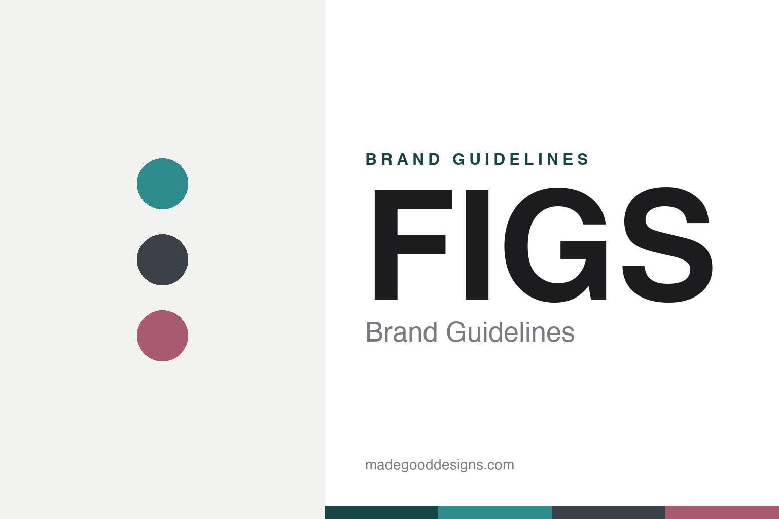
FIGS Brand Guidelines
For Awesome Humans.
Aa
Two constants: a colour-forward palette and a bold all-caps wordmark. Abstract homage — not the FIGS wordmark.
Scrubs, reinvented
FIGS made healthcare uniforms premium.
FIGS is a lesson in bringing fashion to a forgotten uniform. Founded in 2013 by Heather Hasson and Trina Spear in the Los Angeles area, it looked at frumpy, boxy medical scrubs and asked why healthcare workers didn’t get the technical, stylish apparel that athletes did. The answer was FIGS: premium scrubs in proprietary FIONx fabric, sold direct-to-professional, with signature styles like the Zamora jogger.
The brand made colour its signature — a wide, rotating seasonal palette applied to the scrubs themselves — and built a community identity around “Awesome Humans,” its term for healthcare workers, with slick editorial photography of real professionals. It treated a uniform like a lifestyle brand.
(Honest notes: FIGS is a public company (NYSE: FIGS) — its 2021 IPO was the first led by two female co-founders on the NYSE — but the stock fell sharply afterward and margins are thin. The founders are no longer co-CEOs: since 2023, Trina Spear is sole CEO and Heather Hasson is Executive Chairman. A 2020 marketing video drew criticism from osteopathic physicians; FIGS apologised and pledged $100,000 to the AOA. No official brand hex is published.)
Colour
FIGS lives in a colour-forward palette. Click a swatch to copy the hex.
FIGS’ identity is bold, colourful and confident — a teal, a graphite, a mauve, an off-white, and an ink. The brand is deliberately colour-forward: its identity lives in a wide, rotating range of scrub colourways (graphites, mosses, mauves, burgundies) rather than one fixed brand colour. It signals premium, modern, expressive apparel rather than institutional white. The honest caveat: with no published brand hex, these tones are an original, unofficial interpretation, not first-party values.
The lesson is colour can be the product story. FIGS’ world is a spectrum of confident colourways. For designers, it is a reminder that when the product is the colour, the brand should stay bold but flexible — a strong wordmark and consistent photography holding a deliberately shifting palette together. The takeaways: let the product carry a wide, seasonal colour range; anchor it with a bold, consistent wordmark and photography; and treat any single hex as unofficial — using a deep teal for small text so the colourways stay bold.
Typography
The wordmark spirit is a bold all-caps sans — confident and modern.
FIGS’ identity carries a bold, confident, modern spirit — an all-caps “FIGS” wordmark over colourful, fashion-forward photography of healthcare workers. A bold grotesque sans captures the mood: it is strong and contemporary, the register of a brand that treats scrubs like performance apparel. Set against a colour-forward palette, the bold type feels premium and energetic — exactly the “Awesome Humans” personality FIGS carries. It is assertive rather than institutional, mirroring apparel designed to be seen. (FIGS’ real all-caps wordmark is a trademark and trade dress we describe but do not reproduce, and the exact typeface is not published, so we don’t assert it.) Because the specific mark is not ours to use, the honest description is “a bold all-caps spirit,” not the FIGS logo. The type behaves like the brand: bold, confident and modern.
Aa
A bold all-caps spirit — confident and modern. (Specimen set in Archivo, a bold grotesque sans; NOT the FIGS logo, which is a trademark.)
A uniform, treated like fashion
FIGS stands for Awesome Humans.
FIGS is a lesson in applying lifestyle-brand thinking to a uniform. It took scrubs — purely functional, bought without thought — and made them premium, colourful, and community-defining, selling directly to healthcare workers it celebrated as “Awesome Humans.” The design turned a commodity into an identity people were proud to wear. The differentiator is fashion-brand treatment of a professional uniform.
For designers and brand-builders, FIGS offers a clear takeaway: treat any category’s customers like a community worth designing for. The lessons: make colour the product story with a wide, confident range; anchor it with a bold wordmark and consistent editorial photography; and build a genuine community identity (“Awesome Humans”). It is also a reminder to stay accurate: FIGS is public with a sharply fallen stock and thin margins, its founders are no longer co-CEOs (Spear is sole CEO since 2023), and a 2020 ad drew criticism it apologised for — with the palette here an unofficial interpretation. FIGS dressed the Awesome Humans — proof that community can be the difference.
Explore & save
Keep FIGS’s identity on hand — save it to a board in the Made Good inspiration library.
FIGS identity set
Pin the colour-forward palette and the bold-all-caps spirit to your own board.


