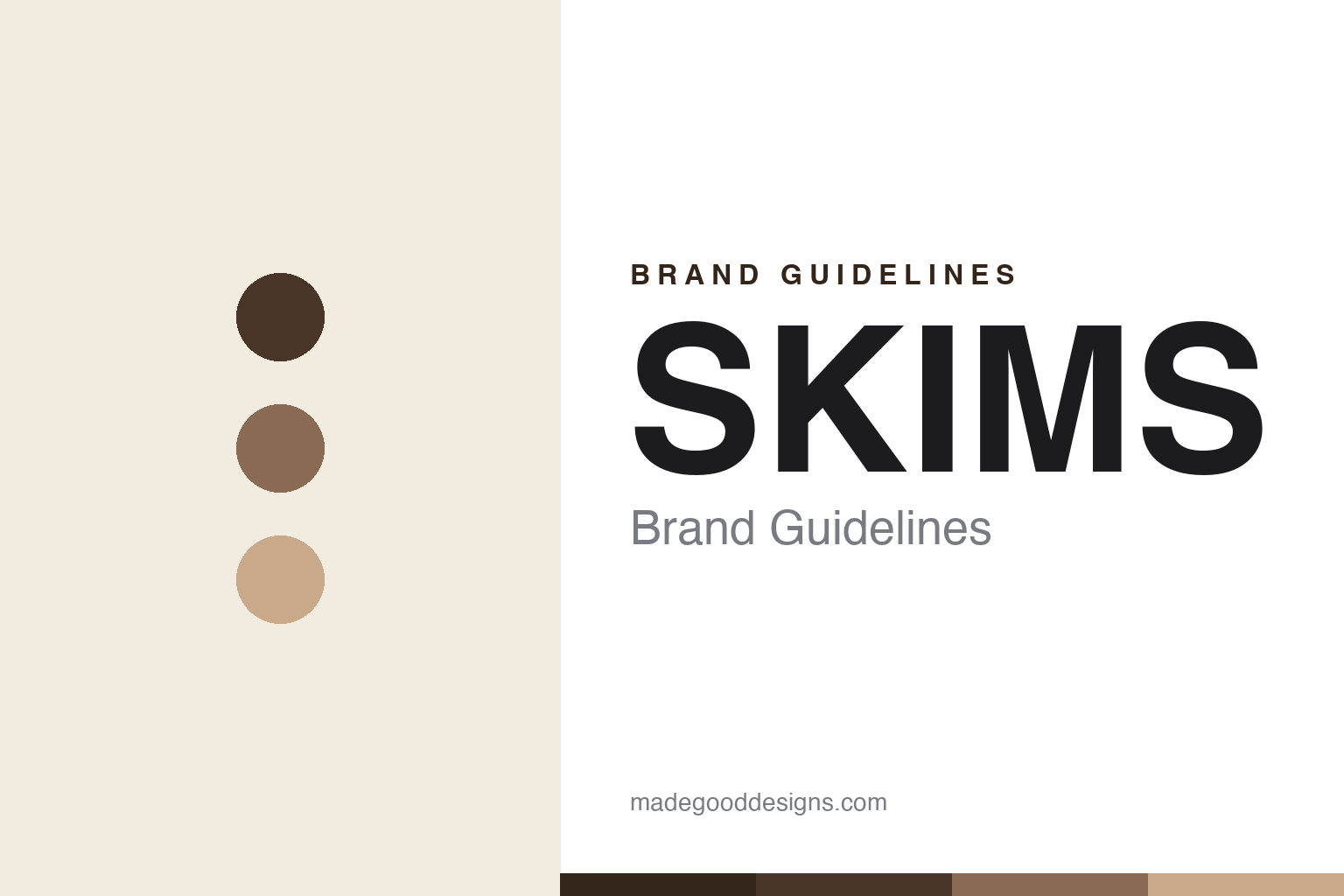
SKIMS Brand Guidelines
Solutions for every body.
Aa
Two constants: a nude-tone spectrum palette and a clean geometric wordmark. Abstract homage — not the SKIMS wordmark.
A shade for every body
SKIMS made inclusive nude tones its whole identity.
SKIMS is a lesson in an inclusive palette as a brand. Founded in 2019 by Kim Kardashian with Jens and Emma Grede, it reinvented shapewear (“solutionwear”) around one idea competitors had ignored: a full spectrum of skin-tone “nude” shades and an inclusive size range, so “nude” finally meant everyone.
The design is disciplined and minimalist — a palette of skin tones from bone to clay to deep brown, a clean all-caps “SKIMS” wordmark in warm neutral, and sleek editorial photography. It grew fast into loungewear, underwear, swim and menswear, and landed marquee partnerships (the NBA/WNBA, Team USA, and a co-branded NikeSKIMS).
(Honest notes: Kim Kardashian is co-founder and creative face, but the Gredes operate the company — Jens as CEO, Emma as chief product officer. It launched controversially as “Kimono” before renaming after backlash. It is private, reported around a $5 billion valuation in 2025 and expected to cross $1 billion in sales — figures we attribute to reporting, not audited disclosures. No official brand hex is published.)
Colour
SKIMS lives in a nude-tone spectrum. Click a swatch to copy the hex.
SKIMS’ identity is neutral, warm and inclusive — an espresso, a cocoa, a clay, a bone, and an ink. The palette is literally a range of skin tones, from bone and sand to clay, cocoa and deep espresso-brown, chosen to represent many complexions rather than one “nude.” It signals inclusivity, calm and modern minimalism. The honest caveat: with no published brand hex, these tones are an original, unofficial interpretation, not first-party values.
The lesson is an inclusive palette can be the product. SKIMS’ world is a full skin-tone spectrum. For designers, it is a reminder that expanding “nude” into a considered range of complexions is both an ethical choice and an ownable brand signature — the palette does the positioning. The takeaways: build the palette from real skin tones, not one default; keep everything else minimal so the range leads; and treat any single hex as unofficial — using a deep espresso for small text so the neutrals stay warm.
Typography
The wordmark spirit is a clean geometric sans — modern and neutral.
SKIMS’ identity carries a modern, neutral, confident spirit — an all-caps “SKIMS” wordmark in warm taupe over minimal, editorial imagery. A clean geometric sans captures the mood: it is contemporary and understated, the register of a brand that lets the body and the shade range be the story. Set against nude tones, the clean type feels premium and inclusive — exactly the “solutions for every body” personality SKIMS carries. It is neutral rather than loud, mirroring a palette built to flatter everyone. (SKIMS’ real wordmark is a trademark and trade dress we describe but do not reproduce, and the exact typeface is not published, so we don’t assert it.) Because the specific mark is not ours to use, the honest description is “a clean geometric spirit,” not the SKIMS logo. The type behaves like the brand: modern, neutral and confident.
Aa
A clean geometric spirit — modern and neutral. (Specimen set in Sora, a geometric sans; NOT the SKIMS logo, which is a trademark.)
Inclusivity as design
SKIMS stands for solutions for every body.
SKIMS is a lesson in turning inclusivity into an ownable design system. Shapewear had long meant one beige; SKIMS made a spectrum of skin tones and sizes its defining feature, then wrapped it in disciplined minimalism so the range — not a logo — was the identity. Fame opened the door, but the palette kept people. The differentiator is an inclusive, considered nude spectrum.
For designers and brand-builders, SKIMS offers a clear takeaway: an inclusive palette can be the whole positioning. The lessons: redefine a category default (“nude”) as a real range; keep the surrounding system minimal so the range leads; and let a celebrity open the door while the design earns the stay. It is also a reminder to stay accurate: SKIMS is operated by the Gredes (not Kim alone), private, and valued by reporting rather than disclosure — with the palette here an unofficial interpretation. SKIMS made “nude” mean everyone — proof that inclusivity can be the design.
Explore & save
Keep SKIMS’s identity on hand — save it to a board in the Made Good inspiration library.
SKIMS identity set
Pin the nude-tone spectrum and the clean-geometric spirit to your own board.


