David Brand Guidelines
Protein, idealized.
Aa
Two constants: a metallic gold-and-bronze palette and a refined serif wordmark. Abstract homage — not the David wordmark, wrapper or macro block.
Protein, idealized
David won by saying almost nothing.
David is a lesson in restraint as strategy. Launched in September 2024 by Peter Rahal — co-founder of RXBAR, which sold to Kellogg for about $600 million — with Zach Ranen, it entered the protein-bar wars with a single, science-forward promise: the most protein per calorie. Its flagship “Gold” bar hits a headline 28g protein, 150 calories, 0g sugar.
Its whole aesthetic is anti-marketing: stark, minimalist, metallic gold and bronze wrappers (the tier names are the colours), a giant protein number, a lab-like macro block, and a name borrowed from Michelangelo’s David — “marble perfection.” Designed by studio Day Job, it looks more like a pharmaceutical or tech product than a snack.
(Honest notes: David is independent and VC-backed; its macros are enabled by EPG, a modified-fat ingredient — David acquired its sole maker (Epogee) in 2025, which prompted an antitrust lawsuit and ultra-processed-food criticism (worth stating factually); and the “28g” figure is the Gold bar specifically (a 20g “Bronze” also exists). No official brand hex is published.)
Colour
David lives in metallic gold and bronze. Click a swatch to copy the hex.
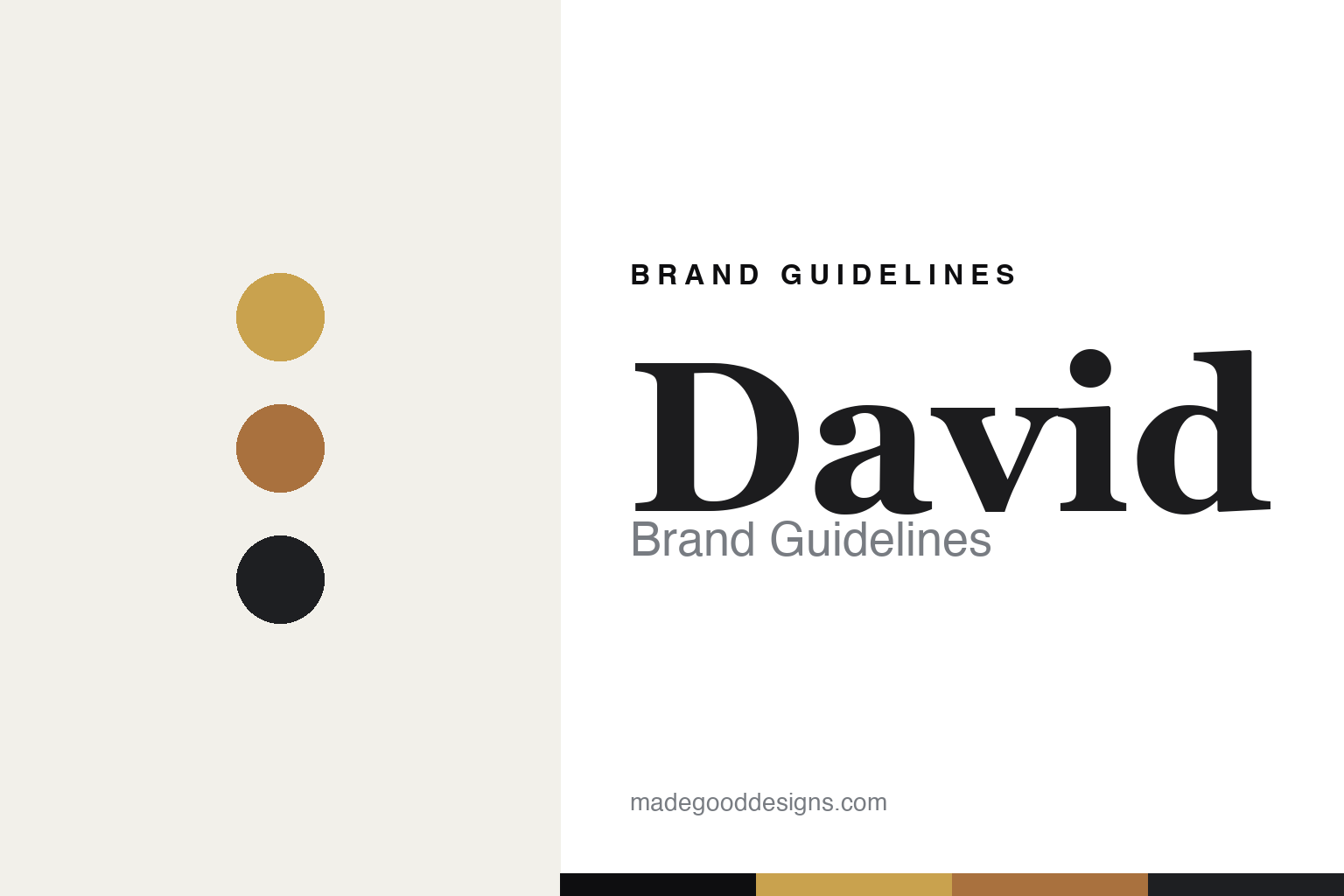
David’s identity is stark, metallic and minimal — a David gold, a bronze, a charcoal, an off-white, and an ink. The palette is almost entirely metallic gold and bronze on neutral — the wrapper tiers are the colour system — with black-white-grey elsewhere. It signals precision, engineering and premium restraint, the opposite of a loud protein bar. The honest caveat: with no published brand hex, these tones are an original, unofficial interpretation, not first-party values.
The lesson is metallic restraint reads as engineered and premium. David’s world is a spec sheet in gold foil. For designers, it is a reminder that stripping a category’s clutter — a metallic wrapper, a giant number, a lab-like macro block — can make a product feel scientific, confident and premium. The takeaways: reduce to essentials (one number, one metallic); let the wrapper finish carry the tier; and treat any single hex as unofficial — using a near-black for small text so the metallics stay the hero.
Typography
The wordmark spirit is a refined serif — precise and Renaissance.
David’s identity carries a precise, confident, Renaissance-clinical spirit — a refined serif “David” wordmark set against metallic minimalism and a mono-spaced macro block. A high-contrast serif captures the mood: it is elegant and deliberate, the register of a brand named for a Michelangelo sculpture and pitched on “marble perfection.” Set against gold and bronze, the refined serif feels premium and exacting — exactly the engineered, anti-marketing personality David carries. It is precise rather than loud, mirroring a product that says almost nothing. (David’s real wordmark, wrapper and macro block are trademarks and trade dress we describe but do not reproduce; its type pairs a refined serif with a grotesque and a monospace, which we note rather than assert as ours.) Because the specific mark is not ours to use, the honest description is “a refined serif spirit,” not the David logo. The type behaves like the brand: precise, elegant and exacting.
Aa
A refined serif spirit — precise and Renaissance. (Specimen set in Playfair Display, a high-contrast serif; NOT the David logo, which is a trademark.)
Anti-marketing as marketing
David stands for less.
David is a lesson in saying less to stand out. In a category shouting flavours and claims, David whispered — a stark metallic wrapper, one giant protein number, a Renaissance name — and that restraint became its loudest signal. The “anti-marketing” look reads as confidence and engineering, and it drove explosive early growth. The differentiator is disciplined minimalism in a noisy aisle.
For designers and brand-builders, David offers a clear takeaway: restraint can be the loudest choice. The lessons: reduce to a single hero fact (protein per calorie); use finish and typography (metallic, serif, mono) to signal premium and precision; and let the confidence of “less” do the talking. It is also a reminder to stay accurate and fair: David is VC-backed, its macros rely on the EPG modified-fat it now owns (a litigated, UPF-debated point), and 28g is the Gold bar — with the palette here an unofficial interpretation. David said less — proof that restraint can be the difference.
Explore & save
Keep David’s identity on hand — save it to a board in the Made Good inspiration library.
David identity set
Pin the metallic gold-and-bronze palette and the refined-serif spirit to your own board.