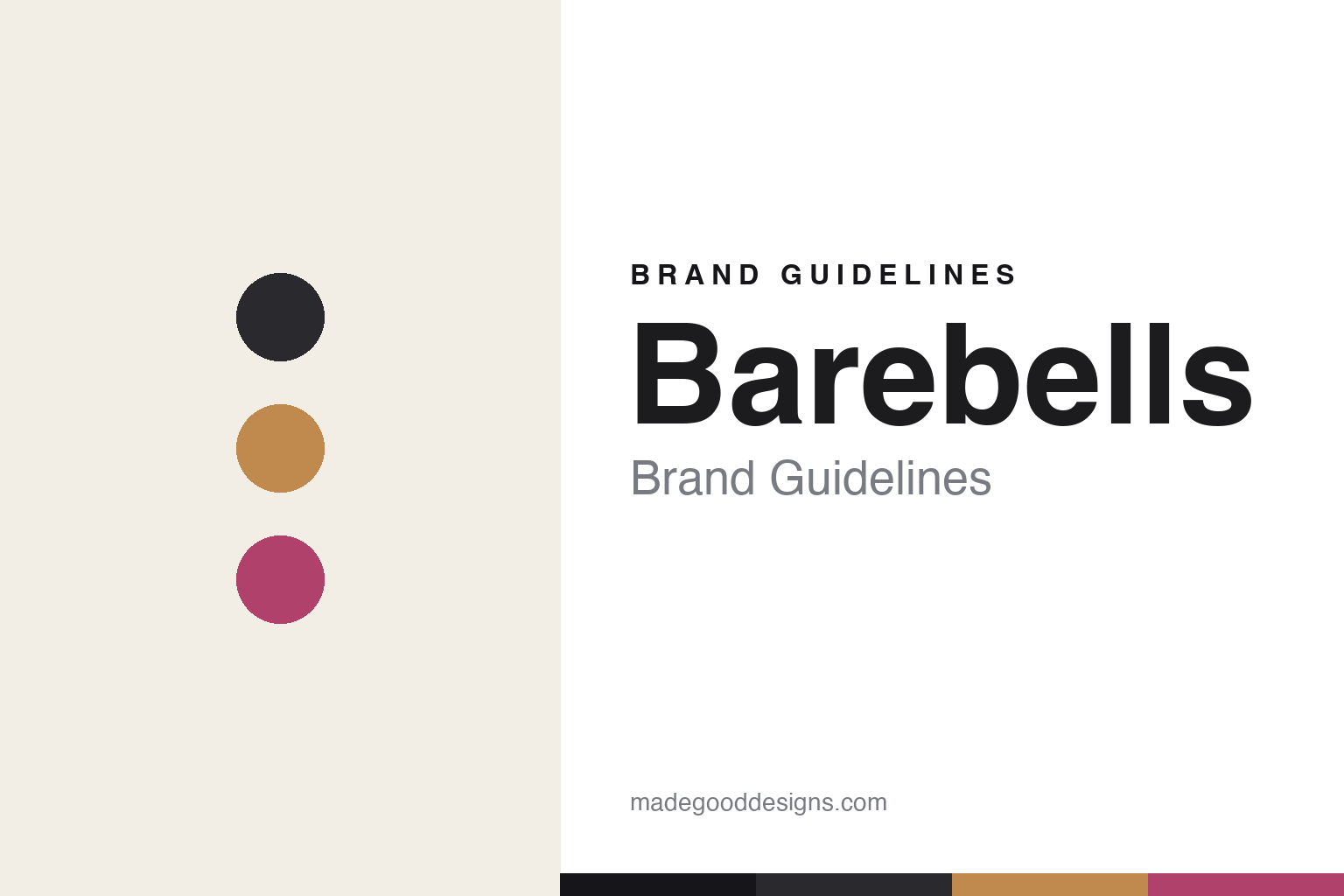
Barebells Brand Guidelines
Taste is what we do.
Aa
Two constants: a candy-bar colour system and a sleek sans wordmark. Abstract homage — not the Barebells wordmark or wrapper.
A protein bar that eats like candy
Barebells made protein taste like a chocolate bar.
Barebells is a lesson in reframing a functional product as a treat. A Swedish brand launched in 2016 and part of the Vitamin Well Group (the company behind Vitamin Well and NOCCO), it built its pitch on taste: a high-protein bar that eats like a chocolate/candy bar — chocolate coating, soft nougat and creamy fillings — but with no added sugar.
The design sells the treat. Barebells uses premium, candy-bar-inspired wrappers with strong per-flavour colour-blocking (Creamy Caramel, Cookies & Cream), a clean “Barebells” sans wordmark reversed out of each flavour’s colour, and a sleek Scandinavian minimalism. Its line spans bars, soft bars, milkshakes and protein sodas, under “Taste Is What We Do.”
(Honest notes: Barebells is Swedish (part of the PE-backed Vitamin Well Group), not an American startup; the “candy-like” claim is about taste and texture — it is high-protein and no-added-sugar, not a sugary confection; and its sister brand NOCCO is a separate energy drink, not Barebells. No official brand hex is published.)
Colour
Barebells lives in candy-bar colour-blocking. Click a swatch to copy the hex.
Barebells’ identity is premium, candy-coded and sleek — a charcoal, a caramel, a berry, a cream, and an ink. Each flavour owns a dominant colour block (like a chocolate-bar range), grounded by charcoal and cream. It signals indulgent-tasting-but-functional — a treat that happens to be high-protein. The honest caveat: with no published brand hex, these tones are an original, unofficial interpretation, not first-party values.
The lesson is candy-bar colour reframes a functional product. Barebells’ world looks like a premium chocolate-bar aisle. For designers, it is a reminder that borrowing the visual codes of an indulgent category (candy) can reposition a functional product (protein) as a treat — colour-blocking per flavour makes it feel like confectionery. The takeaways: borrow the target category’s codes; colour-block by flavour; and treat any single hex as unofficial — using charcoal for small text so the candy colours stay the field.
Typography
The wordmark spirit is a sleek sans — modern and Scandinavian.
Barebells’ identity carries a sleek, modern, Scandinavian spirit — a clean “Barebells” wordmark reversed out of a candy-coloured field. A sleek geometric sans captures the mood: it is minimal and premium, the register of a Swedish brand selling indulgence with discipline. Set against candy-bar colour-blocking, the sleek type feels modern and treat-like — exactly the tastes-like-candy personality Barebells carries. It is sleek rather than rustic, mirroring a premium chocolate-bar wrapper. (Barebells’ real wordmark and wrappers are trademarks and trade dress we describe but do not reproduce, and the exact typeface is not published, so we don’t assert it.) Because the specific mark is not ours to use, the honest description is “a sleek sans spirit,” not the Barebells logo. The type behaves like the brand: sleek, modern and premium.
Aa
A sleek sans spirit — modern and Scandinavian. (Specimen set in Outfit, a geometric sans; NOT the Barebells logo, which is a trademark.)
Selling function as indulgence
Barebells stands for the treat.
Barebells is a lesson in positioning by borrowing another category’s codes. A high-protein, no-added-sugar bar could look clinical; Barebells instead dressed it like premium candy — chocolate-bar colour-blocking, indulgent flavour names, sleek Scandinavian wrappers — so shoppers read “treat” first and “protein” second. The design reframes what the product is. The differentiator is indulgence codes on a functional product.
For designers and brand-builders, Barebells offers a clear takeaway: you can borrow the aesthetics of the category you want to feel like. The lessons: identify the emotional category you’re competing with (candy) and adopt its codes; colour-block by flavour for a confectionery feel; and keep the wordmark sleek to stay premium. It is also a reminder to stay accurate: Barebells is Swedish (Vitamin Well Group) and its “candy-like” claim is about taste, not sugar — with the palette here an unofficial interpretation. Barebells tasted like a treat — proof that borrowed codes can be the difference.
Explore & save
Keep Barebells’s identity on hand — save it to a board in the Made Good inspiration library.
Barebells identity set
Pin the candy-colour palette and the sleek-sans spirit to your own board.