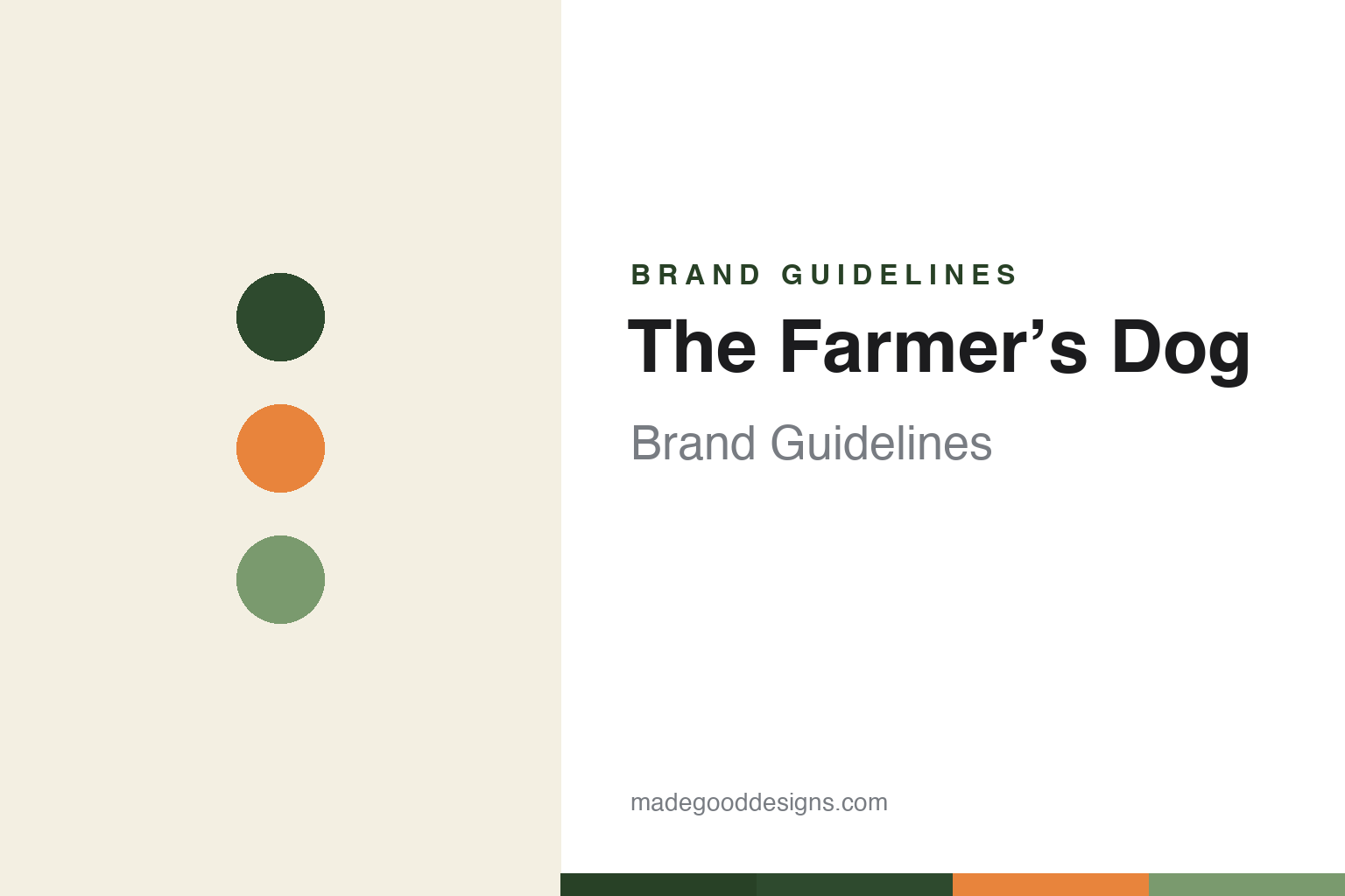
The Farmer’s Dog Brand Guidelines
Real food for dogs.
Aa
Two constants: a warm kale-and-carrot palette and a clean grotesque wordmark. Abstract homage — not The Farmer’s Dog wordmark, stamp mark or packaging.
Real food, delivered
The Farmer’s Dog made fresh the default alternative to kibble.
The Farmer’s Dog is a lesson in reframing a category with a promise. Founded in 2015 by Brett Podolsky and Jonathan Regev, it built the category-leading fresh, human-grade dog food business — gently cooked, pre-portioned to each dog, and delivered by subscription. By early 2025 it was running at roughly $1.2 billion in annualised revenue.
Its pitch is simple and emotional: “real food for dogs” — the anti-kibble alternative, developed with a board-certified nutritionist to AAFCO standards. Its design matches: clean, transparent, human-meal-kit packaging, and a warm, earthy palette its own brand guide names Kale, Carrot, Oat and Sage. A 2023 Super Bowl ad, “Forever,” (a dog and owner across a lifetime) topped the USA TODAY Ad Meter.
(Honest notes: it is gently cooked, not raw; it is founder-led but venture-backed (Insight, Forerunner, Shasta), privately held and not acquired — not bootstrapped; its palette is warm and earthy (kale/carrot/oat), not mint; and “human-grade” is a real regulated term, not an FDA endorsement. No official brand hex is published.)
Colour
The Farmer’s Dog lives in kale, carrot and oat. Click a swatch to copy the hex.
The Farmer’s Dog’s identity is warm, earthy and human-food — a kale green, a carrot orange, a sage, an oat cream, and an ink. Per the brand’s own guide, the palette is named for food — Kale (dark green), Carrot (orange), Oat (cream), Sage — so the pack reads like fresh human food, not pet feed. It signals real, wholesome, cooked-fresh food. The honest caveat: with no published brand hex, these tones are an original, unofficial interpretation, not first-party values.
The lesson is a food palette makes food feel real. The Farmer’s Dog’s world looks like a human meal kit. For designers, it is a reminder that borrowing the visual language of fresh human food (warm greens, carrot orange, cream) can reposition a category away from “feed” and toward “real food.” The takeaways: name and draw the palette from ingredients; keep packaging transparent and human-food-like; and treat any single hex as unofficial — using a deep kale for small text so the carrot stays a warm accent.
Typography
The wordmark spirit is a clean grotesque — modern and warm.
The Farmer’s Dog’s identity carries a modern, warm, human spirit — a clean wordmark and a hand-painted “stamp” mark, over honest, human-food-inspired packaging. A clean grotesque sans captures the mood: it is modern and trustworthy, the register of a brand selling real food and a lifelong bond. Set against kale and carrot, the clean type feels fresh and sincere — exactly the “real food for dogs” personality it carries. It is warm-modern rather than clinical, mirroring a human meal kit. (The Farmer’s Dog’s real wordmark, the stamp mark and packaging are trademarks and trade dress we describe but do not reproduce; its type is a Haas/Neue-Haas-Grotesk-style grotesque, which we note rather than claim as ours.) Because the specific mark is not ours to use, the honest description is “a clean grotesque spirit,” not the logo. The type behaves like the brand: modern, warm and sincere.
Aa
A clean grotesque spirit — modern and warm. (Specimen set in Hanken Grotesk, a clean grotesque; NOT The Farmer’s Dog logo, which is a trademark.)
Winning by looking like real food
The Farmer’s Dog stands for real food.
The Farmer’s Dog is a lesson in a promise made visible. It didn’t just claim “real food” — it looked like real food, borrowing the human-meal-kit aesthetic and an ingredient-named palette so the pack itself argued the point. Paired with an emotional health-and-bond message (the “Forever” ad), it made fresh the aspirational default. The differentiator is a promise the design embodies.
For designers and brand-builders, The Farmer’s Dog offers a clear takeaway: make the packaging prove the promise. The lessons: if you claim “real food,” design like real food (human-food cues, ingredient palette, transparency); pair it with an emotional message; and back claims with real credentials (a nutritionist, AAFCO). It is also a reminder to stay accurate: it is gently cooked (not raw) and founder-led-but-VC-backed — with the palette here an unofficial interpretation. The Farmer’s Dog looked like dinner — proof that design can carry a promise.
Explore & save
Keep The Farmer’s Dog’s identity on hand — save it to a board in the Made Good inspiration library.
The Farmer’s Dog identity set
Pin the kale-and-carrot palette and the clean-grotesque spirit to your own board.


