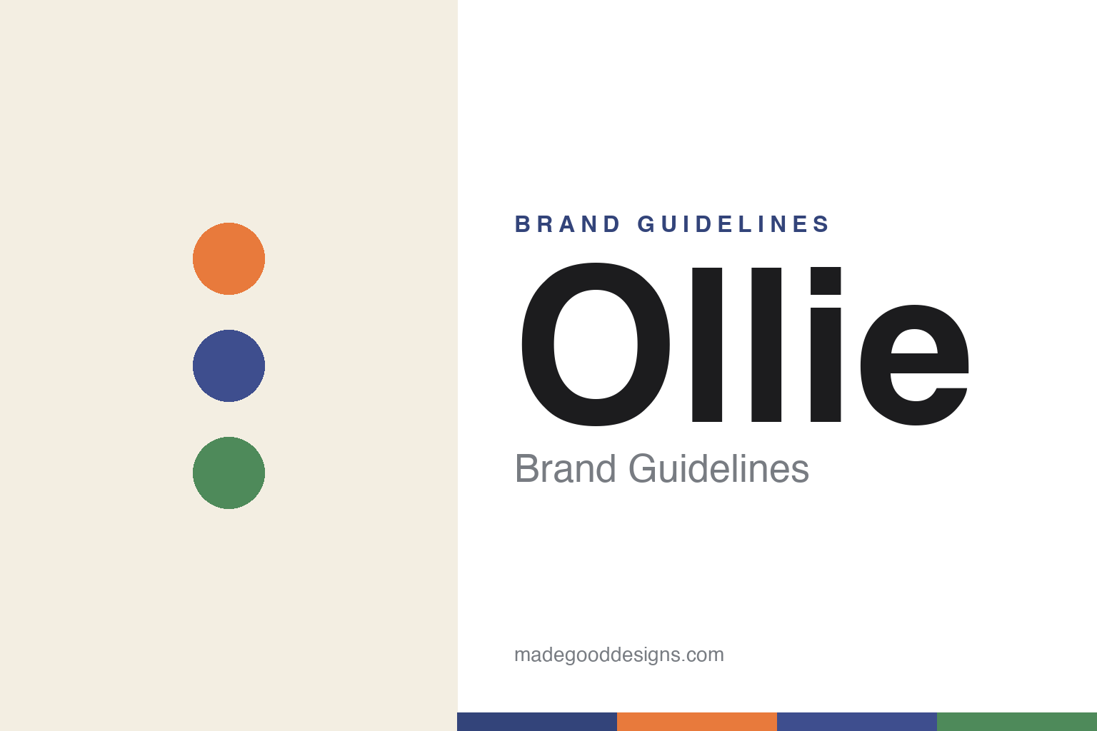
Ollie Brand Guidelines
Feed the obsession.
Aa
Two constants: a bright ingredient palette on a cream base, and a friendly rounded wordmark. Abstract homage — not the Ollie wordmark (with its hidden scoop) or packaging.
Bright, fresh, personalised
Ollie dressed fresh dog food in bright, unexpected colour.
Ollie is a lesson in counter-coding a health category. Founded in 2016 in New York by Gabby Slome, Alex Douzet and Randy Jimenez, it makes human-grade fresh dog food with personalised, vet-developed meal plans by subscription, and has expanded into “Baked” (gently-baked kibble), treats and retail (Petco). But its design is what stands out.
A 2022 rebrand (by Strand Studio) deliberately rejected the earthy health-brand look: a warm off-white base the brand calls “Bone,” lit by four bright, ingredient-named colours (Sweet Potato, Blueberry, Cranberry, Spinach). The bold caps “Ollie” wordmark hides a clever touch — a food scoop tucked into the negative space of the “e.” Its 2026 platform: “Feed the Obsession.”
(Honest notes: Ollie is no longer independent — it was acquired by the Spanish food group Agrolimen in early 2026 (a reported $600M+ deal), keeping US HQ and management; its CEO, Nick Stafford, is not a founder; it is DTC and retail (not DTC-only), with a kibble line; and its palette is bright, not earthy. No official brand hex is published.)
Colour
Ollie lives in bright ingredient hues on a cream base. Click a swatch to copy the hex.
Ollie’s identity is bright, fresh and unexpected — a sweet-potato orange, a blueberry blue, a spinach green, a bone cream, and an ink. On a warm off-white (“Bone”) base, ingredient-named brights pop with lots of white space, for a modern-yet-premium feel. It signals fresh, real, cheerful food — deliberately unlike an earthy natural brand. The honest caveat: with no published brand hex, these tones are an original, unofficial interpretation, not first-party values.
The lesson is bright ingredient colour can own “fresh”. Ollie’s world is clean and colourful. For designers, it is a reminder that naming your palette after real ingredients — and keeping it bright on a neutral base — can feel fresh and appetising while standing apart from the sea of earthy health brands. The takeaways: base the palette on ingredients; keep a neutral ground so brights pop; and treat any single hex as unofficial — using a deep blueberry for small text so the ingredient hues stay bright.
Typography
The wordmark spirit is a friendly rounded sans — cheerful and clever.
Ollie’s identity carries a friendly, cheerful, clever spirit — a bold caps “Ollie” wordmark with a food scoop hidden in the “e,” on bright, clean packaging. A friendly rounded sans captures the mood: it is warm and approachable, the register of a brand that turns feeding into a joyful “obsession.” Set against bright ingredient hues, the rounded type feels cheerful and modern — exactly the fresh, playful personality Ollie carries. It is friendly rather than clinical, mirroring a brand built on love for dogs. (Ollie’s real wordmark — including the hidden-scoop “e” — and packaging are trademarks and trade dress we describe but do not reproduce, and the exact typeface is not published, so we don’t assert it.) Because the specific mark is not ours to use, the honest description is “a friendly rounded spirit,” not the Ollie logo. The type behaves like the brand: friendly, cheerful and clever.
Aa
A friendly rounded spirit — cheerful and clever. (Specimen set in Nunito, a rounded sans; NOT the Ollie logo, which is a trademark.)
A clever mark and a bright palette
Ollie stands for fresh, made cheerful.
Ollie is a lesson in joy as a design strategy. Where fresh-food rivals leaned earnest and earthy, Ollie went bright, cheerful and clever — ingredient-named colours, generous white space, and a hidden scoop in the logo that rewards a second look. The design made a health product feel fun and premium at once. The differentiator is a joyful, considered identity.
For designers and brand-builders, Ollie offers a clear takeaway: a category can be won on tone as much as substance. The lessons: counter the category’s default mood (earthy → bright); build a palette that’s both fresh and ownable (named ingredients); and hide a small delight in the mark (the scoop). It is also a reminder to stay accurate: Ollie is now Agrolimen-owned (2026), sells fresh and kibble across DTC and retail, and its CEO is not a founder — with the palette here an unofficial interpretation. Ollie made fresh cheerful — proof that tone can be the difference.
Explore & save
Keep Ollie’s identity on hand — save it to a board in the Made Good inspiration library.
Ollie identity set
Pin the bright ingredient palette and the friendly-rounded spirit to your own board.