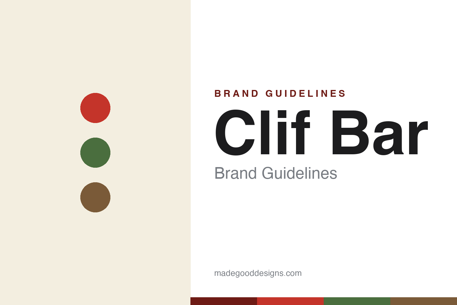
Clif Bar Brand Guidelines
Feed your adventure.
Aa
Two constants: an outdoorsy red-and-green palette and a bold sans wordmark. Abstract homage — not the Clif climber illustration or wordmark.
Born on a bike ride
Clif built an adventure brand around a climber.
Clif Bar is a lesson in an identity rooted in a subculture. Founded in 1992 by Gary Erickson — after an “Epiphany Ride” where he couldn’t face another bad energy bar — and named for his father, Clifford, it built an organic energy bar for cyclists, climbers and endurance athletes. Its wrapper icon says it all: a climber scaling a rock face up toward the “CLIF” wordmark, famously sketched by a friend on a napkin.
For two decades Clif leaned into independence and values — employee-owned, organic, with “Five Aspirations” written into its charter, and a famous 2000 decision to turn down a ~$120M buyout to stay private. Its world is outdoorsy and earthy, expanded across Clif, Builders, LUNA and Clif Kid.
(Honest notes: after decades of independence, Clif was acquired by Mondelez in 2022 (~$2.9 billion) — a notable end to its indie-ethos story; the 2000 turned-down offer was from Quaker Oats, after which Erickson bought out his co-founder; and “Feed Your Adventure” is a real line while some other slogans are unverified. No official brand hex is published.)
Colour
Clif lives in trail red and green. Click a swatch to copy the hex.
Clif’s identity is outdoorsy, red and green — a Clif red, a trail green, an earth brown, a cream, and an ink. The palette is the trail: a bold red, forest greens and earthy browns, matching an adventure-and-endurance world. It signals rugged, organic, outdoors fuel rather than a candy bar. The honest caveat: with no published brand hex, these tones are an original, unofficial interpretation, not first-party values.
The lesson is an earthy palette signals the outdoors. Clif’s world is mountains and trails. For designers, it is a reminder that a bold-red-plus-earthy-green scheme, paired with an adventure illustration, can root a product in a lifestyle (climbing, cycling) rather than a category. The takeaways: draw the palette from the activity; pair it with an iconic illustration; and treat any single hex as unofficial — using a deep red for small text so the trail colours stay bold.
Typography
The wordmark spirit is a bold sans — sturdy and adventurous.
Clif’s identity carries a sturdy, adventurous, athletic spirit — a bold all-caps “CLIF” wordmark with a climber reaching up to it. A bold grotesque sans captures the mood: it is strong and energetic, the register of a brand built for endurance and the outdoors. Set against trail red and green, the bold type feels rugged and capable — exactly the adventure personality Clif carries. It is athletic rather than delicate, mirroring fuel for a long climb. (Clif’s real wordmark and the climber illustration are trademarks and trade dress we describe but do not reproduce, and the exact typeface is not published, so we don’t assert it.) Because the specific mark is not ours to use, the honest description is “a bold sans spirit,” not the Clif logo. The type behaves like the brand: sturdy, adventurous and strong.
Aa
A bold sans spirit — sturdy and adventurous. (Specimen set in Archivo, a grotesque sans; NOT the Clif logo, which is a trademark.)
A subculture icon, then a giant’s brand
Clif stands for the climb.
Clif Bar is a lesson in owning a lifestyle, then facing scale. It rooted itself in endurance and climbing culture — the napkin-sketched climber, organic ingredients, an employee-owned, values-first ethos, even turning down a buyout to stay independent. That authenticity built a beloved brand. Then, in 2022, it sold to Mondelez — a reminder that even the most independent stories can change hands. The differentiator is authentic subculture roots.
For designers and brand-builders, Clif offers a clear takeaway: a lifestyle icon is durable equity. The lessons: anchor the brand in a real community (climbing, cycling) with an ownable icon (the climber); let values shape the identity; and know that design equity outlasts ownership changes. It is also a reminder to stay accurate: Clif is now a Mondelez brand (2022), after famously turning down Quaker in 2000 — with the palette here an unofficial interpretation. Clif fed the adventure — proof that a subculture icon can be the difference.
Explore & save
Keep Clif Bar’s identity on hand — save it to a board in the Made Good inspiration library.
Clif Bar identity set
Pin the trail red-and-green palette and the bold-sans spirit to your own board.


