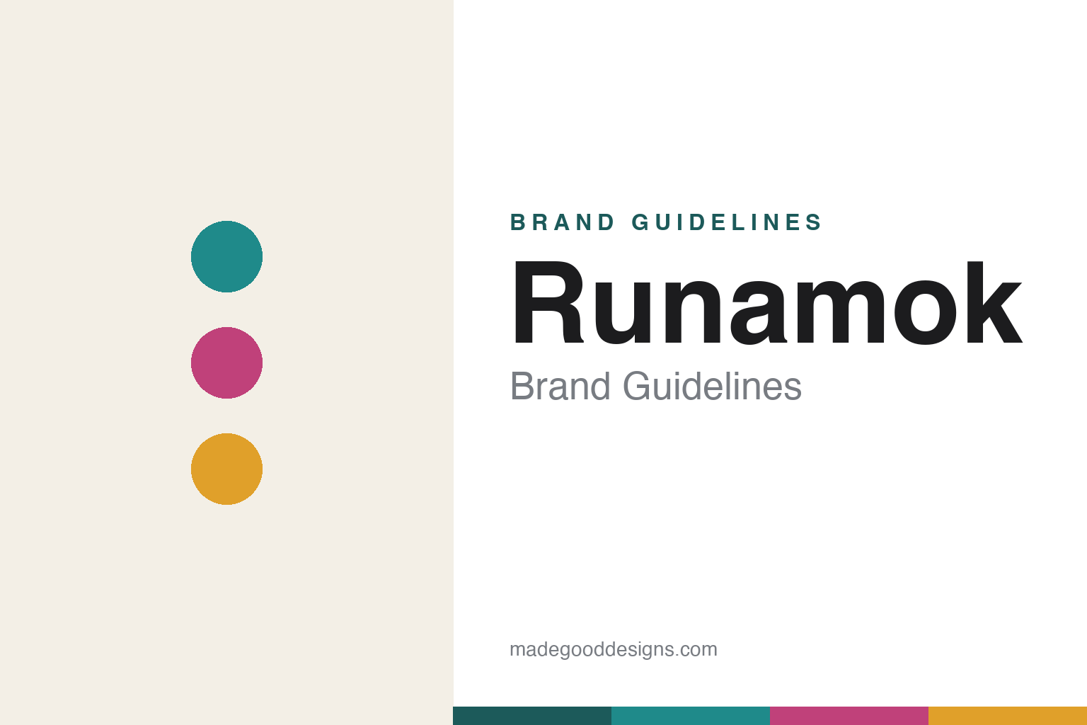
Runamok Brand Guidelines
Maple out of the ordinary.
Aa
Two constants: a colourful, craft palette and a modern rounded wordmark. Abstract homage — not the Runamok wordmark, bottles or label art.
Maple, reinvented
Runamok made maple syrup a design object.
Runamok is a lesson in reinventing a traditional category. Founded by husband-and-wife Eric and Laura Sorkin in Vermont — sugaring from around 2009 and launching the retail Runamok brand in 2016 — it is an organic maple producer that broke maple out of its rustic mould. It remains family-owned and independent.
Its signature is flavour and craft: infused, barrel-aged and smoked syrups (bourbon- and rum-barrel-aged, pecanwood-smoked, cinnamon-vanilla, elderberry, ginger, jasmine-tea) plus the trademarked Sparkle Syrup® (maple with an edible shimmer). And its design matches — whimsical, design-forward labels on tall, slim glass bottles that look nothing like a rustic maple jug.
(Honest notes: the Sorkins started sugaring around 2009 but launched the retail brand in 2016 (its “10 years” counts from 2016); it is family-owned and independent, though a 2026 leadership transition is underway (a new CEO, with Eric Sorkin becoming chairman); and its packaging is genuinely design-led — the specific colour system here is an interpretation of that look. No official brand hex is published.)
Colour
Runamok lives in colourful craft. Click a swatch to copy the hex.
Runamok’s identity is colourful, modern and craft — a Runamok teal, a berry, an amber, a cream, and an ink. Unlike rustic maple browns, Runamok leans into a bright, contemporary palette with distinct colours across its many flavours. It signals a design-forward, gift-worthy, adventurous take on maple. The honest caveat: with no published brand hex, these tones are an original, unofficial interpretation, not first-party values.
The lesson is colour can modernise a traditional category. Runamok’s world is bright and playful where maple is usually brown and folksy. For designers, it is a reminder that a fresh, colourful, whimsical palette — on an elegant bottle — can reposition a heritage product as modern and giftable. The takeaways: break the category’s default colours; use distinct hues to navigate a wide flavour range; and treat any single hex as unofficial — using a deep teal for small text so the brights stay clean.
Typography
The wordmark spirit is a modern rounded sans — fresh and playful.
Runamok’s identity carries a fresh, modern, playful spirit — a “Runamok” wordmark on whimsical, design-forward labels. A modern rounded sans captures the mood: it is friendly and contemporary, the register of a brand that took maple “out of the realm of tradition.” Set against a colourful palette, the modern type feels fresh and giftable — exactly the design-led, adventurous personality Runamok carries. It is playful rather than rustic, mirroring bottles made to be noticed. (Runamok’s real wordmark, bottles and label illustrations — by a named designer — are trademarks and protected artwork we describe but do not reproduce, and the exact typeface is not published, so we don’t assert it.) Because the specific mark is not ours to use, the honest description is “a modern rounded spirit,” not the Runamok logo. The type behaves like the brand: fresh, modern and playful.
Aa
A modern rounded spirit — fresh and playful. (Specimen set in Poppins, a geometric sans; NOT the Runamok logo, which is a trademark.)
Design plus flavour, against tradition
Runamok stands for maple reimagined.
Runamok is a lesson in modernising a heritage product on two fronts. It reinvented maple’s flavour (infused, barrel-aged, smoked, even shimmering) and its look (colourful, whimsical, design-forward bottles) at once — so a traditional Vermont staple became a giftable, contemporary brand. Flavour innovation and design innovation reinforced each other. The differentiator is craft creativity, made visible.
For designers and brand-builders, Runamok offers a clear takeaway: innovate the product and the packaging together. The lessons: give a heritage category new reasons to exist (new flavours); dress them in a design language that signals the modernity; and lean into gift-worthiness. It is also a reminder to stay accurate: Runamok’s retail brand launched in 2016, it is family-owned (with a 2026 leadership transition), and its design specifics here are an interpretation — with the palette an unofficial interpretation. Runamok reimagined maple — proof that pairing craft and design can be the difference.
Explore & save
Keep Runamok’s identity on hand — save it to a board in the Made Good inspiration library.
Runamok identity set
Pin the colourful-craft palette and the modern-rounded spirit to your own board.