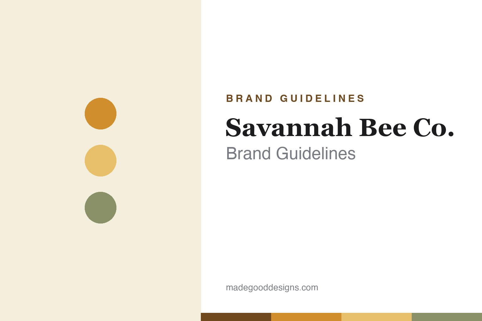
Savannah Bee Company Brand Guidelines
Bee above your usual.
Aa
Two constants: an amber-and-sage palette and an elegant apothecary serif. Abstract homage — not the Savannah Bee wordmark, bottles or bee mark.
Making honey beautiful
Savannah Bee turned honey into a design object.
Savannah Bee Company is a lesson in elevating a humble product through design. Founded by beekeeper Ted Dennard in Savannah, Georgia (formally in 2002, with roots to 1999), it set out to rescue honey from the generic plastic bear — presenting premium varietal honeys (Tupelo, its signature, plus Acacia, Sourwood and more) as something to savour like fine wine or cheese. It remains founder-led and independent.
Design is the whole idea. Savannah Bee packages honey in tall, wine-style / apothecary bottles with elegant, illustrative, heritage-apothecary labels — a look premium enough for Williams Sonoma and Neiman Marcus. Beyond honey, it makes beeswax body care, runs its own experiential retail stores, and champions a save-the-bees mission.
(Honest notes: the company was formally founded in 2002, though the brand traces its origin to 1999; it is genuinely founder-led and independent (Ted Dennard, CEO); and its bee logo was recently redesigned from a three-bee mark to a single queen bee, so older three-bee references are dated. No official brand hex is published.)
Colour
Savannah Bee lives in amber and sage. Click a swatch to copy the hex.
Savannah Bee’s identity is warm, amber and apothecary — a Savannah amber, a honeycomb gold, a sage, a cream, and an ink. The palette is honey and herb: warm ambers and golds softened by sage and cream, evoking a heritage apothecary. It signals artisanal, premium, storytelling-rich honey rather than a commodity jar. The honest caveat: with no published brand hex, these tones are an original, unofficial interpretation, not first-party values.
The lesson is an apothecary palette elevates a humble product. Savannah Bee’s world is a beautiful old pharmacy of honey. For designers, it is a reminder that warm ambers plus soft, heritage neutrals — on an elegant bottle with an illustrative label — can turn a generic category into a giftable, premium one. The takeaways: draw the palette from the product and an era; invest in bottle and label craft; and treat any single hex as unofficial — using a deep amber for small text so the golds stay warm.
Typography
The wordmark spirit is an elegant apothecary serif — warm and crafted.
Savannah Bee’s identity carries a warm, elegant, apothecary spirit — a “Savannah Bee Company” wordmark and a bee mark on illustrative, heritage-style labels. A refined serif captures the mood: it is graceful and storytelling, the register of a brand that made honey feel like an artisanal treasure. Set against amber and sage, the elegant serif feels premium and crafted — exactly the boutique, design-led personality Savannah Bee carries. It is apothecary rather than industrial, mirroring bottles styled like fine spirits. (Savannah Bee’s real wordmark, bottles and bee mark are trademarks and trade dress we describe but do not reproduce, and the exact typeface is not published, so we don’t assert it.) Because the specific mark is not ours to use, the honest description is “an elegant apothecary serif spirit,” not the Savannah Bee logo. The type behaves like the brand: warm, elegant and crafted.
Aa
An elegant apothecary serif spirit — warm and crafted. (Specimen set in Playfair Display, an elegant serif; NOT the Savannah Bee logo, which is a trademark.)
Design as the entire strategy
Savannah Bee stands for beautiful honey.
Savannah Bee is a lesson in design as the differentiator. Honey is a commodity; Savannah Bee made it a giftable, premium, design-led product by rejecting the plastic bear for elegant bottles, illustrative labels and a varietal, terroir-driven story. The look opened premium retail doors the product alone never would. The differentiator is design ambition applied to an ordinary category.
For designers and brand-builders, Savannah Bee offers a clear takeaway: packaging can reposition an entire category. The lessons: reject the category cliché (the honey bear) for a considered, premium form; tell a terroir/varietal story that justifies the price; and let founder authenticity (a real beekeeper, a bee-saving mission) ground the beauty. It is also a reminder to stay accurate: the company dates to 2002 (roots to 1999), is founder-led, and recently moved to a single queen-bee logo — with the palette here an unofficial interpretation. Savannah Bee made honey beautiful — proof that design can be the difference.
Explore & save
Keep Savannah Bee Company’s identity on hand — save it to a board in the Made Good inspiration library.
Savannah Bee identity set
Pin the amber-and-sage palette and the apothecary-serif spirit to your own board.