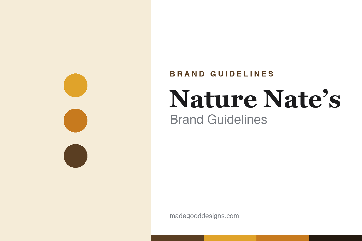
Nature Nate’s Brand Guidelines
All we add is the bottle.
Aa
Two constants: a warm honey-gold palette and a wholesome slab wordmark. Abstract homage — not the Nature Nate’s wordmark or squeeze bottle.
The everyday honey brand
Nature Nate’s built the top US honey brand on purity.
Nature Nate’s is a lesson in a single, clear promise. Founded around 1997 by Nathan “Nate” Sheets — who started with one backyard beehive in Texas and went full-time in 2010, self-stocking Walmart shelves — it grew into one of the top-selling honey brands in the US. Its whole pitch is purity.
Everything points to that: “100% Pure, Raw & Unfiltered” honey, one ingredient, a Purity Guarantee and testing against adulteration — summed up as “All we add is the bottle.” The design is warm and trustworthy: a signature squeeze bottle, honey-gold tones, and a friendly, wholesome, mass-market-premium look.
(Honest notes: Nature Nate’s is no longer independent — it was sold to Blue Road Capital and merged with Sweet Harvest Foods (announced 2022), and founder Nate Sheets later stepped down as CEO; its “raw/pure” claims are the brand’s claims — they have faced a class-action challenge — so we attribute rather than assert them; and “#1” is a widely cited brand claim. No official brand hex is published.)
Colour
Nature Nate’s lives in warm honey gold. Click a swatch to copy the hex.
Nature Nate’s identity is warm, golden and wholesome — a Nate’s gold, an amber, a brown, a cream, and an ink. The palette is pure honey: warm golds and ambers, grounded by brown, on a friendly squeeze bottle. It signals wholesome, trustworthy, everyday quality rather than luxury or clinical wellness. The honest caveat: with no published brand hex, these tones are an original, unofficial interpretation, not first-party values.
The lesson is honey gold reads as wholesome and trustworthy. Nature Nate’s world is the family kitchen. For designers, it is a reminder that leaning fully into a product’s own colour (honey gold) with warm, friendly cues can make a mass-market item feel pure and dependable — matching a purity promise. The takeaways: let the product’s natural colour lead; keep the cues warm and friendly; and treat any single hex as unofficial — using a deep brown for small text so the gold stays warm.
Typography
The wordmark spirit is a wholesome slab — friendly and trustworthy.
Nature Nate’s identity carries a wholesome, friendly, trustworthy spirit — a “Nature Nate’s” wordmark on a warm, honey-gold squeeze bottle. A sturdy, friendly slab serif captures the mood: it is approachable and dependable, the register of an everyday honey sold on purity and a personal, founder-named story. Set against honey gold, the slab type feels wholesome and reassuring — exactly the pure, trustworthy personality Nature Nate’s carries. It is friendly rather than fancy, mirroring a kitchen staple. (Nature Nate’s real wordmark and squeeze bottle are trademarks and trade dress we describe but do not reproduce, and the exact typeface is not published, so we don’t assert it.) Because the specific mark is not ours to use, the honest description is “a wholesome slab spirit,” not the Nature Nate’s logo. The type behaves like the brand: wholesome, friendly and trustworthy.
Aa
A wholesome slab spirit — friendly and trustworthy. (Specimen set in Bitter, a slab serif; NOT the Nature Nate’s logo, which is a trademark.)
Winning on one clear promise
Nature Nate’s stands for purity.
Nature Nate’s is a lesson in a single, repeated promise. In a commodity category, it won by owning one idea — pure, raw, unfiltered honey, “all we add is the bottle” — and dressing it in warm, wholesome, trustworthy design. The clarity did the work: shoppers understood the promise at a glance. The differentiator is a simple purity claim, consistently made.
For designers and brand-builders, Nature Nate’s offers a clear takeaway: a clear promise, warmly designed, can lead a commodity category. The lessons: pick one ownable claim and repeat it (purity); use the product’s own colour and a friendly format to reinforce it; and be honest, since bold claims invite scrutiny. It is also a reminder to stay accurate: Nature Nate’s is now owned by Blue Road Capital / Sweet Harvest Foods (not independent), and its purity claims are the brand’s (and have been challenged) — with the palette here an unofficial interpretation. Nature Nate’s kept it pure and simple — proof that a clear promise can be the difference.
Explore & save
Keep Nature Nate’s’s identity on hand — save it to a board in the Made Good inspiration library.
Nature Nate’s identity set
Pin the honey-gold palette and the wholesome-slab spirit to your own board.