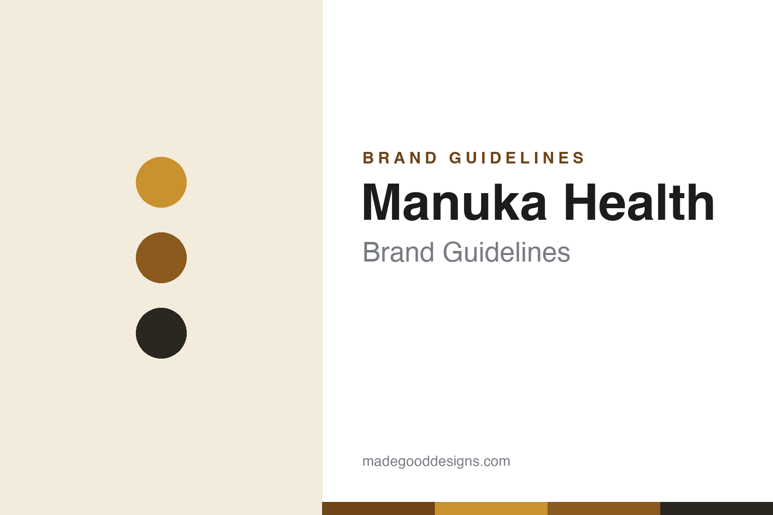
Manuka Health Brand Guidelines
The number on the jar.
Aa
Two constants: a gold-and-dark palette and a clean premium wordmark. Abstract homage — not the Manuka Health wordmark or the MGO badge.
The brand that made the number the hero
Manuka Health turned a lab measure into packaging.
Manuka Health is a lesson in making a metric the brand. Founded in 2006 in New Zealand, it did something few food brands manage: it took a scientific measure and put it front and centre. Working with the researcher who identified methylglyoxal (MGO) as manuka honey’s key compound, it created and trademarked the MGO grading system (~2007).
That number is the design. Jars are labelled MGO 100+, 250+, 400+, 550+, 850+ — the figure is the dominant element on the pack, a shorthand for potency and a trust signal. The look is premium, clinical-yet-natural: gold and dark tones, a clean “Mānuka Health” wordmark, and the big MGO figure doing the heavy lifting.
(Honest notes: MGO measures only methylglyoxal — a single marker — and differs from the multi-marker UMF system used by rivals; “manuka” is not legally exclusive to New Zealand (Australia produces it too, and NZ lost the trademark bids); and Manuka Health is owned by Malaysia’s Hong Leong Group (since 2018), not an independent NZ company. No official brand hex is published.)
Colour
Manuka Health lives in gold and dark. Click a swatch to copy the hex.
Manuka Health’s identity is premium, gold and dark — a manuka gold, a deep amber, a charcoal, a cream, and an ink. The palette pairs honey golds with dark, clinical neutrals, signalling a science-backed, medicinal-grade product rather than a folksy honey. It reads as premium wellness. The honest caveat: with no published brand hex, these tones are an original, unofficial interpretation, not first-party values.
The lesson is gold-plus-dark reads as premium and clinical. Manuka Health’s world is the pharmacy shelf as much as the pantry. For designers, it is a reminder that pairing a warm, appetising gold with dark, restrained neutrals can make a natural product feel scientific and high-value — supporting a number-led, potency story. The takeaways: pair a warm hero colour with clinical darks; let a single figure dominate; and treat any single hex as unofficial — using a deep amber-brown for small text so the gold stays rich.
Typography
The wordmark spirit is a clean premium sans — clinical and natural.
Manuka Health’s identity carries a clean, premium, science-backed spirit — a restrained “Mānuka Health” wordmark beside a bold MGO number. A clean sans captures the mood: it is modern and clinical, the register of a brand that sells a lab-verified potency figure. Set against gold and dark, the clean type feels premium and trustworthy — exactly the medicinal-wellness personality Manuka Health carries. It is clinical rather than rustic, mirroring a product graded like a supplement. (Manuka Health’s real wordmark and the MGO badge are trademarks we describe but do not reproduce, and the exact typeface is not published, so we don’t assert it.) Because the specific mark is not ours to use, the honest description is “a clean premium spirit,” not the Manuka Health logo. The type behaves like the brand: clean, clinical and premium.
Aa
A clean premium spirit — clinical and natural. (Specimen set in Jost, a geometric sans; NOT the Manuka Health logo, which is a trademark.)
Owning a grading system
Manuka Health stands for MGO.
Manuka Health is a lesson in turning a standard into an identity. By pioneering and trademarking the MGO grading system, it made a scientific measure inseparable from its brand — the number on the jar is both a product claim and a logo-adjacent asset. In a category where authenticity is fiercely contested, a clear, ownable metric became the differentiator. The differentiator is a proprietary way of measuring quality.
For designers and brand-builders, Manuka Health offers a clear takeaway: a metric can be a design system. The lessons: if your category lacks a clear standard, consider creating (and owning) one; make the metric the hero of the pack; and pair it with a premium, clinical palette to reinforce credibility. It is also a reminder to stay accurate: MGO differs from UMF, “manuka” is not NZ-exclusive, and Manuka Health is owned by Hong Leong Group — with the palette here an unofficial interpretation. Manuka Health owned the number — proof that a metric can be the difference.
Explore & save
Keep Manuka Health’s identity on hand — save it to a board in the Made Good inspiration library.
Manuka Health identity set
Pin the gold-and-dark palette and the clean-premium spirit to your own board.