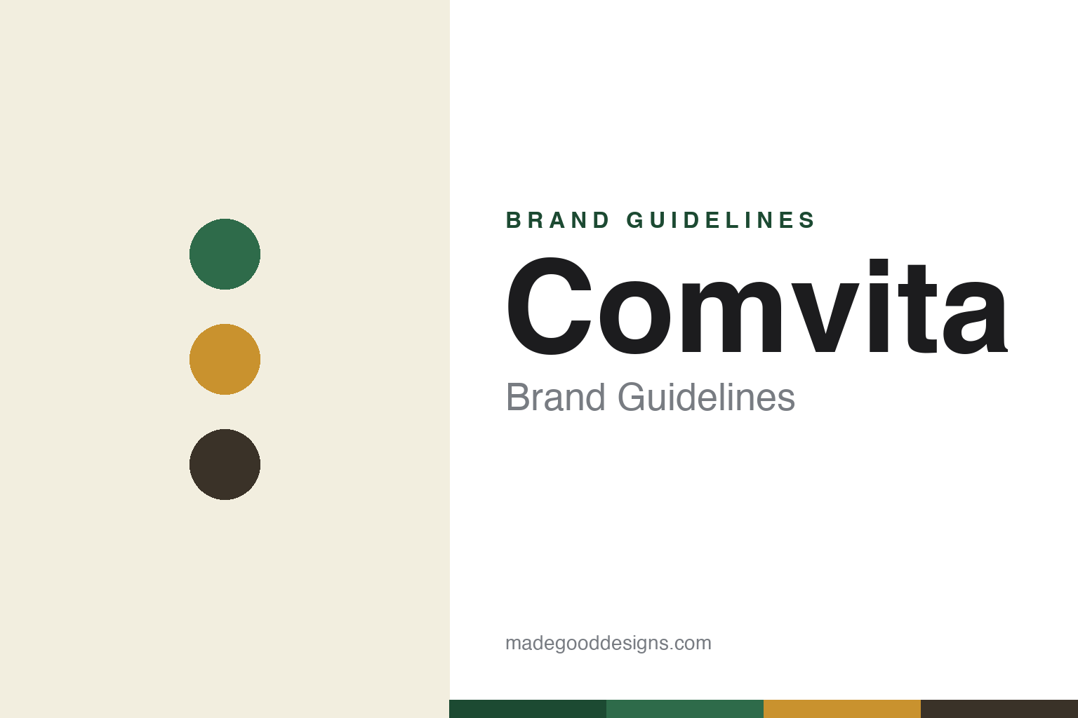
Comvita Brand Guidelines
Nature’s gold standard.
Aa
Two constants: a green-and-gold palette and a wellness sans wordmark. Abstract homage — not the Comvita wordmark or the UMF badge.
The manuka leader
Comvita is the biggest name in manuka honey.
Comvita is a lesson in leading a category with a standard. Founded in 1974 by Claude Stratford and Alan Bougen in New Zealand — starting in a basement with a hand-operated extractor — it grew into the world’s largest manuka honey company, with tens of thousands of hives and a broad natural-wellness range beyond honey (propolis, olive-leaf extract, skincare, medical honey).
Its quality language is UMF — the Unique Mānuka Factor, a multi-marker grade run by an independent association — displayed prominently as UMF 5+, 10+, 15+, 20+. The identity is premium natural-wellness: green, gold and black, with the UMF number as a trust badge, under the line “Nature’s Gold Standard.”
(Honest notes: UMF is a certification mark of the independent UMF Honey Association — not Comvita’s own — and it differs from the single-marker MGO system; Comvita is publicly listed (NZX: CVT) and went through a near-death financial episode — a large FY25 loss and a rescue capital raise — before returning to profit in FY26; and “manuka” is not exclusive to New Zealand. No official brand hex is published.)
Colour
Comvita lives in green and gold. Click a swatch to copy the hex.
Comvita’s identity is natural, green and gold — a Comvita green, a honey gold, a bark, a cream, and an ink. The palette pairs a wellness green with honey gold and dark accents, signalling nature, health and premium quality. It reads as a trusted natural-health brand rather than a commodity honey. The honest caveat: with no published brand hex, these tones are an original, unofficial interpretation, not first-party values.
The lesson is green-plus-gold reads as natural wellness. Comvita’s world is nature and science together. For designers, it is a reminder that a botanical green paired with a premium gold can position a product as both natural and high-quality — a fit for a wellness range spanning honey to supplements. The takeaways: use green to signal natural health and gold to signal premium; let the grade badge carry trust; and treat any single hex as unofficial — using a deep green for small text so the gold stays warm.
Typography
The wordmark spirit is a wellness sans — natural and trusted.
Comvita’s identity carries a natural, trusted, wellness spirit — a clean “Comvita” wordmark with a prominent UMF badge. A friendly wellness sans captures the mood: it is approachable and credible, the register of a heritage natural-health leader. Set against green and gold, the clean type feels natural and premium — exactly the trusted, nature’s-gold-standard personality Comvita carries. It is wellness-forward rather than clinical, mirroring a brand that spans honey and supplements. (Comvita’s real wordmark and the UMF badge are trademarks — the UMF mark belonging to the UMF Honey Association — which we describe but do not reproduce, and the exact typeface is not published, so we don’t assert it.) Because the specific mark is not ours to use, the honest description is “a wellness sans spirit,” not the Comvita logo. The type behaves like the brand: natural, trusted and premium.
Aa
A wellness sans spirit — natural and trusted. (Specimen set in Mulish, a humanist sans; NOT the Comvita logo, which is a trademark.)
Leadership, and surviving a crisis
Comvita stands for trusted manuka.
Comvita is a lesson in category leadership under pressure. As the world’s largest manuka honey company, it built its brand on a trusted grade (UMF), a wellness range and a heritage story. But leadership is not immunity: Comvita went through a severe financial crisis — a heavy loss and a rescue raise — before clawing back to profit. Its recovery is part of its current story. The differentiator is scale and a trusted standard, tested by real adversity.
For designers and brand-builders, Comvita offers a clear takeaway: a trust mark and a consistent look carry a brand through hard times. The lessons: anchor a category on a credible, third-party standard (UMF); keep a consistent premium-natural identity across a wide range; and be honest about the business, not just the brand. It is also a reminder to stay accurate: UMF is the association’s mark (not Comvita’s), Comvita is a public company that survived a near-death episode, and “manuka” is not NZ-exclusive — with the palette here an unofficial interpretation. Comvita led and survived — proof that a trusted standard can be the difference.
Explore & save
Keep Comvita’s identity on hand — save it to a board in the Made Good inspiration library.
Comvita identity set
Pin the green-and-gold palette and the wellness-sans spirit to your own board.