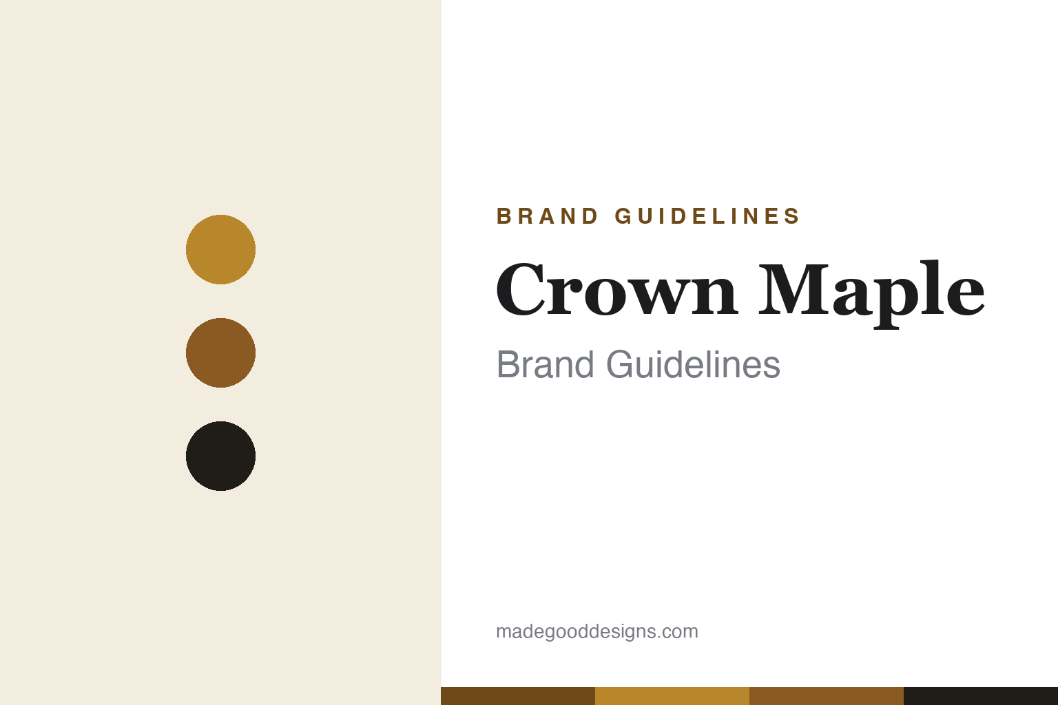
Crown Maple Brand Guidelines
The best nature has to offer.
Aa
Two constants: a luxe gold-and-black palette and a refined serif wordmark. Abstract homage — not the Crown Maple wordmark, crown mark or glass bottle.
The estate maple
Crown Maple made syrup a luxury design object.
Crown Maple is a lesson in estate branding for a humble food. Founded around 2010 by former finance executive Robb Turner and his family, it is produced at Madava Farms — an ~800-acre certified-organic estate in Dover Plains, in New York’s Hudson Valley — using state-of-the-art, vertically-integrated production. It positioned maple as an ultra-premium, estate-produced product.
Its identity is luxe and minimal: an elegant clear glass bottle, a crown motif, and a restrained gold-cream-black palette that reads as a design object, not a pantry jug. The range is graded (Golden, Amber, Dark, Very Dark) plus bourbon barrel-aged, and it sells through fine dining (Eleven Madison Park) and upscale retail (West Elm), under the line “The Best Nature Has to Offer®.”
(Honest notes: Crown Maple is estate-produced — a fair description — though it also sources sap regionally, so it is not strictly single-parcel; it uses the current US grades (Golden/Amber/Dark/Very Dark), not old Grade A/B; it is New York, not Canadian; and it remains founder/family-owned. No official brand hex is published.)
Colour
Crown Maple lives in luxe gold and black. Click a swatch to copy the hex.
Crown Maple’s identity is luxe, gold and minimal — a crown gold, a maple amber, a black, a cream, and an ink. The palette is restrained and premium: warm maple golds against black and cream, with lots of clarity. It signals a design-object, fine-dining product rather than a breakfast-table commodity. The honest caveat: with no published brand hex, these tones are an original, unofficial interpretation, not first-party values.
The lesson is restraint plus gold reads as luxury. Crown Maple’s world is the estate and the tasting menu. For designers, it is a reminder that a minimal, gold-and-black palette on a clear glass bottle can turn a commodity into a luxury design object — matching an estate-produced, ultra-premium story. The takeaways: keep the palette minimal and premium; let a clear glass bottle be the hero form; and treat any single hex as unofficial — using a deep gold-brown for small text so the gold stays luxe.
Typography
The wordmark spirit is a refined serif — luxe and estate.
Crown Maple’s identity carries a refined, luxe, estate spirit — a “Crown Maple” wordmark with a crown motif on a clear glass bottle. A refined serif captures the mood: it is elegant and premium, the register of an estate-produced syrup sold beside fine wine. Set against gold and black, the refined serif feels luxurious and considered — exactly the design-object personality Crown Maple carries. It is estate rather than rustic, mirroring a bottle made to be displayed. (Crown Maple’s real wordmark, the crown mark and the glass bottle are trademarks and trade dress we describe but do not reproduce, and the exact typeface is not published, so we don’t assert it.) Because the specific mark is not ours to use, the honest description is “a refined serif spirit,” not the Crown Maple logo. The type behaves like the brand: refined, luxe and estate.
Aa
A refined serif spirit — luxe and estate. (Specimen set in Cormorant Garamond, a refined serif; NOT the Crown Maple logo, which is a trademark.)
Estate branding for a breakfast staple
Crown Maple stands for the estate.
Crown Maple is a lesson in borrowing luxury codes for a humble product. It took the language of wine and spirits — a named estate, single-source provenance, graded tiers, an elegant glass bottle — and applied it to maple syrup, turning a breakfast staple into an ultra-premium design object worthy of fine-dining tables. The design did the elevating. The differentiator is estate-luxury branding in an unexpected category.
For designers and brand-builders, Crown Maple offers a clear takeaway: you can import luxury codes into a commodity. The lessons: adopt the trust cues of a premium adjacent category (estate, grade, glass); keep the palette minimal and gold-luxe; and back it with a real production story. It is also a reminder to stay accurate: Crown Maple is estate-produced (but regionally sourced, not single-parcel), uses current US grades, and is New York-based and family-owned — with the palette here an unofficial interpretation. Crown Maple crowned the syrup — proof that luxury codes can be the difference.
Explore & save
Keep Crown Maple’s identity on hand — save it to a board in the Made Good inspiration library.
Crown Maple identity set
Pin the luxe gold-and-black palette and the refined-serif spirit to your own board.