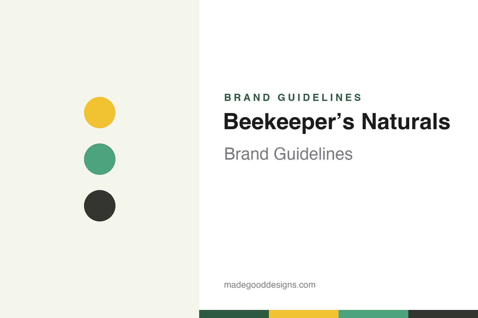
Beekeeper’s Naturals Brand Guidelines
Reinventing the medicine cabinet.
Aa
Two constants: a clean yellow-and-green palette and a clean modern wordmark. Abstract homage — not the Beekeeper’s Naturals wordmark or packaging.
The modern medicine cabinet
Beekeeper’s Naturals made bee products a wellness brand.
Beekeeper’s Naturals is a lesson in re-framing a category. Founded in 2016 by Carly Stein — a former Goldman Sachs analyst who discovered propolis after it cured her chronic tonsillitis — it turned bee products into a modern, science-forward wellness brand, not a rustic honey company. Its rallying idea: “reinventing the medicine cabinet.”
Its hero isn’t honey; it’s propolis — a bestselling Propolis Throat Spray, plus B.Powered superfood honey, royal jelly, bee pollen and a kids’ line, all “Powered by Propolis™.” The design matches: deliberately modern, minimalist and anti-rustic — clean whites and neutrals, a warm honey-yellow accent, a subtle hexagon motif, reading like a contemporary pharmacy rather than a farm stand.
(Honest notes: Beekeeper’s Naturals is founder-led but venture-backed (it has raised multiple rounds), so it isn’t independent or founder-owned; it is a wellness/nutraceutical brand that uses bee products, not a traditional honey brand; and, despite a common assumption, it did not appear on Shark Tank. No official brand hex is published.)
Colour
Beekeeper’s Naturals lives in clean whites and honey-yellow. Click a swatch to copy the hex.
Beekeeper’s Naturals’ identity is clean, modern and bright — a honey yellow, a fresh green, a soft charcoal, an off-white, and an ink. The palette is clean-white-plus-accent: lots of light space, a warm honey-yellow, and fresh greens to organise product lines. It signals a modern, science-forward wellness brand — the opposite of amber-glass, kraft-paper honey. The honest caveat: with no published brand hex, these tones are an original, unofficial interpretation, not first-party values.
The lesson is clean and bright reads as modern wellness. Beekeeper’s Naturals’ world is a contemporary pharmacy, not a farm. For designers, it is a reminder that deliberately rejecting a category’s clichés (rustic honey codes) for a clean, minimal, accented look can reposition a product for a modern wellness audience. The takeaways: reject the category default when it doesn’t fit your audience; keep a clean base with one warm accent; and treat any single hex as unofficial — using a deep green for small text so the yellow stays fresh.
Typography
The wordmark spirit is a clean modern sans — fresh and science-forward.
Beekeeper’s Naturals’ identity carries a clean, modern, science-forward spirit — a contemporary “Beekeeper’s Naturals” wordmark with a subtle hexagon motif. A clean modern sans captures the mood: it is fresh and credible, the register of a wellness brand “reinventing the medicine cabinet.” Set against clean whites and a honey-yellow accent, the modern type feels contemporary and trustworthy — exactly the pharmacy-clean personality the brand carries. It is modern rather than rustic, mirroring products that look like clean supplements. (Beekeeper’s Naturals’ real wordmark and packaging — and “Powered by Propolis™” — are trademarks and trade dress we describe but do not reproduce, and the exact typeface is not published, so we don’t assert it.) Because the specific mark is not ours to use, the honest description is “a clean modern spirit,” not the Beekeeper’s Naturals logo. The type behaves like the brand: clean, modern and fresh.
Aa
A clean modern spirit — fresh and science-forward. (Specimen set in Figtree, a clean sans; NOT the Beekeeper’s Naturals logo, which is a trademark.)
Rejecting the rustic honey cliché
Beekeeper’s Naturals stands for modern wellness.
Beekeeper’s Naturals is a lesson in designing out of a category. Bee products come wrapped in rustic, folksy codes; Beekeeper’s Naturals deliberately went the other way — clean, minimal, pharmacy-modern — to sell propolis and honey as science-forward wellness to a contemporary audience. The look reframes what the product is. The differentiator is a modern identity in a traditionally rustic space.
For designers and brand-builders, Beekeeper’s Naturals offers a clear takeaway: a new audience may need a new visual language. The lessons: if the category’s default codes don’t fit your buyer, reject them for a cleaner, more modern system; lead with a hero product and a clear mission (“reinventing the medicine cabinet”); and keep the design credible and clinical. It is also a reminder to stay accurate: it is founder-led but venture-backed (not independent), a wellness brand rather than a honey brand, and it was not on Shark Tank — with the palette here an unofficial interpretation. Beekeeper’s Naturals modernised the hive — proof that a new visual language can be the difference.
Explore & save
Keep Beekeeper’s Naturals’s identity on hand — save it to a board in the Made Good inspiration library.
Beekeeper’s Naturals identity set
Pin the clean honey-yellow palette and the clean-modern spirit to your own board.