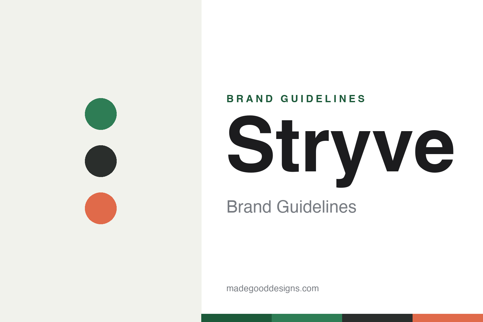
Stryve Brand Guidelines
Biltong, not jerky.
Aa
Two constants: a clean, health-forward palette and a clean sans wordmark. Abstract homage — not the Stryve wordmark or packaging.
Biltong, not jerky
Stryve built a brand on a category distinction.
Stryve is a lesson in owning a category difference. Founded in 2017 (Plano, Texas), its whole thesis is that its flagship is biltong, not jerky: a South-African-style, air-dried beef — air-dried, not smoked or cooked — that is naturally sugar-free, nitrate-free and high in protein. That distinction is the brand.
Its design follows the health-forward story: clean, minimalist resealable pouches with real-beef photography and earth tones, a plain “STRYVE” wordmark — deliberately unlike the rugged, rustic packaging of traditional jerky. The parent is a multi-brand meat-snack company (Stryve, Kalahari, Braaitime, Vacadillos).
(Honest notes: Stryve’s biltong is genuinely on shelves in 2026 (thousands of retail doors, with new distribution wins), so it is a live brand; but its parent company is financially distressed — it was delisted from Nasdaq in 2025 and now trades over-the-counter, with going-concern warnings, so we state both truths; and “biltong” is a generic category, not a Stryve trademark. No official brand hex is published.)
Colour
Stryve lives in clean, health-forward colour. Click a swatch to copy the hex.
Stryve’s identity is clean, green and health-forward — a Stryve green, a charcoal, a coral, a cream, and an ink. The palette is calm and modern: a healthy green, neutral charcoal, and a warm accent, on clean pouches. It signals better-for-you, high-protein, low-sugar — the opposite of rustic, rugged jerky. The honest caveat: with no published brand hex, these tones are an original, unofficial interpretation, not first-party values.
The lesson is clean design signals a clean product. Stryve’s world is minimalist and health-forward, matching a sugar-free, air-dried story. For designers, it is a reminder that when a product’s difference is “cleaner and healthier,” the packaging should look it — calm colour, real-product photography, clear claims. The takeaways: let the design mirror the health claim; keep it minimal and modern; and treat any single hex as unofficial — using a deep green for small text so the palette stays clean.
Typography
The wordmark spirit is a clean sans — modern and health-forward.
Stryve’s identity carries a clean, modern, health-forward spirit — a plain “STRYVE” wordmark on minimalist pouches. A clean sans captures the mood: it is calm and contemporary, the register of a brand whose pitch is “biltong, not jerky” — cleaner, higher-protein, sugar-free. Set against a health-forward palette, the clean type feels modern and trustworthy — exactly the better-for-you personality Stryve carries. It is clean rather than rustic, mirroring a product that rejects the rugged jerky cliché. (Stryve’s real wordmark and packaging are trademarks and trade dress we describe but do not reproduce, and the exact typeface is not published, so we don’t assert it.) Because the specific mark is not ours to use, the honest description is “a clean sans spirit,” not the Stryve logo. The type behaves like the brand: clean, modern and health-forward.
Aa
A clean sans spirit — modern and health-forward. (Specimen set in Outfit, a clean sans; NOT the Stryve logo, which is a trademark.)
A category difference as the whole pitch
Stryve stands for biltong.
Stryve is a lesson in naming your difference. Rather than compete as one more jerky, Stryve staked everything on a genuine distinction — biltong: air-dried, not cooked; sugar-free; high-protein — and designed a clean, health-forward identity to match. The positioning is the product truth, made visual. The differentiator is a real category difference, clearly owned.
For designers and brand-builders, Stryve offers a clear takeaway: a real difference deserves a design that shows it. The lessons: if your product is genuinely different (biltong vs jerky), build the whole identity around that difference; let the design signal the benefit (clean = healthy); and be honest about the business behind the brand. It is also a reminder to stay accurate: Stryve’s biltong is on shelves in 2026, but its parent is a distressed, Nasdaq-delisted micro-cap — with the palette here an unofficial interpretation. Stryve named its difference — proof that a clear distinction can be the difference.
Explore & save
Keep Stryve’s identity on hand — save it to a board in the Made Good inspiration library.
Stryve identity set
Pin the health-forward palette and the clean-sans spirit to your own board.