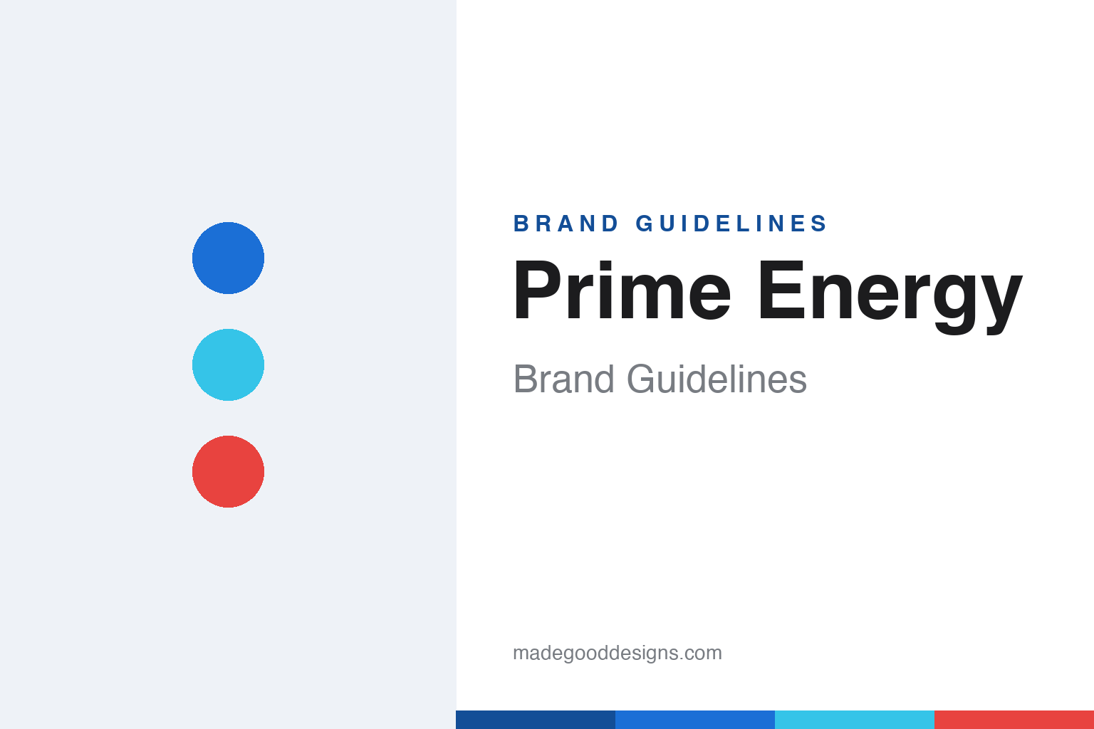
Prime Energy Brand Guidelines
Refresh. Replenish. Refuel.
Aa
Two constants: a bright, per-flavour palette and a bold grotesque wordmark. Abstract homage — not the Prime wordmark, bottles or cans.
Hype in a bottle
Prime turned influencer reach into a beverage.
Prime is a lesson in audience as launch fuel. Created by Congo Brands (Max Clemons and Trey Steiger) with YouTubers Logan Paul and KSI as its faces, it launched Prime Hydration in January 2022 and Prime Energy in January 2023. Powered by their combined online reach, it became a 2023 phenomenon — viral shortages, resale markups and lines at stores.
Two products, one look. Prime Hydration is a caffeine-free electrolyte sports drink in a distinctive clear, contoured bottle; Prime Energy is a caffeinated can with 200mg of caffeine. Both live on flavour colour-blocking — each SKU owns one loud, saturated hue — and a bold, hype aesthetic, backed by big sports deals (UFC, Arsenal, FC Barcelona, WWE).
(Honest notes: Hydration is caffeine-free; only Energy has 200mg — the most common mix-up, and the caffeine controversy is about Energy; the company is Congo Brands, with Paul and KSI as frontmen and equity partners, not the operator; Prime is well past its 2023 peak but still operating; and Celsius bought Alani Nu from Congo, not Prime. No official brand hex is published.)
Colour
Prime lives in loud, per-flavour colour. Click a swatch to copy the hex.
Prime’s identity is loud, saturated and colour-coded — a Prime blue, an ice cyan, a strawberry red, a cream, and an ink. There is no single brand colour; instead each flavour owns a bright, glossy hue (Blue Raspberry blue, Ice Pop red-white-blue), so a shelf of Prime reads as a rainbow built for social media. It signals hype, energy and youth. The honest caveat: with no published brand hex, these tones are an original, unofficial interpretation, not first-party values.
The lesson is colour engineered for the feed. Prime’s world is glossy and vivid, designed to pop on a phone screen. For designers, it is a reminder that a bold, per-flavour colour system plus a distinctive bottle can make a product instantly shareable — the look is the marketing. The takeaways: give each variant a loud, ownable colour; make the package photogenic; and treat any single hex as unofficial — using a deep blue for small text so the brights stay loud.
Typography
The wordmark spirit is a bold grotesque — heavy and hype.
Prime’s identity carries a bold, hype, athletic spirit — a heavy all-caps “PRIME” wordmark centred on loud, glossy packaging. A bold grotesque sans captures the mood: it is punchy and confident, the register of a drink built on scarcity, sports deals and social buzz. Set against saturated per-flavour colour, the heavy type feels energetic and modern — exactly the hype-driven personality Prime carries. It is loud rather than refined, mirroring a product engineered for attention. (Prime’s real wordmark, bottles and cans are trademarks and trade dress we describe but do not reproduce, and the exact typeface is not published, so we don’t assert it.) Because the specific mark is not ours to use, the honest description is “a bold grotesque spirit,” not the Prime logo. The type behaves like the brand: heavy, hype and modern.
Aa
A bold grotesque spirit — heavy and hype. (Specimen set in Archivo, a grotesque sans; NOT the Prime logo, which is a trademark.)
When the audience is the launch
Prime stands for hype.
Prime is a lesson in distribution through fame. It didn’t build an audience with the product; it started with the audience — two of the internet’s biggest personalities — and used loud, colour-blocked, photogenic packaging to convert attention into a 2023 sales explosion. The design existed to be seen and shared. The differentiator is reach, dramatised by design.
For designers and brand-builders, Prime offers a clear takeaway: packaging can be built for the feed. The lessons: make the pack loud, glossy and per-flavour colourful so it photographs well; give the product a distinctive silhouette; and remember that hype-led launches can fade (Prime is well down from its peak), so design has to carry beyond the buzz. It is also a reminder to stay accurate: Hydration is caffeine-free while Energy is 200mg, and Congo Brands is the company — with the palette here an unofficial interpretation. Prime rode the hype — proof that an audience can be the launch.
Explore & save
Keep Prime Energy’s identity on hand — save it to a board in the Made Good inspiration library.
Prime Energy identity set
Pin the loud per-flavour palette and the bold-grotesque spirit to your own board.


