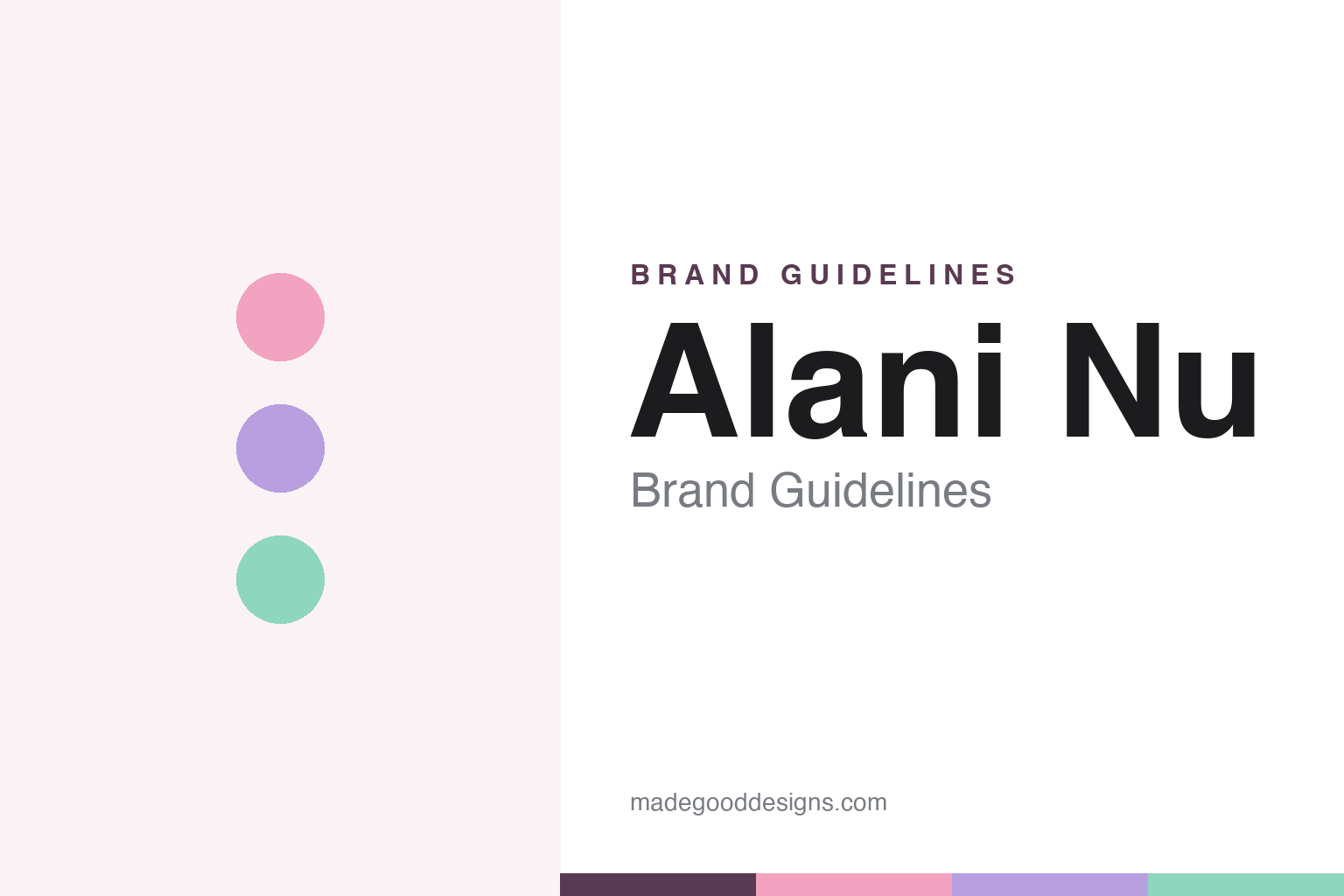
Alani Nu Brand Guidelines
Big flavour. Bright energy.
Aa
Two constants: a soft pastel palette and a soft rounded wordmark. Abstract homage — not the Alani Nu wordmark or cans.
The energy drink that went pastel
Alani Nu won by looking nothing like an energy drink.
Alani Nu is a lesson in counter-coding a category. Founded in 2018 by fitness influencer Katy Hearn and her husband Haydn Schneider (starting in supplements, with the energy drink arriving in 2019), it built a fast-growing, female-focused “better-for-you” brand — zero sugar, 200mg caffeine, added vitamins.
Its genius is design. In a category of black cans and aggressive neon, Alani Nu went pastel — soft pinks, lilacs and mints, a clean, beauty-adjacent look so pretty that fans display the cans. That deliberate anti-macho femininity is the whole brand-design thesis, paired with a lowercase “alani nu” wordmark and the line “Big Flavor. Bright Energy.”
(Honest notes: Alani Nu is no longer independent — Celsius Holdings acquired it in 2025 for about $1.8 billion (closed April 2025), and the founders exited; it started in supplements (2018), with the energy drink following in 2019; and the pastel look is a deliberate counter to macho energy branding, not an accident. No official brand hex is published.)
Colour
Alani Nu lives in soft pastels. Click a swatch to copy the hex.
Alani Nu’s identity is soft, pastel and feminine — a pink, a lilac, a mint, a cream, and a deep plum. The palette is candy-soft: powder pinks, lavenders and mints that read more like a beauty brand than a caffeine bomb. It signals wellness, self-care and a female audience the category long ignored. The honest caveat: with no published brand hex, these tones are an original, unofficial interpretation, not first-party values.
The lesson is pastels can be a competitive weapon. Alani Nu’s world is soft and pretty on purpose — the opposite of black-and-neon. For designers, it is a reminder that counter-coding a category’s visual clichés can open an underserved audience: soft, collectible cans stood out precisely because everything else shouted. The takeaways: identify the category’s default codes and consider inverting them; make the pack collectible; and treat any single hex as unofficial — using a deep plum for small text so the pastels stay soft.
Typography
The wordmark spirit is a soft rounded sans — friendly and feminine.
Alani Nu’s identity carries a soft, friendly, feminine spirit — a lowercase “alani nu” wordmark on pretty pastel cans. A soft rounded sans captures the mood: it is warm and approachable, the register of a wellness brand made for women in a macho category. Set against pastels, the rounded type feels gentle and modern — exactly the beauty-adjacent, self-care personality Alani Nu carries. It is soft rather than aggressive, mirroring a can you’d leave out on a desk. (Alani Nu’s real wordmark and cans are trademarks and trade dress we describe but do not reproduce, and the exact typeface is not published, so we don’t assert it.) Because the specific mark is not ours to use, the honest description is “a soft rounded spirit,” not the Alani Nu logo. The type behaves like the brand: soft, friendly and modern.
Aa
A soft rounded spirit — friendly and feminine. (Specimen set in Quicksand, a rounded sans; NOT the Alani Nu logo, which is a trademark.)
Winning the audience the category ignored
Alani Nu stands for pretty.
Alani Nu is a lesson in designing for an ignored audience. The energy category coded itself male — black, neon, aggressive — and Alani Nu simply designed for the women it overlooked, in soft, collectible pastels. The look did the positioning: it said “this is for you” to a whole market, and grew into a billion-dollar brand on the strength of that clarity. The differentiator is a deliberately opposite aesthetic aimed at an open audience.
For designers and brand-builders, Alani Nu offers a clear takeaway: who a design speaks to is a strategy. The lessons: read the category’s default codes and invert them to reach the overlooked; make packaging feel personal and collectible; and let a genuine audience insight (women want in) lead the palette. It is also a reminder to stay accurate: Alani Nu started in supplements (2018), and it is now Celsius-owned (2025, ~$1.8 billion) rather than founder-run — with the palette here an unofficial interpretation. Alani Nu went pastel — proof that designing for the ignored can be the difference.
Explore & save
Keep Alani Nu’s identity on hand — save it to a board in the Made Good inspiration library.
Alani Nu identity set
Pin the soft pastel palette and the soft-rounded spirit to your own board.


