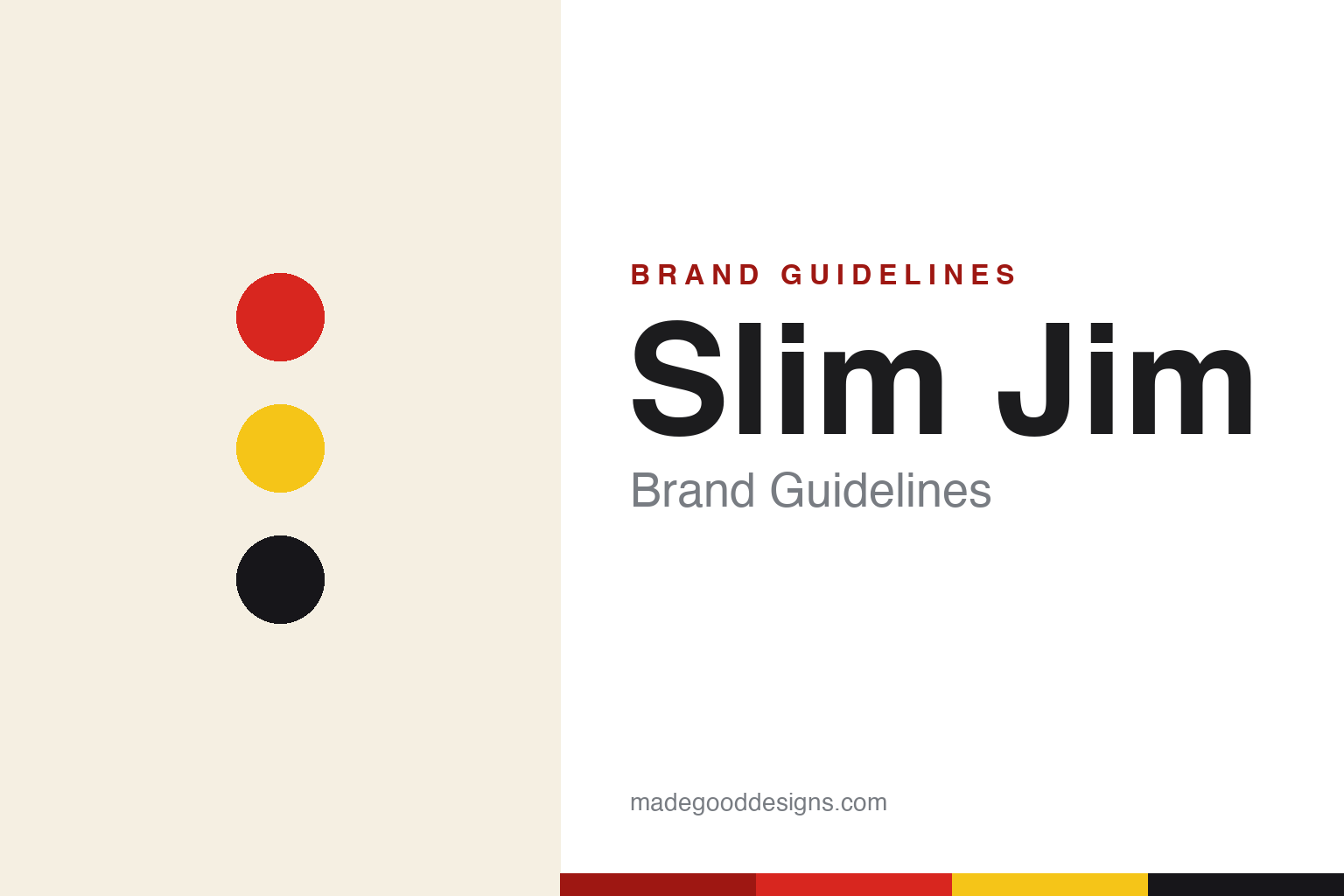
Slim Jim Brand Guidelines
Snap into a Slim Jim!
Aa
Two constants: a bold red-and-yellow palette and a heavy black wordmark. Abstract homage — not the Slim Jim wordmark or packaging.
The edgiest stick in the aisle
Slim Jim turned a meat stick into a meme.
Slim Jim is a lesson in attitude as branding. Created by Adolph “Al” Levis in Philadelphia in 1929 and now owned by Conagra Brands, it is a shelf-stable, spicy meat-stick icon — a checkout-lane fixture selling around a billion sticks a year. But its real distinctiveness is tone: loud, edgy and funny.
That voice made it famous. The 1990s “Snap into a Slim Jim!” campaign, fronted by wrestler “Macho Man” Randy Savage, is one of the most memorable ad lines in snack history; more recently, its irreverent, meme-driven social media grew a cult fan community — the “Long Boi Gang” — into the millions. All of it rides on a bold red-and-yellow look.
(Honest notes: Slim Jim dates to 1929 and passed through General Mills (1967) and GoodMark before Conagra acquired it in 1998; Randy Savage was the iconic spokesman (from 1993), though not the first; and its edgy voice is a deliberate, documented strategy. No official brand hex is published.)
Colour
Slim Jim lives in red and yellow. Click a swatch to copy the hex.
Slim Jim’s identity is loud, red and yellow — a Slim red, a bold yellow, a black, a cream, and an ink. The palette is high-voltage: a hot red and a bright yellow, grounded by black. It signals cheap, spicy, fun, anti-precious energy — the opposite of a wellness snack. The honest caveat: with no published brand hex, these tones are an original, unofficial interpretation, not first-party values.
The lesson is a loud palette can carry a loud voice. Slim Jim’s world is red, yellow and unapologetic. For designers, it is a reminder that colour and tone should agree — a brand that jokes and shouts should look like it, with high-contrast, aggressive colour. The takeaways: match palette to voice; commit to a bold, high-contrast pair; and treat any single hex as unofficial — using a deep red for small text so the bright red and yellow stay the field.
Typography
The wordmark spirit is a heavy black sans — bold and edgy.
Slim Jim’s identity carries a bold, edgy, irreverent spirit — a heavy wordmark on a loud red-and-yellow pack, matched by a wisecracking voice. A heavy black sans captures the mood: it is punchy and unapologetic, the register of a brand that made “Snap into a Slim Jim!” a catchphrase and turned memes into a fan army. Set against red and yellow, the heavy type feels aggressive and fun — exactly the edgy personality Slim Jim carries. It is loud rather than tasteful, mirroring a snack that revels in being over-the-top. (Slim Jim’s real wordmark and packaging are trademarks and trade dress we describe but do not reproduce, and the exact typeface is not published, so we don’t assert it.) Because the specific mark is not ours to use, the honest description is “a heavy black spirit,” not the Slim Jim logo. The type behaves like the brand: bold, edgy and loud.
Aa
A heavy black spirit — bold and edgy. (Specimen set in Archivo Black, a heavy sans; NOT the Slim Jim logo, which is a trademark.)
Tone of voice as the whole brand
Slim Jim stands for attitude.
Slim Jim is a lesson in owning a tone. A cheap meat stick could be forgettable; Slim Jim made itself unforgettable with loud, funny, irreverent branding — a wrestler yelling “snap into it,” a red-and-yellow pack, and a meme-fluent social presence that built the “Long Boi Gang.” The product is ordinary; the voice is not. The differentiator is a committed, distinctive attitude.
For designers and brand-builders, Slim Jim offers a clear takeaway: voice can be the brand’s biggest asset. The lessons: pick a tone and commit to it fully (edgy, funny, loud); make the visual system match the voice; and let culture (a catchphrase, a fan community) amplify it. It is also a reminder to stay accurate: Slim Jim dates to 1929 and is owned by Conagra, and Randy Savage was the iconic (not first) spokesman — with the palette here an unofficial interpretation. Slim Jim snapped into attitude — proof that voice can be the difference.
Explore & save
Keep Slim Jim’s identity on hand — save it to a board in the Made Good inspiration library.
Slim Jim identity set
Pin the red-and-yellow palette and the heavy-black spirit to your own board.