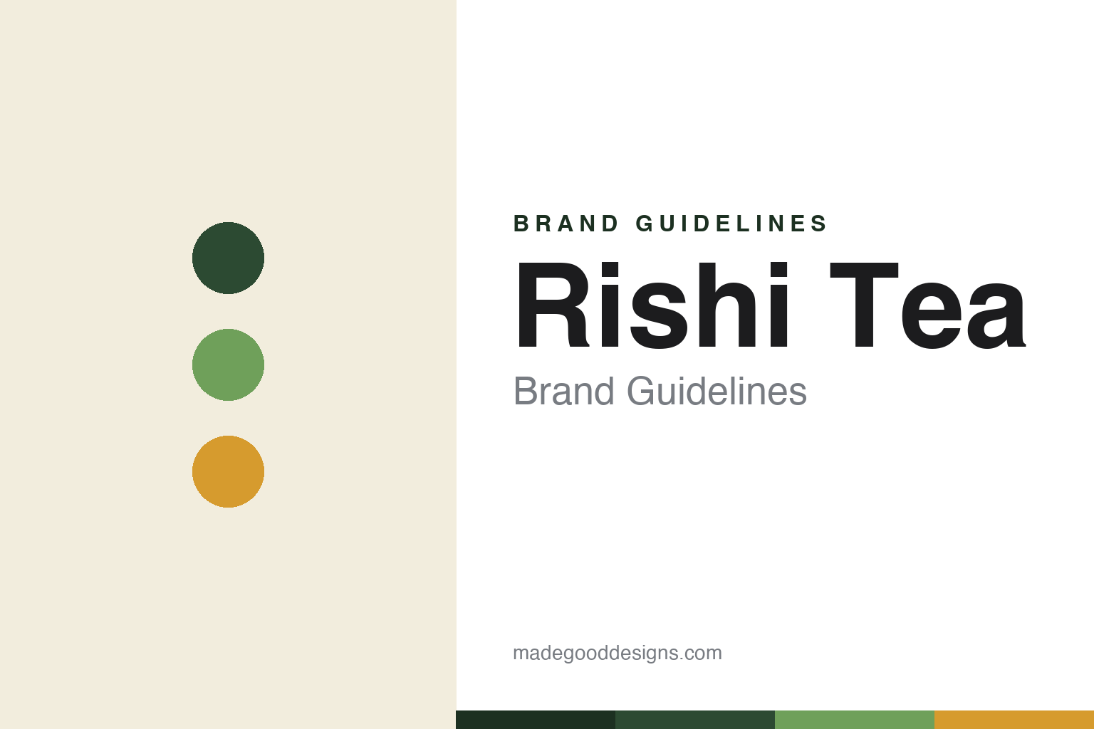
Rishi Tea Brand Guidelines
Direct-trade organic tea from off the beaten path.
Aa
Two constants: a botanical-green palette and a modern sans. Abstract homage — not the Rishi wordmark or logo.
Off the beaten path
Rishi built tea on direct trade.
Rishi Tea is a lesson in sourcing as the brand. Founded in 1997 in Milwaukee, Wisconsin by Joshua Kaiser, it bet that people would embrace artisan tea the way they had embraced single-origin coffee and fine wine. Its foundation is direct trade — relationships traceable “back to individual farms” — and it was among the first to earn USDA organic certification, in 2002.
Now branded Rishi Tea & Botanicals, it is a major supplier of organic teas and matcha to specialty cafés and restaurants, alongside its direct-to-consumer and grocery channels. Its range spans loose-leaf, sachets, ceremonial and barista matcha, concentrates, sparkling botanicals, and caffeine-free botanical blends — with more than 95% of ingredients certified organic.
(Honest notes: Rishi frames direct trade and organic sourcing as the heart of its quality story; the “& Botanicals” rename reflects its broader botanical range, though we don’t assert a specific year for it; and it is privately held, with no acquisition publicly reported. No official brand hex is published, so any values here are an interpretation.)
Colour
Rishi lives in a botanical-green palette. Click a swatch to copy the hex.
Rishi’s identity is natural, botanical and authentic — a botanical green, a matcha green, a turmeric gold, a cream, and a bark brown. The palette reads like the ingredients: deep botanical and matcha greens, a turmeric gold, earthy neutrals — an organic, origin-forward world. It signals a direct-trade, garden-to-cup brand rather than a synthetic mass-market one. The honest caveat: with no published brand hex, these tones are an original, unofficial interpretation, not first-party values.
The lesson is botanical greens plus earth tones read as organic and direct-trade. Rishi’s world feels natural and considered. For designers, it is a reminder that a green-and-earth palette with botanical illustration can communicate authenticity and origin, matching a brand built on traceable sourcing. The takeaways: build on botanical greens and earthy neutrals; use botanical illustration and origin cues; and treat any single hex as unofficial — using the deep botanical green for small text so the brighter tones stay in the palette.
Typography
The wordmark spirit is a modern sans — clean and natural.
Rishi’s identity carries a clean, natural, authentic spirit — a simple “Rishi” wordmark, modern and unfussy, with no mascot. A modern sans captures the mood: it is clear and contemporary, the register of a brand that lets botanical illustration and origin photography carry the warmth. Set against botanical greens, the modern sans feels natural and premium — exactly the direct-trade, origin-obsessed personality Rishi carries. It is clean rather than ornate, mirroring a brand focused on the leaf and its source. (Rishi’s real wordmark is a trademark we describe but do not reproduce, and the exact typeface is not something we assert.) Because the specific mark is not ours to use, the honest description is “a modern sans spirit,” not the Rishi logo. The type behaves like the brand: clean, modern and natural.
Aa
A modern sans spirit — clean and natural. (Specimen set in Sora, a modern sans; NOT the Rishi logo, which is a trademark.)
Traceable sourcing as the difference
Rishi stands for where its tea comes from.
Rishi is a lesson in making sourcing the story. It did not lead with flavour gimmicks; it led with direct trade and organic certification — relationships with specific gardens, traceable to individual farms. By building the brand on where the tea comes from, Rishi earned trust with both cafés and consumers who care about origin. The differentiator is provenance: know your farms, and the quality claim becomes credible.
For designers and brand-builders, Rishi offers a clear takeaway: a natural, origin-forward identity should look as traceable as the sourcing. The lessons: build on botanical greens and earthy neutrals; use illustration and origin cues rather than hype; and let real certifications (organic, direct trade) do the persuading. It is also a reminder to stay accurate: Rishi was founded in 1997, it was an early organic-certified brand, and it is privately held — with the palette here an unofficial interpretation. Rishi made sourcing the story — proof that provenance can be the difference.
Explore & save
Keep Rishi Tea’s identity on hand — save it to a board in the Made Good inspiration library.
Rishi Tea identity set
Pin the botanical-green palette and the modern-sans spirit to your own board.


