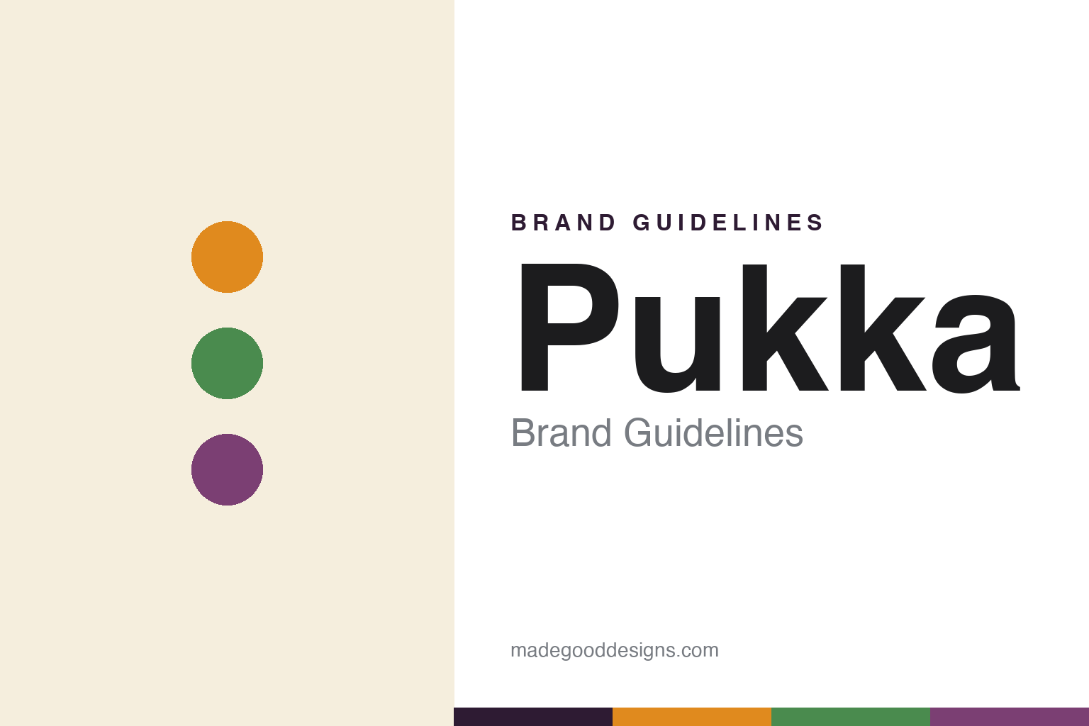
Pukka Brand Guidelines
Organic herbal tea, authentically ornate.
Aa
Two constants: a vibrant, color-coded palette and a warm sans. Abstract homage — not the Pukka wordmark or logo.
Pukka means authentic
Pukka built organic herbal wellness.
Pukka is a lesson in ornament as identity. Founded in 2001 in Bristol, England by Sebastian Pole, a trained herbalist, and Tim Westwell, it makes organic herbal and wellness teas — Ayurvedic-inspired blends rather than mostly “true” tea. The name says it all: “Pukka” is an Anglo-Indian word meaning authentic, genuine, first-class.
Its blends are colour-coded and named for their purpose — Three Mint, Turmeric Gold, Night Time, and Feel New (formerly “Detox,” renamed under health-claim rules). Sustainability is central: Pukka is organic and a prominent adopter of FairWild, a standard for sustainable wild-harvesting of herbs, and it became a Certified B Corporation in 2016.
(Honest notes on ownership: Pukka was acquired by Unilever in 2017; Unilever’s tea business was later sold to CVC Capital Partners in 2022 and now trades as Lipton Teas and Infusions — so Pukka sits there today, not under Unilever. The founders stepped back after 2017; and its B Corp status is best checked live. No official brand hex is published.)
Colour
Pukka lives in a vibrant, color-coded palette. Click a swatch to copy the hex.
Pukka’s identity is vibrant, ornate and refined — a turmeric orange, a herbal green, a berry purple, a cream, and a deep plum. Rather than one corporate colour, Pukka uses a full, saturated spectrum, colour-coded per blend, wrapped in intricate, mandala-like botanical patterns. It signals an organic, Ayurvedic-inspired wellness brand rather than a plain herbal box. The honest caveat: with no published brand hex (and an intentionally multi-colour system), these tones are an original, unofficial interpretation, not first-party values.
The lesson is ornate, colour-coded pattern reads as authentic herbal wellness. Pukka’s world is bright and kaleidoscopic yet still premium. For designers, it is a reminder that intricate illustration and a per-blend colour system can make a herbal range feel both varied and coherent, matching a brand rooted in Ayurvedic tradition. The takeaways: let ornament and pattern carry the identity; code colour to each blend; and treat any single hex as unofficial — using the deep plum for small text so the brights stay vivid.
Typography
The wordmark spirit is a warm sans — friendly and grounded.
Pukka’s identity carries a warm, grounded, wellness spirit — a “Pukka” wordmark that sits within a richly decorative, patterned world. A warm sans captures the mood: it is friendly and human, the register of a brand built on herbs, wellbeing and authenticity. Set against vibrant, mandala-like packaging, the warm sans feels approachable and natural — exactly the organic, Ayurvedic-inspired personality Pukka carries. It is warm rather than clinical, mirroring a brand that connects people and plants. (Pukka’s real wordmark is a trademark we describe but do not reproduce, and the exact typeface is not something we assert.) Because the specific mark is not ours to use, the honest description is “a warm sans spirit,” not the Pukka logo. The type behaves like the brand: warm, friendly and grounded.
Aa
A warm sans spirit — friendly and grounded. (Specimen set in Mulish, a warm sans; NOT the Pukka logo, which is a trademark.)
Ornament as the difference
Pukka stands for its ornate, authentic world.
Pukka is a lesson in owning a decorative style. It did not adopt the clean, minimal look of most wellness brands; it went the opposite way — intricate, colourful, mandala-like packaging that reads as authentic, Ayurvedic and alive. That ornament, coded by blend, makes a whole herbal range instantly recognisable and coherent. The differentiator is ornament with meaning: decoration that expresses the brand’s roots, not just prettiness.
For designers and brand-builders, Pukka offers a clear takeaway: a rich, consistent decorative system can be a moat. The lessons: commit to a distinctive illustration style; colour-code by blend so the range coheres; and root the ornament in a real story (herbalism, FairWild, organic). It is also a reminder to stay accurate: Pukka was founded in 2001, means “authentic,” and now sits under Lipton Teas and Infusions after Unilever’s tea business was sold — with the palette here an unofficial interpretation. Pukka owned its ornament — proof that decoration can be the difference.
Explore & save
Keep Pukka’s identity on hand — save it to a board in the Made Good inspiration library.
Pukka identity set
Pin the vibrant, color-coded palette and the warm-sans spirit to your own board.


