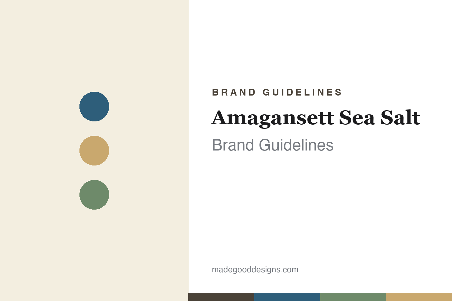
Amagansett Sea Salt Brand Guidelines
Solar-harvested salt from the Hamptons.
Aa
Two constants: a coastal palette and a coastal serif. Abstract homage — not the Amagansett Sea Salt wordmark or logo.
Sea, wind, sun, patience
Amagansett makes salt with the sun.
Amagansett Sea Salt is a lesson in method as identity. Founded in 2011 in Amagansett, in the Hamptons (eastern Long Island), by a couple — Natalie and Steven, both former attorneys who left law to make salt — it grew from a lifelong love of their childhood beach town. The whole brand is built on how the salt is made.
Its method is patient and natural: they collect Atlantic seawater, filter it, and evaporate it outdoors in open-air pans using only sun, wind and time — no boiling, no ovens, no artificial heat — harvesting the flakes by hand, year-round. The result is a delicate finishing salt, sometimes called “the fleur de sel of New York,” alongside seasonal infused salts (Merlot wine, truffle, Aleppo pepper and more).
(Honest notes: there are two founders, a couple — Natalie is a co-founder, not a footnote; the surname reported in press is “Judelson,” which we attribute rather than assert; flavours are seasonal and rotate; and no official brand hex is published, so colours are an interpretation.)
Colour
Amagansett lives in a coastal palette. Click a swatch to copy the hex.
Amagansett’s identity is coastal, natural and understated — an Atlantic blue, a sand, a dune green, a cream, and a driftwood brown. The palette is the shoreline: the blue of the Atlantic, sandy tans, dune greens, driftwood neutrals. It signals a small-batch, hand-harvested, coastal craft brand rather than a commodity. The honest caveat: with no published brand hex, these tones are an original, unofficial interpretation, not first-party values.
The lesson is coastal, natural colour reads as artisan and place-based. Amagansett’s world is quiet and seaside. For designers, it is a reminder that a shoreline palette — Atlantic blue, sand, dune green — plus clean glass jars can make a finishing salt feel genuinely of its place, matching a sun-and-wind method. The takeaways: draw the palette from the coast; keep the packaging clean and glass-forward; and treat any single hex as unofficial — using the driftwood brown for small text so the coastal tones stay soft.
Typography
The wordmark spirit is a coastal serif — warm and personal.
Amagansett’s identity carries a warm, personal, coastal spirit — an “Amagansett Sea Salt” wordmark on clean glass jars, first-person and heartfelt. A coastal serif captures the mood: it is warm and considered, the register of a couple who write in “we” and named the brand for their beloved beach town. Set against a shoreline palette, the coastal serif feels personal and artisan — exactly the slow-craft, “sea, wind, sun, patience” personality Amagansett carries. It is warm rather than corporate, mirroring a small, hand-made operation. (Amagansett’s real wordmark is a trademark we describe but do not reproduce, and the exact typeface is not something we assert.) Because the specific mark is not ours to use, the honest description is “a coastal serif spirit,” not the Amagansett logo. The type behaves like the brand: warm, personal and coastal.
Aa
A coastal serif spirit — warm and personal. (Specimen set in Petrona, a warm serif; NOT the Amagansett Sea Salt logo, which is a trademark.)
A slow method as the difference
Amagansett stands for sun and patience.
Amagansett Sea Salt is a lesson in letting the method be the brand. It did not scale with heat and machinery; it kept the process slow and natural — sun, wind and time, by hand, year-round — and made that patience the whole story. In a category where much salt is boiled or industrially produced, a genuinely solar, hand-harvested method is a real, ownable difference. The differentiator is process integrity: do it the patient way, and the method becomes the message.
For designers and brand-builders, Amagansett offers a clear takeaway: a distinctive method deserves a personal, place-based identity. The lessons: let the process lead the story (sun, wind, patience); use a coastal palette and clean glass; and keep the voice warm and first-person. It is also a reminder to stay accurate: Amagansett was founded in 2011 by a couple (both former attorneys), uses a solar-evaporation method, and rotates seasonal flavours — with the palette here an unofficial interpretation. Amagansett made patience the point — proof that method can be the difference.
Explore & save
Keep Amagansett Sea Salt’s identity on hand — save it to a board in the Made Good inspiration library.
Amagansett Sea Salt identity set
Pin the coastal palette and the coastal-serif spirit to your own board.


