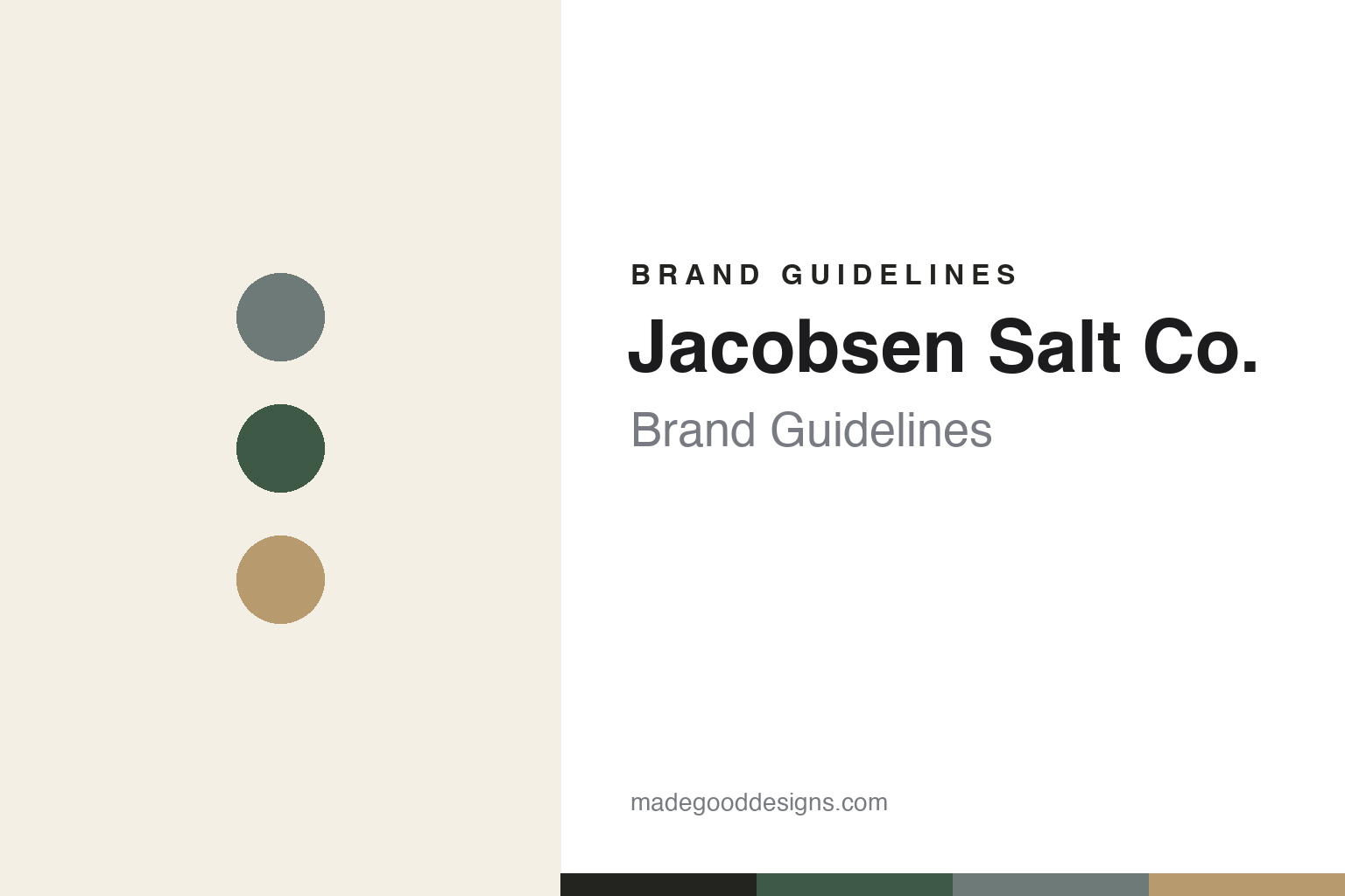
Jacobsen Salt Co. Brand Guidelines
Flake sea salt from the Oregon coast.
Aa
Two constants: a muted, natural palette and a minimal sans. Abstract homage — not the Jacobsen wordmark or logo.
Harvested on the Oregon coast
Jacobsen revived Pacific sea salt.
Jacobsen Salt Co. is a lesson in craft plus design. Founded in 2011 by Ben Jacobsen, it harvests sea salt from Netarts Bay on the Oregon coast — chosen after testing dozens of Pacific sites for its bright salinity and the natural filtering of its oyster beds — and packs and ships from Portland. It is one of the most design-forward names in American salt.
Its hero is a flake finishing sea salt — bright, briny, crunchy pyramid flakes, hand-harvested and hand-graded — alongside kosher-style and infused salts, plus honey, pantry goods and even caramels. Jacobsen is often described as reviving commercial finishing sea salt on the Pacific coast after generations, and it built its reputation through chefs.
(Honest notes: the salt is made at Netarts Bay, while Portland is the packaging/HQ base — don’t say it’s “made in Portland”; the “first Pacific harvest in generations” framing is a widely-repeated description rather than a claim on the company’s own site, so we attribute it; it is privately held and founder-led; and no official brand hex is published.)
Colour
Jacobsen lives in muted, natural tones. Click a swatch to copy the hex.
Jacobsen’s identity is minimalist, natural and premium — a sea grey, an Oregon green, a kraft tan, an off-white, and an ink. The palette is quiet and coastal: muted greys and greens, natural kraft, lots of white space. It signals a design-led, craft brand rather than a mass-market box. The honest caveat: with no published brand hex, these tones are an original, unofficial interpretation, not first-party values.
The lesson is muted, natural colour reads as design-forward craft. Jacobsen’s world is calm and considered. For designers, it is a reminder that restraint — muted tones, generous white space, a clean wordmark — can make a pantry staple feel like a premium “made object,” matching a brand built on craft and place. The takeaways: keep the palette muted and natural; let white space and typography lead; and treat any single hex as unofficial — using the ink for small text so the naturals stay quiet.
Typography
The wordmark spirit is a minimal sans — clean and coastal.
Jacobsen’s identity carries a clean, minimalist, coastal spirit — a “Jacobsen Salt Co.” wordmark used as the logo itself, no mascot, lots of negative space. A minimal sans captures the mood: it is restrained and modern, the register of a brand whose lines are “Harvested on the Oregon Coast” and “Bring the Oregon Coast to Your Kitchen.” Set against muted naturals, the minimal sans feels design-forward and calm — exactly the craft, place-proud personality Jacobsen carries. It is minimal rather than busy, mirroring premium packaging with room to breathe. (Jacobsen’s real wordmark is a trademark we describe but do not reproduce, and the exact typeface is not something we assert.) Because the specific mark is not ours to use, the honest description is “a minimal sans spirit,” not the Jacobsen logo. The type behaves like the brand: clean, minimalist and coastal.
Aa
A minimal sans spirit — clean and coastal. (Specimen set in Instrument Sans, a minimalist sans; NOT the Jacobsen logo, which is a trademark.)
Design as the difference
Jacobsen stands for craft made beautiful.
Jacobsen Salt Co. is a lesson in pairing genuine craft with genuine design. It did not just harvest good salt; it made the whole brand look as considered as the product — minimalist packaging, a clean wordmark, muted natural tones — so a jar of salt reads as a premium object. That combination of real place-based craft and design restraint is why Jacobsen stands out in a commodity category. The differentiator is design discipline on top of real craft.
For designers and brand-builders, Jacobsen offers a clear takeaway: restraint can be the loudest choice in a busy category. The lessons: build on muted, natural tones and white space; let a clean wordmark be the logo; and root it in a true story (Netarts Bay, hand-harvested). It is also a reminder to stay accurate: Jacobsen was founded in 2011, harvests at Netarts Bay (Portland is the base), and is founder-led — with the palette here an unofficial interpretation, and the “first Pacific harvest” framing attributed rather than asserted. Jacobsen made salt beautiful — proof that design can be the difference.
Explore & save
Keep Jacobsen Salt Co.’s identity on hand — save it to a board in the Made Good inspiration library.
Jacobsen Salt Co. identity set
Pin the muted, natural palette and the minimal-sans spirit to your own board.


