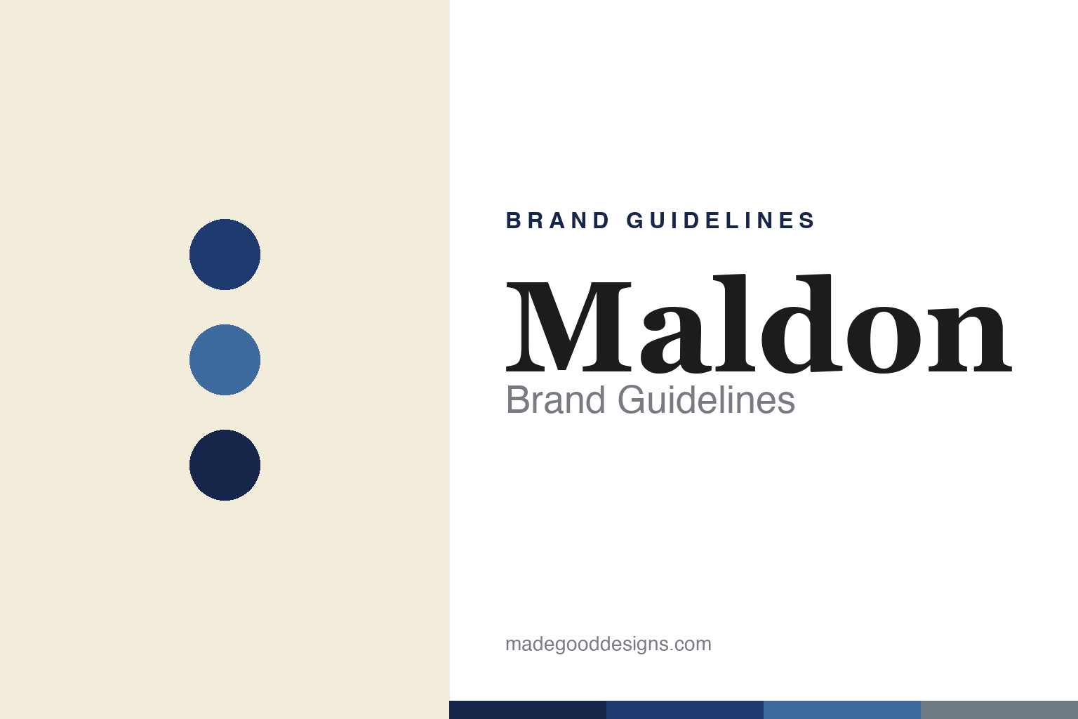
Maldon Brand Guidelines
The pyramid-flake sea salt since 1882.
Aa
Two constants: a deep-blue palette and a heritage serif. Abstract homage — not the Maldon wordmark or box.
Master salt makers
Maldon is famous for its flakes.
Maldon is a lesson in a crystal shape as a signature. Made in Maldon, Essex, England, on the Blackwater estuary, The Maldon Crystal Salt Company was founded in 1882 (the town’s salt-making tradition runs back roughly a thousand years, to the Domesday Book and Roman times). It is still family-owned by the Osborne family, across four generations.
Its fame rests on one thing: soft, crunchy, hollow inverted-pyramid sea salt flakes, hand-harvested and prized by chefs as a finishing salt — the company calls the pyramid shape its own “trademark.” Alongside the hero flake it makes a smoked sea salt (over English oak). Exported to 60+ countries, it holds a Royal Warrant as, in the company’s words, purveyors of sea salt to the Royal Household.
(Honest notes: 1882 is the company’s founding under its current name (keep it distinct from the town’s ancient salt heritage); the Osborne family has run it for about a century, but were not the 1882 founders; the Royal Warrant is as the company states, to King Charles III; and no official brand hex is published.)
Colour
Maldon lives in a deep blue. Click a swatch to copy the hex.
Maldon’s identity is heritage, deep-blue and understated — a Maldon blue, a sea blue, a deep navy, a cream, and an estuary grey. The palette is essentially the box: a deep-blue carton with the wordmark reversed out in white, a clean two-colour scheme. It signals a traditional, artisan, premium finishing salt rather than a mass-market commodity. The honest caveat: with no published brand hex, these tones are an original, unofficial interpretation, not first-party values.
The lesson is a single deep colour can carry heritage premium. Maldon’s world is calm and confident. For designers, it is a reminder that a restrained, deep-blue box with white type can feel both traditional and premium, letting the product (the flakes) be the hero. The takeaways: commit to one deep, heritage colour; keep the packaging clean and two-colour; and treat any single hex as unofficial — using the deep navy for small text so the blue stays rich.
Typography
The wordmark spirit is a heritage serif — traditional and refined.
Maldon’s identity carries a traditional, refined, artisan spirit — a “Maldon” wordmark set in white on a deep-blue box, understated and heritage. A heritage serif captures the mood: it is classic and considered, the register of a family firm that calls itself “Master Salt Makers and Merchants.” Set against a deep blue, the heritage serif feels traditional and premium — exactly the hand-harvested, chef-favourite personality Maldon carries. It is refined rather than flashy, mirroring a restrained heritage box. (Maldon’s real wordmark and box are trademarks and trade dress we describe but do not reproduce, and the exact typeface is not something we assert.) Because the specific mark is not ours to use, the honest description is “a heritage serif spirit,” not the Maldon logo. The type behaves like the brand: traditional, refined and artisan.
Aa
A heritage serif spirit — traditional and refined. (Specimen set in Frank Ruhl Libre, a heritage serif; NOT the Maldon logo, which is a trademark.)
A signature crystal as the difference
Maldon stands for its pyramid flake.
Maldon is a lesson in owning a physical signature. It did not win on marketing spend; it won on the pyramid flake — a crystal so distinctive the company treats it as a trademark, so good that chefs the world over reach for it as a finishing salt. That signature, plus a hand-harvested heritage and a deep-blue box, is the whole brand. The differentiator is a genuine, tactile product signature that competitors can’t copy.
For designers and brand-builders, Maldon offers a clear takeaway: a real product signature deserves calm, confident packaging. The lessons: let a genuine product hallmark lead (the flake); wrap it in a restrained, heritage colour (the blue box); and let longevity and craft (family-owned, Royal Warrant) carry the premium. It is also a reminder to stay accurate: Maldon was founded in 1882, is family-owned by the Osbornes for four generations, and is famous for its pyramid flakes — with the palette here an unofficial interpretation. Maldon owns its flake — proof that a product signature can be the difference.
Explore & save
Keep Maldon’s identity on hand — save it to a board in the Made Good inspiration library.
Maldon identity set
Pin the deep-blue palette and the heritage-serif spirit to your own board.


