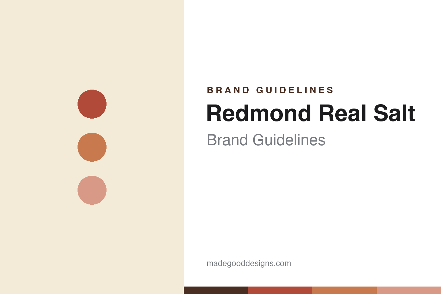
Redmond Real Salt Brand Guidelines
Unrefined salt from an ancient seabed.
Aa
Two constants: an earthy, mineral palette and a natural sans. Abstract homage — not the Redmond wordmark or logo.
The secret’s in the salt
Redmond mines an ancient sea.
Redmond Real Salt is a lesson in provenance as the product. It is mined from an ancient seabed in central Utah, near the town of Redmond — a Jurassic-era deposit later sealed by volcanic ash, which the brand says protects it from modern pollutants. The company traces its roots to the 1950s, when a Utah farming family began mining the deposit as a mineral supplement for livestock, then realised the unrefined, mineral-rich salt was good for people too.
The flagship, “Real Salt,” is an unrefined, additive-free salt with a pink-to-reddish colour from its trace minerals — positioned against refined table salt. Redmond has since grown into a natural-health family of products (electrolytes, natural toothpaste, bentonite clay, agriculture), and it owns the deposit and controls everything “from the mine to the shelf.”
(Honest notes: although marketed as “sea salt,” it is dry-mined rock salt from an ancient seabed, not evaporated from today’s ocean; the popular “1958 / founding-family” retelling is widely repeated but hard to verify, and the company today is family-operated under Redmond Inc. (CEO Rhett Roberts); its pink colour is American, not Himalayan; and no official brand hex is published.)
Colour
Redmond lives in an earthy, mineral palette. Click a swatch to copy the hex.
Redmond’s identity is earthy, natural and mineral — a rock red, a terracotta, a mineral pink, a cream, and an earth brown. The palette comes straight from the salt: the pink-to-reddish rock colour, warm terracottas, natural cream and kraft. It signals an unrefined, natural-health product rather than a refined commodity. The honest caveat: with no published brand hex, these tones are an original, unofficial interpretation, not first-party values.
The lesson is earthy, mineral colour reads as natural and unrefined. Redmond’s world is warm and elemental. For designers, it is a reminder that letting a product’s own natural colour (the reddish rock salt) lead the palette can communicate authenticity and “realness,” matching a brand built on an ancient, unprocessed source. The takeaways: build on the product’s real earth tones; keep the look natural and clean; and treat any single hex as unofficial — using the earth brown for small text so the reds and pinks stay warm.
Typography
The wordmark spirit is a natural sans — clean and grounded.
Redmond’s identity carries a natural, grounded, honest spirit — a “Redmond” house name over the “Real Salt®” product mark, on earthy, outdoorsy packaging. A natural sans captures the mood: it is clean and unpretentious, the register of a brand whose taglines are “The secret’s in the salt” and “From our mine to your table.” Set against earthy, mineral tones, the natural sans feels honest and elemental — exactly the unrefined, real-food personality Redmond carries. It is grounded rather than glossy, mirroring an ancient, unprocessed source. (Redmond’s real wordmarks are trademarks we describe but do not reproduce, and the exact typeface is not something we assert.) Because the specific mark is not ours to use, the honest description is “a natural sans spirit,” not the Redmond logo. The type behaves like the brand: natural, grounded and honest.
Aa
A natural sans spirit — clean and grounded. (Specimen set in Work Sans, a clean sans; NOT the Redmond logo, which is a trademark.)
Provenance as the difference
Redmond stands for where its salt comes from.
Redmond Real Salt is a lesson in owning a source. It did not sell salt as a commodity; it sold a place and a story — an ancient Utah seabed, mined and unrefined, controlled end to end from mine to shelf. That vertical integration and “realness” is the whole pitch, and the reddish colour makes the story visible in the product itself. The differentiator is provenance you can see: own the source, and the authenticity is literal.
For designers and brand-builders, Redmond offers a clear takeaway: a genuine source should drive the identity. The lessons: let the product’s own colour and origin lead (the reddish, ancient-seabed salt); keep the design natural and honest; and let vertical integration back the authenticity claim. It is also a reminder to stay accurate: Redmond’s salt is mined from an ancient seabed (not evaporated from the sea), its founding retelling should be hedged, and its pink is American, not Himalayan — with the palette here an unofficial interpretation. Redmond owns its source — proof that provenance can be the difference.
Explore & save
Keep Redmond Real Salt’s identity on hand — save it to a board in the Made Good inspiration library.
Redmond Real Salt identity set
Pin the earthy, mineral palette and the natural-sans spirit to your own board.


