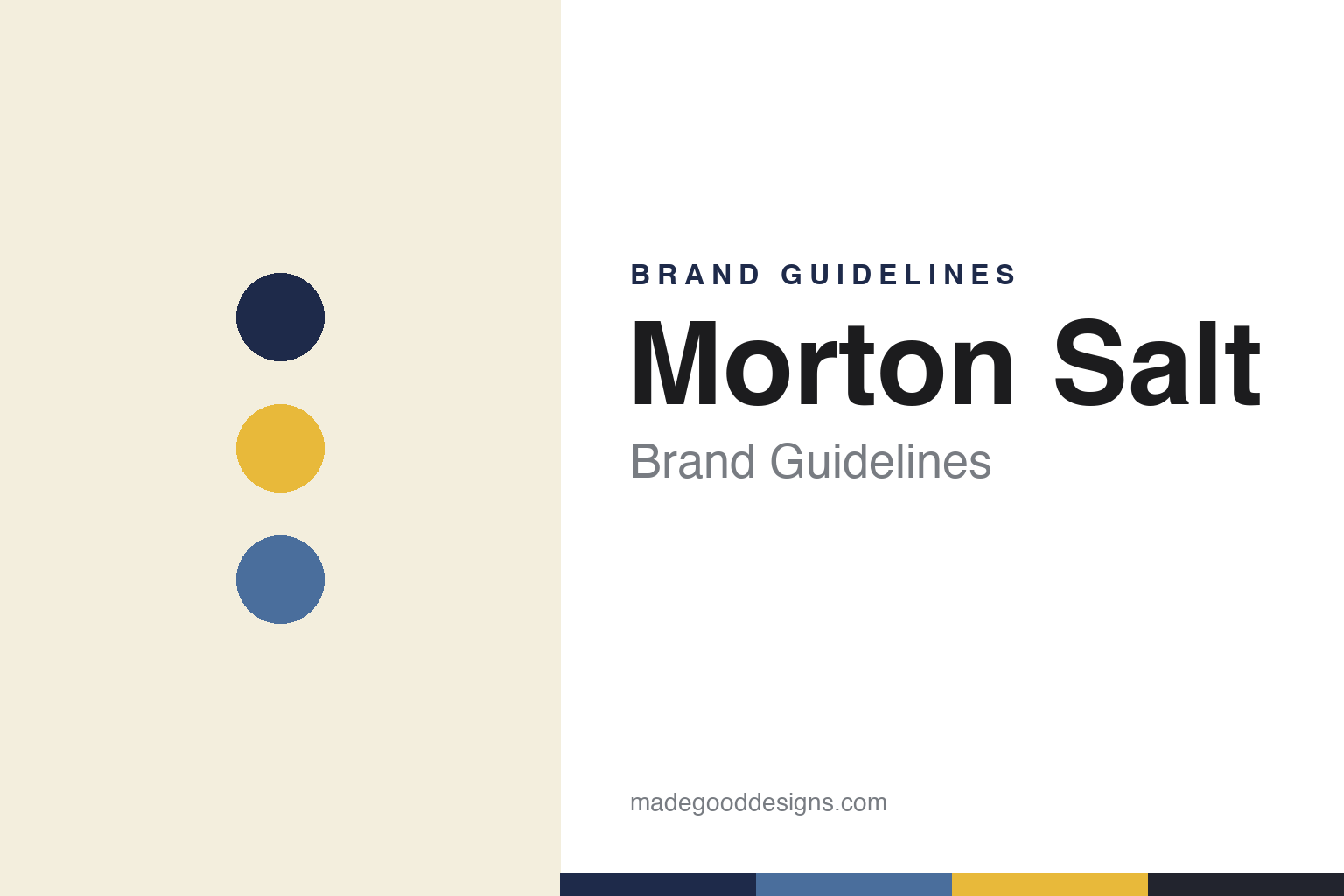
Morton Salt Brand Guidelines
When it rains it pours.
Aa
Two constants: a navy-and-yellow palette and a bold Americana type. Abstract homage — not the Morton wordmark, canister or mascot.
The salt that pours
Morton made salt free-flowing.
Morton Salt is a lesson in solving a problem and owning the story. Its lineage traces to 1848 in Chicago (a salt agency started by Alonzo Richmond); Joy Morton invested in the business in 1880, and the Morton Salt Company was incorporated in 1910. Its most famous move was practical: an anti-caking agent that made the first free-flowing salt — salt that pours even in damp weather.
That innovation became one of America’s most enduring campaigns. In 1914, the Morton Salt Girl (the “Umbrella Girl,” walking in the rain with salt pouring freely) and the slogan “When It Rains It Pours®” debuted, dramatising the free-flowing promise. Morton grew into a major North American producer of table, kosher, sea, water-softener and de-icing salt.
(Honest notes: 1848 is the lineage date, not the company’s founding — the Morton Salt Company dates to 1910; the Umbrella Girl has been redesigned periodically, most recently for its 2014 centennial; and on ownership, Morton was sold to Stone Canyon Industries in 2021 for about $3.2 billion, having previously been owned by K+S. No official brand hex is published.)
Colour
Morton lives in navy and yellow. Click a swatch to copy the hex.
Morton’s identity is classic, bold and American — a navy blue, a golden yellow, a rain blue, a cream, and a charcoal. The palette is the canister: a deep navy cylinder with a bright golden-yellow pour spout, plus white. It signals a trusted, heritage household staple rather than a modern craft product. The honest caveat: with no published brand hex, these tones are an original, unofficial interpretation, not first-party values.
The lesson is navy and yellow read as trusted Americana. Morton’s world is dependable and familiar. For designers, it is a reminder that a strong two-colour scheme, consistent for a century on a distinctive package, builds instant recognition — a canister you know from across the aisle. The takeaways: commit to a bold two-colour identity; keep it consistent across decades; and treat any single hex as unofficial — using the navy for small text so the yellow stays a bright accent.
Typography
The wordmark spirit is a bold Americana type — trusted and classic.
Morton’s identity carries a trusted, classic, American spirit — a bold “MORTON” wordmark, the Umbrella Girl medallion, and the “When It Rains It Pours®” line on a navy canister. A bold Americana type captures the mood: it is dependable and familiar, the register of a household staple that has looked reassuringly consistent for generations. Set against navy and yellow, the bold type feels trusted and heritage — exactly the everyday, coast-to-coast personality Morton carries. It is classic rather than trendy, mirroring an iconic canister. (Morton’s real wordmark, canister and Umbrella Girl are trademarks and trade dress we describe but do not reproduce, and the exact typeface is not something we assert.) Because the specific mark is not ours to use, the honest description is “a bold Americana spirit,” not the Morton logo. The type behaves like the brand: trusted, classic and bold.
Aa
A bold Americana spirit — trusted and classic. (Specimen set in Archivo Black, a bold sans; NOT the Morton logo, which is a trademark.)
A hundred years of consistency as the difference
Morton stands for the canister you know.
Morton Salt is a lesson in the compounding power of consistency. It did not reinvent itself every decade; it kept the navy canister, the Umbrella Girl and the slogan for over a century, updating gently rather than overhauling. That steadiness turned a commodity into an icon: people trust the package they’ve always known. The differentiator is durable recognition — stay consistent long enough and the design becomes cultural.
For designers and brand-builders, Morton offers a clear takeaway: consistency is a strategy, not a lack of imagination. The lessons: anchor on a distinctive package and two-colour scheme; keep a memorable mascot and slogan and evolve them lightly; and let a real product truth (free-flowing salt) sit under it all. It is also a reminder to stay accurate: Morton’s company dates to 1910 (its lineage to 1848), the mascot has been refreshed over time, and it is now owned by Stone Canyon — with the palette here an unofficial interpretation. Morton stayed the course — proof that consistency can be the difference.
Explore & save
Keep Morton Salt’s identity on hand — save it to a board in the Made Good inspiration library.
Morton Salt identity set
Pin the navy-and-yellow palette and the bold-Americana spirit to your own board.


