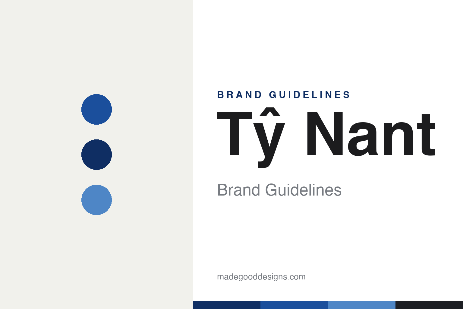
Tŷ Nant Brand Guidelines
Pure by design.
Aa
Two constants: a cobalt-blue identity and a clean, design-led wordmark. Abstract homage — not the Tŷ Nant bottle silhouette, Lovegrove ripple form or logo.
Water as a design object
Tŷ Nant sells a bottle as much as a water.
Tŷ Nant is a lesson in design as the product. A Welsh spring water from Bethania, Ceredigion — the name means “house by the stream” — its source was found by a water diviner in 1976, and the bottled brand launched in 1989. From the start it competed not on taste claims but on how it looked on the table.
Its fame rests on two bottles. The cobalt-blue glass bottle (1989) won a British design award and became a film and television prop, instantly recognisable. Then the Welsh-born industrial designer Ross Lovegrove created a sculptural clear PET bottle (launched at Harrods in 2001) — an asymmetric, rippling “flowing water” form now held in museum collections. Few waters can claim a bottle in a design museum.
(Honest notes: it is spelled Tŷ Nant, with a circumflex; the 1976 date is the spring’s discovery, while 1989 is the brand launch; the celebrated ripple bottle is the 2001 Lovegrove PET, a different design from the 1989 blue glass; and after a long Italian ownership, Tŷ Nant has been independent and British-owned again since 2020 — and is thriving. No official brand hex is published.)
Colour
Tŷ Nant lives in a signature cobalt blue. Click a swatch to copy the hex.
Tŷ Nant’s identity is cool, blue and minimal — a Tŷ Nant cobalt, a deep blue, a sky blue, a cream, and an ink. The palette is the famous cobalt-blue glass, with clean neutrals around it. It signals a premium, design-led water rather than a mass commodity — a bottle you keep. The honest caveat: with no published brand hex, these tones are an original, unofficial interpretation, not first-party values.
The lesson is a single striking colour, on a striking form, is the brand. Tŷ Nant’s world is cobalt and clarity. For designers, it is a reminder that when the object itself is the story, colour and form do the talking — a deep blue glass, or a sculptural clear bottle, needs very little else. The takeaways: commit to one distinctive colour; invest in the physical form; and treat any single hex as unofficial — using the deep blue for small text so the cobalt stays vivid.
Typography
The wordmark spirit is a clean, design-led sans — quiet and modern.
Tŷ Nant’s identity carries a quiet, modern, design-led spirit — a restrained “Tŷ Nant” wordmark that lets the bottle be the hero. A clean geometric sans captures the mood: it is calm and contemporary, the register of a brand whose tagline is literally “pure by design.” Set against cobalt blue, the clean type feels premium and understated — exactly the design-object personality Tŷ Nant carries. It is minimal rather than decorative, mirroring a bottle that belongs in a gallery. (Tŷ Nant’s real wordmark, the cobalt-glass silhouette and Ross Lovegrove’s rippled PET form are trademarks and protected design we describe but do not reproduce, and the exact typeface is not published, so we don’t assert it.) Because the specific mark is not ours to use, the honest description is “a clean, design-led spirit,” not the Tŷ Nant logo. The type behaves like the brand: quiet, modern and confident.
Aa
A clean, design-led spirit — quiet and modern. (Specimen set in Space Grotesk, a geometric sans; NOT the Tŷ Nant logo, which is a trademark.)
When the bottle is the brand
Tŷ Nant stands for its bottle.
Tŷ Nant is a lesson in investing in form. It did not out-spend rivals on advertising; it made objects worth noticing — a cobalt-blue glass that reads across a room, and a Lovegrove-designed clear bottle celebrated as industrial design. The packaging is the marketing: the water became desirable because the bottle did. The differentiator is design ambition most commodities never attempt.
For designers and brand-builders, Tŷ Nant offers a clear takeaway: a package can be the whole strategy. The lessons: if the product is undifferentiated, differentiate the object; commission real design talent and let it lead; and keep the identity minimal so the form carries it. It is also a reminder to stay accurate: the ripple bottle is Lovegrove’s 2001 PET (distinct from the 1989 blue glass), and Tŷ Nant is independent and British-owned again since 2020 — with the palette here an unofficial interpretation. Tŷ Nant bet on the bottle — proof that design can be the difference.
Explore & save
Keep Tŷ Nant’s identity on hand — save it to a board in the Made Good inspiration library.
Tŷ Nant identity set
Pin the cobalt-blue identity and the design-led spirit to your own board.


